@vlsergey/react-bootstrap-pagetable
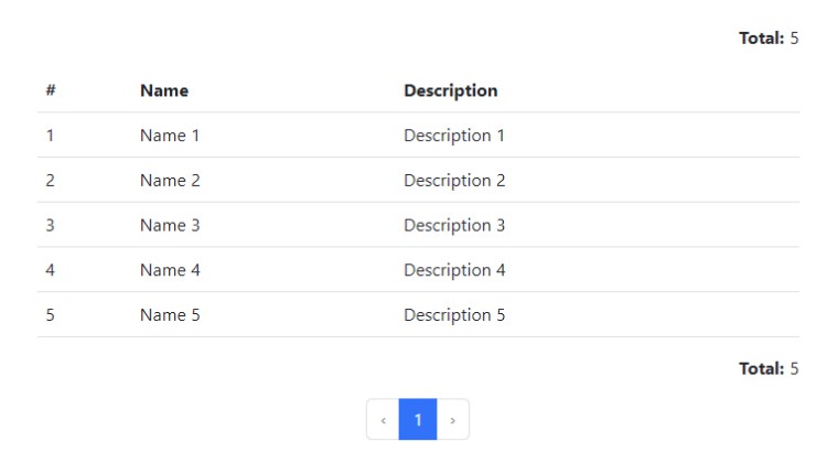
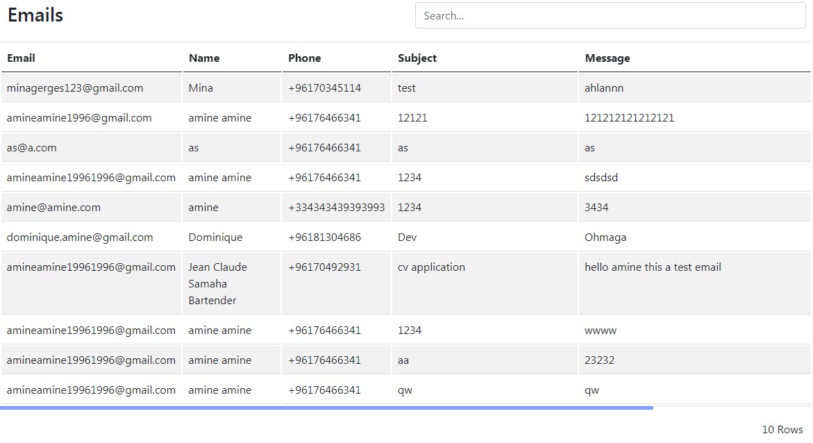
Goal of this component is provide standard and simple-to-use component to display and operate over data presented in tables. Such data are usually provided by server side using some find... methods with page and size arguments, as well as filtering, sorting and other options.
Main features:
- [x] Display and navigate over pages of data
- [x] Change size of page
- [x] Allow actions to be executed with elements (with or without autorefresh after action completed).
- [x] Allow selecting multiple elements and execute single action over them
- [x] Server-side sorting (i.e. passing
sortargument to server) - [x] Server-side filtering (allow to display filters and pass filter arguments to server)
- [x] Integration with react-router to support fetching arguments from URL and pushing changes back
- [x] Allow user to change visibility and order of columns to be displayed
- [ ] (TODO) Support standard renderers for date, time and other OpenAPI types
- [ ] (TODO) Allow to customize what to display before and after the
Table: page selection, page size selection, custom text, etc.
Additional small features that nice to have:
- [x] Abort
fetch()request if nextfetch()is called with new arguments - [x] Ignore results from old
fetch()if new one is already called - [x] "Select all" checkbox
- [ ] (TODO) examples of custom field types with custom renderers (color)
API
Installation:
npm install --save @vlsergey/react-bootstrap-pagetable
Main component is exposed as default module export of library.
There are 2 main properties to define. First is itemModel -- defines the data
structure, how to display data. Second is fetch -- provides implementation
of method to query data from server (or memory).
import PageTable from '@vlsergey/react-bootstrap-pagetable';

// ...
return <PageTable
         fetch={this.fetchDataImpl}
         itemModel={itemModel} />
To enable react-router integration import another variant of PageTable:
import {UncontrolledWithReactRouter as PageTable} from '@vlsergey/react-bootstrap-pagetable';
| Property | Data type | Default value | Description |
|---|---|---|---|
fetch |
( fetchArgs: FetchArgs ) => Promise<Page<T>> |
required | See below |
itemModel |
ItemModel<T> |
required | See below |
actions |
Action[] |
0 |
Allows to display buttons at the bottom of page table and use them to execute actions over single or multiple elements from single page of the table. |
defaultPage |
number |
0 |
Default page to display (0-based) |
defaultSize |
number |
10 |
Default page size to display |
defaultSort |
string |
Default page sort. One can specify only field name like name or field name and direction like name,ASC / name,DESC. |
|
footerRenderer |
( props: HeaderFooterPropsType ) |
DefaultHeaderFooter |
Component (function) used to render table footer with pagination and page size selector |
headerRenderer |
( props: HeaderFooterPropsType ) |
DefaultHeaderFooter |
Component (function) used to render table header with pagination and page size selector |
itemFieldCellRenderer |
( props: ItemFieldCellRendererProps ) => JSX.Element |
DefaultItemFieldCellRenderer |
Allows to override default item cell renderer (including selection checkbox cell). |
noContentRow |
( tableColumnsCount: number ) => ReactNode |
"no content on this page, select another page to display" | What to display instead of row when no data present on the fetched page |
rowsRenderer |
( props: RowsRendererProps ) => JSX.Element |
DefaultRowsRenderer |
Allows to override default rows renderer. |
rowProps |
( item: T ) => React.ComponentProps<'tr'> |
() => ({}) |
Additional properties for inner <tr> element |
size |
undefined | 'lg' | 'sm' |
undefined |
Will be passed to react bootstrap Table component as well as to Button, Form.Control and other inner components to change their visible size. |
tableProps |
props of react bootstrap <Table> component |
{} |
Additional properties for inner <Table> component |
urlParamsPrefix |
string |
"" |
What is the prefix of page, size, sort and other URL arguments that PageTable should interact with. Only with react-router integration enabled. |
Item model
So far itemModel (itemModel: ItemModel) defines 2 properties:
idF(idF: (item: T) => string). Defines a way to get unique
identifier of object in the data list. It's usually object ID. Identifier
should be unique in single data page scope and shall be unique in whole
table scope. Internally it's used to store selected rows identifiers and to
providekeyto React element array items.fields (fields: FieldModel<ItemModel, FieldValueType>[]).
List of object properties that can be displayed in the table. Until version 1.0 every listed column is visible and order can't be change. This is subject to change. In future versions user will be able to hide some columns and/or to reorder them. Each field model should have following properties:key(key: string). Defines internal string key for field. Internally
it's used to providekeyto React element array items. In future versions
it will also be used to store 'shown/hidden' lists of column. Assumed to be
safe to change from version to version (nothing really bad happens on change).title(title: string). Field title text. Shown in table column header
cell. Title is string due to DOM limitations related to<option>tag
behavior (for example it's used in visible fields list dialog).description(description?: ReactNode): Description of field. Optional.
Currently unused.sortable(boolean): is field sortable or not. Optional. Defaultfalse. Enabling this will render additional sorting icons in table header cell and will allow user to change sorting by clicking on header cell. Component does not define a way to sort elements, only fillssortfield inFetchArgsstructure passed tofetch()function.getter(getter?: ( item: I, fieldModel: FieldModel<I, V>, itemModel: ItemModel<I> ) => V).
Optional. Defines the way to obtain field value from object structure. By
default obtains object property usingkey, i.e.item[fieldModel.key].render(render: ( props: { value: V, item: I, itemModel: ItemModel<I> } ) => ReactNode). Optional.
Defines the way to render object field as table cell content. By default
just outputs string and number values asReactNode, objects are stringified
usingJSON.stringify(),nullandundefinedare returned asnull.
Feel free to use function, React functional component or React class component
here. Props type is exported from library asValueRendererPropsinterface.headerCellContent(props: ( field: FieldModel<ItemModel, FieldValueType> ) => JSX.Element).
Optional. Allow to change default header cell react element (<th>) content.
By default cell title is renderer with additional icons if field is sortable.valueCellProps(valueCellProps?: ( value: V, item: unknown, fieldModel: FieldModel<V> ) => Record<string, unknown>).
Optional. Provides additional value cell react element (<td>) properties.
Example
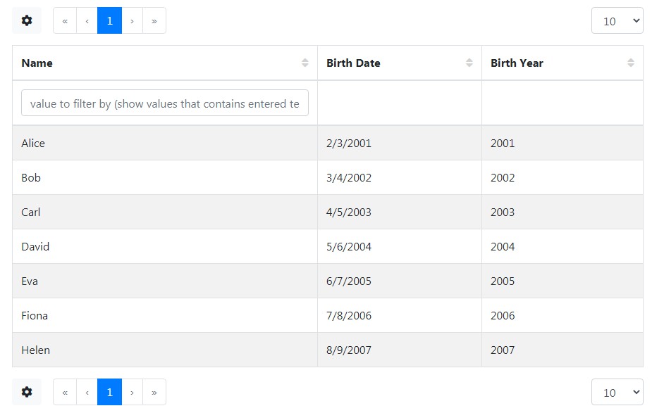
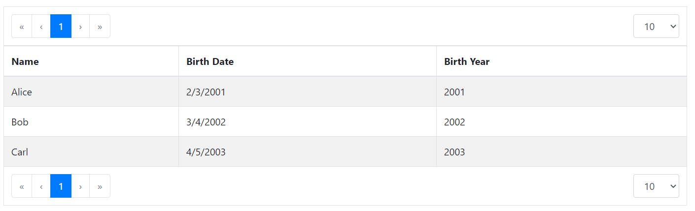
Data example:
[
  { "id": "1", "name": "Alice", "birthday": "2001-02-03" },
  { "id": "2", "name": "Bob", "birthday": "2002-03-04" },
  { "id": "3", "name": "Carl", "birthday": "2003-04-05" }
]
Possible item model:
const itemModel = {
  idF: ( { id } ) => id,
  fields: [
    { key: 'name', title: 'Name', sortable: true },
    {
      key: 'birthday',
      title: 'Birth Date',
      render: ( { value } ) => new Date( Date.parse( value ) ).toLocaleDateString(),
      sortable: true,
    },
    {
      key: 'birthyear',
      title: 'Birth Year',
      getter: ( { birthday } ) => new Date( Date.parse( birthday ) ).getFullYear(),
      sortable: true,
    },
  ]
}
fetch()
fetch: ( fetchArgs: FetchArgs, fetchOptions: FetchOptions ) => Promise<Page<T>>

interface FetchArgs {
  /** 0-based page to fetch */
  page: number,
  /** Max number of items per page to fetch */
  size: number,
  /** Filter values filled by filter cells (by invoking onFilterByChange callback) */
  filter?: Record<string, unknown>;
  /** Sort by field.
  If multiple fields are specified sort done in order is from last to first.
  (i.e. reversed before put in (for example) ORDER BY clause of SQL query) */
  sort?: { field: string, direction?: 'ASC' | 'DESC' }[]
}

// Additional options to pass to fetch() implementation.
// Can be just passed as fetch( ... , { ...fetchOptions, /* other options */ } )
interface FetchOptions {
  // value of new AbortController().signal to pass to fetch
  signal?: AbortSignal,
}

/**
* Structure of type is same as Spring Data Page type, thus server result
* can be pass to PageTable without transformation.
*/
interface Page<T> {
  content: T[];
  number: number;
  totalElements: number;
  totalPages: number;
}
Provides a way to get items to display. User shall not think about bouncing/scheduling/etc,
just provide data fetch implementation. page field is 0-based.
Utility functions
fetchFromArray
Emulates fetching data from provided array. Supports pagination and sorting (with strings and numbers).
import { fetchFromArray } from '@vlsergey/react-bootstrap-pagetable';

async function fetchFromArray<T>(
    itemModel: ItemModel<T>,
    src: T[],
    fetchArgs: FetchArgs ): Promise<Page<T>>
fetchFromSpringDataRest
import { fetchFromSpringDataRest } from '@vlsergey/react-bootstrap-pagetable';

async function fetchFromSpringDataRest<T>(
  url: string,
  fetchArgs: FetchArgs,
  responseCollectionKey: string ): Promise<Page<T>>
Fetches data from Spring Data REST API. Provided URL can be absolute or relative.
Fields keys to sort or to filter assumed to be passed to server without modifications.
Convert "virtual" fields to server ones before providing fetchArgs to function.
responseCollectionKey is the name of result collection element inside of _embedded structure in response.
springDataRestResponseToPage
import { springDataRestResponseToPage } from '@vlsergey/react-bootstrap-pagetable';

type SpringDataApiResponseType<T> = {
  _embedded: Record<string, T[]>,
  page: {
    size: number,
    totalElements: number,
    totalPages: number,
    number: number,
  }
}

function springDataRestResponseToPage<T>(
    key: string, response: SpringDataApiResponseType<T>
): Page<T>
Converts Spring Data REST API response to Page structure expected by PageTable.
key is the name of content collection in _embedded structure.