Flexr
React Flexbox grid made simple. Based on the "Solved-by-flexbox"-grid
Usage
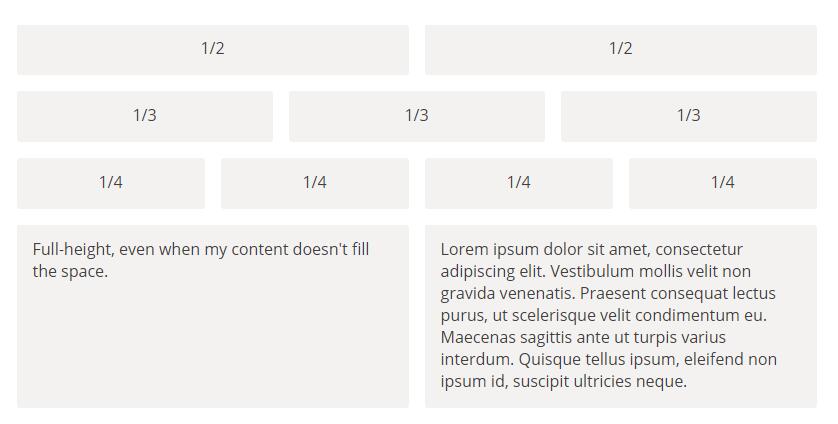
Base example.
import React, { Component } from 'react';
import { Grid, Cell } from 'react-flexr';
import 'react-flexr/styles.css'

class Example extends Component {
  render() {
    return (
      <Grid>
        <Cell>1/3</Cell>
        <Cell>1/3</Cell>
        <Cell>1/3</Cell>
      </Grid>
    );
  }
}
If you don't use webpack with css-loader, make sure to include the react-flexr/styles.css somewhere in your project. For more advanced use cases, the Stilr
stylesheet is also exposed.
Cell sizes can be controlled with fractions.
import React, { Component } from 'react';
import { Grid, Cell } from 'react-flexr';

class Example extends Component {
  render() {
    return (
      <Grid>
        <Cell size='6/12'>
          Fills Half
        </Cell>

        <Cell>
          Fills Rest.. (Yay for Flexbox)
        </Cell>

        <Cell size={200} lap={150}>
          Fills 150px on lap and 200px everywhere else
        </Cell>

        <Cell size={0.5} lap={0.25}>
          Fills a quarter on lap and half everywhere else
        </Cell>

        <Cell size='3/12'>
          Fills a quarter
        </Cell>

        <Cell palm='3/12' lap='1/2'>
          Fills a quarter on palm (mobile), half on lap and dynamicly sized everywhere else
        </Cell>

        <Cell palm='hidden' size='1/2'>
          Hidden on palm, half width otherwise
        </Cell>
      </Grid>
    );
  }
}
Component API:
Grid
import { Grid } from 'react-flexr';

<Grid
  align={ string }    // Vertical Align Sub Cells: top, center, bottom
  hAlign={ string }   // Horizontal Align Sub Cells: left, center, right
  gutter={ string }   // Override default gutter: '1em', '5%', '10px', etc.
                      //   Propagates downwards. Cells inside this Grid component will use the same gutter.
  flexCells={ bool }  // All sub cells will be full height
/>
Cell
import { Cell } from 'react-flexr';

<Cell
  align={ string }             // Vertical Align This Cell: top, center, bottom
  gutter={ string }            // Override default gutter: '1em', '5%', '10px', etc.
  flex={ bool }                // Like flexCells above, but for a single cell.
  size={ string | number }     // Takes a fraction. e.g. 1/6
  palm={ string | number }     // Like size, but only for palm devices.*
  lap={ string | number }      // Like size, but only for lap devices.*
  portable={ string | number } // Like size, but only for ( palm + lap ) devices.*
  desk={ string | number }     // Like size, but only for desk devices.*
/>
* Ergonomic breakpoints accepts 'hidden' as well. This will prevent the
component from being rendered in that state.
See the example folder for more examples.
Responsive Props
The responsive props are based on ergonomics.
We've used these breakpoints in a variety of apps and grids with success. So far the following breakpoints have beeen implemented:
- Palm
- Lap
- Portable
- Desk
See the breakpoint config object for sizes.
Flexr Helpers
Use these to get the most out of Flexr. Especially findMatch is very useful when you need to add different behaviour based on window width outside of the grid/cell elements.
string|false findMatch(string arguments)
This is the internal function that Flexr uses to check which ergonomic state
it's currently in. It's really useful if you have components outside the grid, that you
want to show/hide/manipulate passed properties or stuff in your lifecycle hooks.
The function accepts multipe ergonomic breakpoints as strings and returns the first one matched or false if nothing matches.
Example
import { findMatch } from 'react-flexr';
import React, { Component } from 'react';

class App extends Component {
  render() {
    const isPalm = findMatch('palm');

    if (isPalm) console.log( 'only logged in palm' );

    return (
      <div>
        <h1>Only visible in palm:</h1>
        { isPalm
          ? <h2>Palm</h2>
          : null }

        <h1>Allows Multiple Matches</h1>
        { findMatch('desk', 'lap')
          ? <h2>Lap or Desk</h2>
          : null }
      </div>
    );
  }
}
setBreakpoints( array breakpoints )
It's posible to force flexr to be in a specific ergonomic state. This is
primarily usefull when rendering on the server. E.g. looking at the user agent
string on rendering the app in palm/portable if it's an iOS/iPhone or
lap/portable if iOS/iPad.
Example
import { setBreakpoints } from 'react-flexr';
import App from '../your-app';
import React from 'react';

const isMobile = /iP(hone|od)|Mobile/;
function (req, res) {
  if ( isMobile.test( req.headers['user-agent'] ) ) {
    setBreakpoints(['palm', 'portable'])
  }
  else {
    setBreakpoints(['desk'])
  }
  const html = React.renderToString( <App />);

  res.send( '<!doctype html>' + html );
}
array|false findBreakpoints()
Force flexr to find the current breakpoints. Returns an array of the current
breakpoints that flexr matches in. If they haven't changed since the last time
findBreakpoints() was called, false will be returned.
Use in combination with optimizedResize.
Example
import { findBreakpoints } from 'react-flexr';

// First run. Window is sized to match lap.
findBreakpoints()       // => ['lap', 'portable'];

// Second run. Window not resized.
findBreakpoints()       // => false;
optimizedResize.init( function )
Simple resize event throttler. Usefull for force updating when the app have been
resized. For best performance, use it in your main app component in the
componentDidMount life cycle.
Example
import React, { Component } from 'react';
import { optimizedResize, findBreakpoints } from 'react-flexr';

class App extends Component {
  componentDidMount() {
    optimizedResize.init( () => {
      if ( findBreakpoints() ) {
        console.log('New Breakpoints');
        this.forceUpdate();
      }
    });
  }
}
array getBreakpoints()
returns an array of current breakpoints.
Map stylesheet
The internal Stilr stylesheet used to
handle basic flexbox styling for the components.
Usefull if you need full controll of how the CSS is rendered. Reed the Stilr
documentation on how to use Stilr if you need finegrained controll over you
styling.
palm, lap, portable, desk
The ergonomic breakpoint media queries that flexr uses internally is also
exposed. These are especially useful in combination with Stilr.
Example
import { palm, lap } from 'react-flexr';
import StyleSheet from 'stilr';

console.log(palm)       // => '@media screen and (max-width: 600px)';


// Stilr usage:
const styles = Style.create({
  constainer: {
    color: 'tomato',
    fontSize: 10,
    [palm]: {
      fontSize: 20,
      color: '#fff'
    },
    [lap]: {
      color: '#000',
      width: 200
    }
  }
});