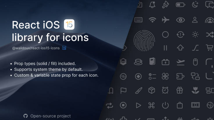
React Material Design Icons
React Material Design Icons – built with Pixo, Styled Components, and Styled System.
npm i rmdi
// import icons individually for better tree-shaking
import Accessibility from 'rmdi/lib/Accessibility'

const App = props => (
  <Accessibility
    size={32}
    color='tomato'
  />
)
// import all icons as a single component
import { Icon } from 'rmdi'

const App = props => (
  <Icon
    name='accessibility'
    size={32}
    color='tomato'
  />
)
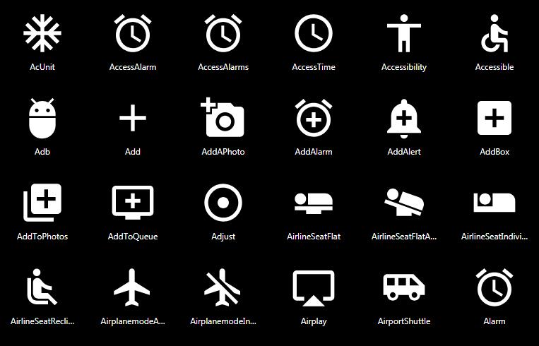
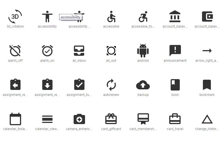
List of Icons
See the icon list for a complete list of all icons available
Props
| Prop | Type | Description |
|---|---|---|
size |
number | width and height in pixels |
color |
string | fill color, uses Styled System's color function |
Spacing Props
Margin can be applied with the following props, which use Styled System's space function.
Margin props accept numbers for pixel values, strings with CSS units, or arrays for responsive margin
| Prop | Description |
|---|---|
m |
margin |
mt |
margin-top |
mr |
margin-right |
mb |
margin-bottom |
ml |
margin-left |
mx |
margin-left and margin-right |
my |
margin-top and margin-bottom |
Contributing
npm install
The build process will:
- Parse the
material-design-iconspackage for SVG source code - Copy the icons to the
svg/folder - Create an
examples/folder for tests and development - Run [Pixo][pixo] on the
svg/folder and output tosrc/ - Run Babel on the
src/folder and output tolib/
Tests:
npm test
To run the development server:
npm start
