react-select-search
React powered select box with filter.
Warning
Until the 1.0.0 release, this react component is considered not to be production ready. It will most likely work for you but it's lacking tests and testing. I'm trying my hardest to get enough time to work on this and test it. Any and all help is much appreciated in forms of both testing and code contributions.
Known issues
- Weird tab behaviour in some places in Safari
How to use
Install it with npm (npm install react-select-search --save) and import it like you normally would.
import SelectSearch from 'react-select-search'
/**
* The options array should contain objects.
* Required keys are "name" and "value" but you can have and use any number of key/value pairs.
*/
const options = [
{name: 'Swedish', value: 'sv'},
{name: 'English', value: 'en'}
];
/* Simple example */
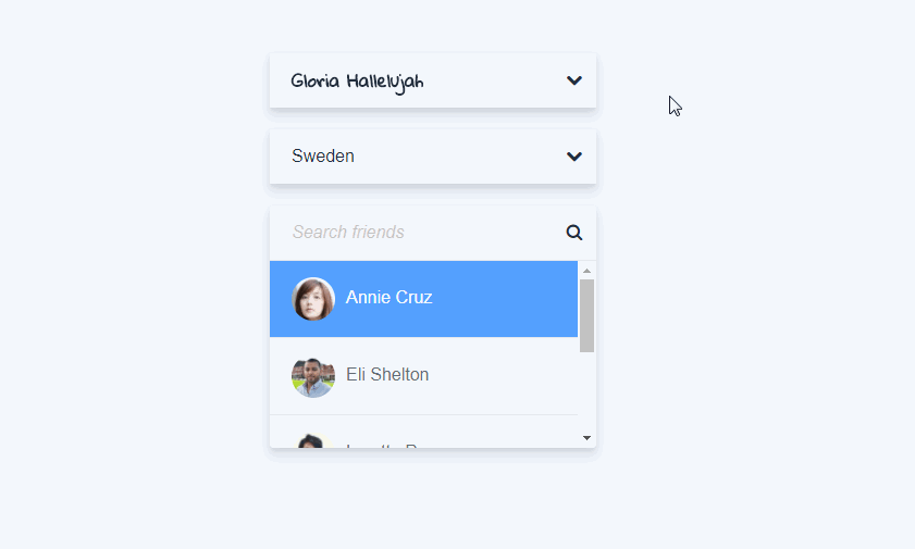
<SelectSearch options={options} value="sv" name="language" placeholder="Choose your language" />
Below is a full list of properties and defaults (displayed in React style).
{
    options: PropTypes.array.isRequired,
    className: PropTypes.string,
    search: PropTypes.bool,
    placeholder: PropTypes.string,
    multiple: PropTypes.bool,
    height: PropTypes.number,
    name: PropTypes.string,
    autofocus: PropTypes.bool,
    fuse: PropTypes.object,
    onChange: PropTypes.func,
    onHighlight: PropTypes.func,
    onMount: PropTypes.func,
    onBlur: PropTypes.func,
    onFocus: PropTypes.func,
    renderOption: PropTypes.func,
    renderValue: PropTypes.func,
    value: PropTypes.oneOfType([
        PropTypes.string,
        PropTypes.array
    ])
}

{
    className: 'select-search-box',
    search: true,
    value: '',
    placeholder: null,
    multiple: false,
    height: 200,
    name: null,
    autofocus: false,
    onHighlight: (value, state, props) => {},
    onMount: (value, state, props) => {},
    onBlur: (value, state, props) => {},
    onFocus: (value, state, props) => {},
    onChange: (value, state, props) => {},
    renderOption: (option, state, props) => option.name,
    renderValue: (label, valueObj, state, props) => label,
    fuse: {
        keys: ['name'],
        threshold: 0.3
    }
}
The height property is the minimum height (max is the remaining space below the selectbox down to the browser window end) of the dropdown if multiple is false, otherwise it's the fixed height.
For examples you can take a look at the bootstrap.js file on the gh-pages branch.
You will also need some CSS to make it look right. Example theme can be found in style.css