React-Select-Tile
The Select control for React.
Installation and usage
The easiest way to use react-select-tile is to install it from npm and build it into your app with Webpack.
yarn add react-select-tile
or
npm install react-select-tile
Then use it in your app:
import React from "react";
import Select from "react-select-tile";
const options = [
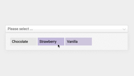
{ value: "chocolate", label: "Chocolate" },
{ value: "strawberry", label: "Strawberry" },
{ value: "vanilla", label: "Vanilla" }
];
const App = () => {
const [value, setValue] = React.useState("");
const handleItemClick = value => {
setValue(value);
console.log(`Option selected:`, value);
};
return (
<Select
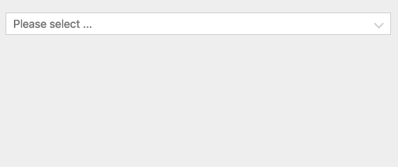
placeholder="Please select ..."
value={value}
options={options}
onItemClick={handleItemClick}
/>
);
};
Props
Common props you may want to specify include:
onInputChange- subscribe to change eventsoptions- specify the options the user can select fromplaceholder- change the text displayed when no option is selectedvalue- control the current valueonItemClick- subscribe to menu item click eventsonMenuClose- will be called when the menu is closedonMenuOpen- will be called when the menu is openedmenuIsOpen- determines weather menu should be opened or not (default = false)containerClassName- root element classcontainerStyle- root element styleinputClassName- input element classinputStyle- input element stylemenuClassName- menu items container classmenuStyle- menu items container stylemenuItemClassName- menu item classmenuItemStyle- menu item styleactiveItemClassName- active menu item classactiveItemStyle- active menu item styleiconClassName- Chevron icon classiconStyle- chevron icon styleemptyComponent- element to display when there are no optionsmenuComponent- element to display as menu items containermenuItemComponent- element to display as menu item,openAnimationDelay- animation duration (default = 300)menuItemColumns- number of menu item columns (default = 4)menuItemWidth- menu item width (default = 120px)menuPosition- where menu should be opened. either "top" or "bottom" (default = "bottom")placeholder- input placeholder (default = "")
Controllable Props
You can control the following props by providing values for them. If you don't, react-select will manage them for you.
value/onChange- specify the current value of the controlmenuIsOpen/onMenuOpen/onMenuClose- control whether the menu is open
Run Demo Locally
npm run demo
Then open the browser and navigate to http://localhost:5555