react-strap-table
react table (client and server side) based on bootstrap style.
You can customize any thing (headings, contents ...) not only by text but you can putting your component or html tags, and will find css classes for all headings and contents of columns, and you can sorting, pagination, limit of per page and filtering of server-side data.
Installation
npm install react-strap-table
components
- ServerTable (server-side data)
import ServerTable from 'react-strap-table'; - ClientTable (client-side data):
Coming soon...
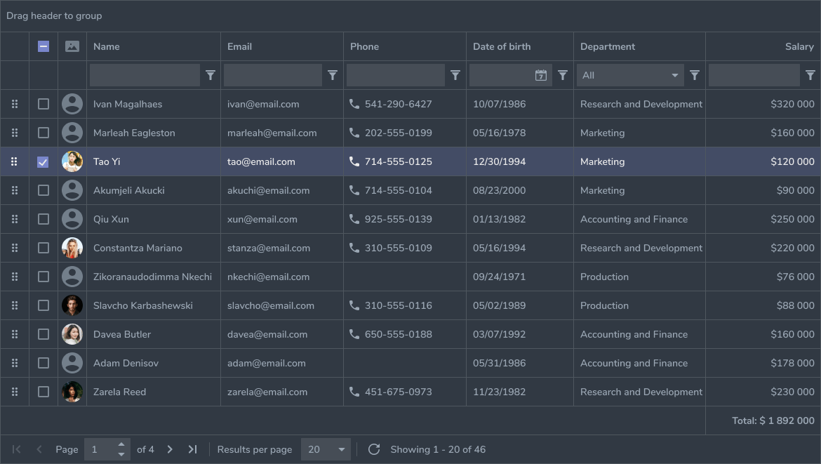
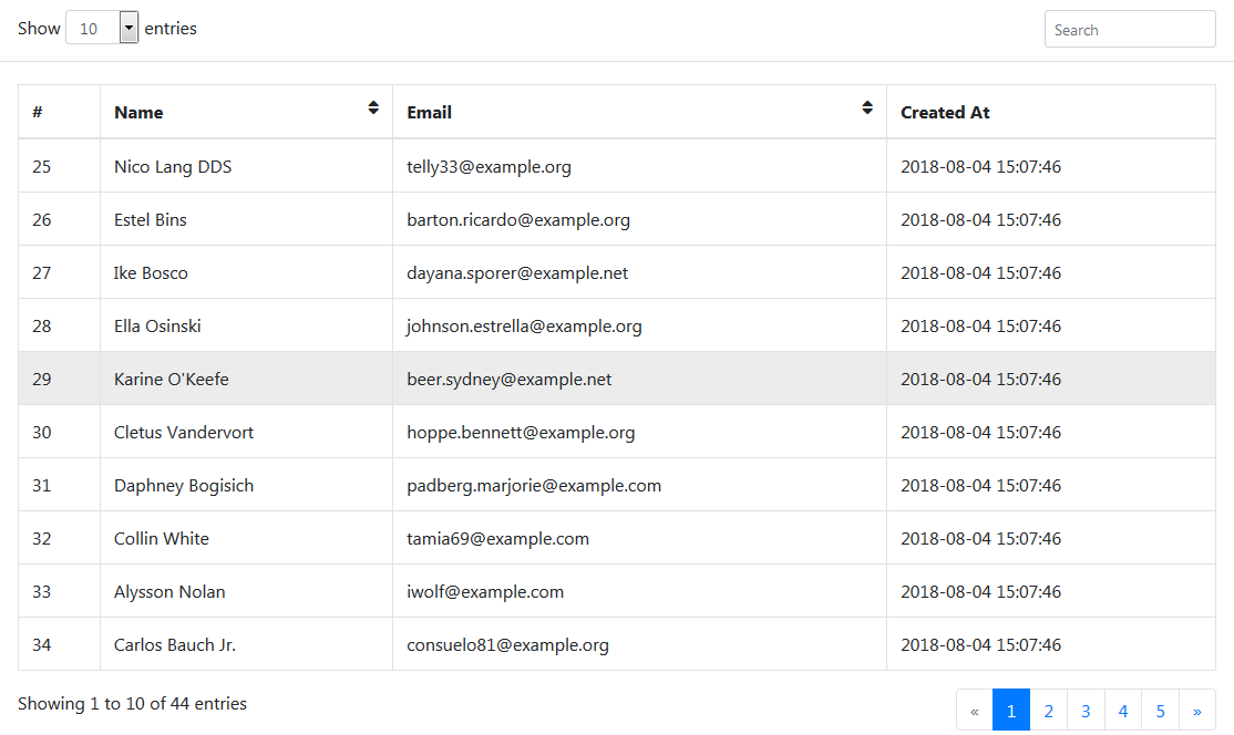
Demo (server-side)
Features
- Customize headings of columns not only text but you can put your component or html tags.
- Customize contents of columns (
tdcell) by any component and the row of data with passed for it. - Server-side sorting, pagination, limit of per page and filtering.
- Customize response of your url request.
- Every columns have css class for customize it
table-{colmun}-thandtable-{colmun}-td. - Customize texts and icons.
Documentation:
Example
const url = 'https://react-strap-table.com/users';
const columns = ['id', 'name', 'email', 'created_at'];
const options = {
   headings: {id: '#', created_at: 'Created At'},
   sortable: ['name', 'email']
};
return (
    <ServerTable columns={columns}
	   url={url}
	   options={options}
	   bordered hover/>
);
Props
- url (required, server-side): base url
- columns (required, array): contains names of columns, the headings of columns will be Upper case of first letter but you can overwrite it by
headingsin options props. - hover (boolean): bootstrap style,
- bordered (boolean): bootstrap style,
- condensed (boolean): bootstrap style,
- striped (boolean): bootstrap style,
- options (object): details.
Children
The children must be Function of two parameters (row, column), and implementation of function must be switch of case columns that you need to customize contents.
The row parameter with return current row of data.
<ServerTable columns={columns}  url={url} bordered>
    {
        function (row, column) {
            switch (column) {
                case 'id':
                    return (
                       <input key={row.id}
                          type="checkbox" value={row.id}
                          onChange={self.handleCheckboxTableChange} />
                    );
                case 'avatar':
                    return (<img src={row.avatar}  className="table-image"/>);
                default:
                    return (row[column]);
            }
        }
    }
</ServerTable>
Note: You can get the index of the current row using
row.indexDon't forget
defaultcase for other columns.
Options
| Option | Description | Default |
|---|---|---|
| headings | object of Headings columns {id:'#', created_at: 'Created At'} |
{} |
| sortable | array of columns that can sorted ['name', 'email'] |
[] |
| columnsWidth | object of width columns by percentage(%) and you can fix it by pixel(px){id: 5, name:30, created_at:'30px'} |
{} |
| columnsAlign | object of align heading columns (not td) {id: 'center'} |
{} |
| perPage | integer limit rows of page |
10 |
| perPageValues | array contain values of per page select |
[10, 20, 25, 100] |
| icons | object contains icons in table |
{sortBase: 'fa fa-sort',sortUp: 'fa fa-sort-amount-up',sortDown: 'fa fa-sort-amount-down',search: 'fa fa-search'} |
| texts | object contains texts in table |
{show: 'Show', entries: 'entries', showing: 'Showing', to: 'to', of: 'of', search: 'Search'} |
| loading | text\|html tag\|component for loading |
(<div style={{fontSize: 18, display: "initial"}}><span className="fa fa-spinner fa-spin"/> Loading...</div>) |
| responseAdapter (server-side) | function if you want to mapping response. function take parameter of data response and must return object contains data and total properties. |
function (resp_data) {return {data: resp_data.data, total: resp_data.total}} |
Options Examples
let checkAllInput = (<input type="checkbox" ref={this.check_all}
	onChange={this.handleCheckboxTableAllChange}/>);
const options = {
    perPage: 5,
    headings: {id: checkAllInput, created_at: 'Created At'},
    sortable: ['name', 'email', 'created_at'],
    columnsWidth: {name: 30, email: 30, id: 5},
    columnsAlign: {id: 'center', avatar: 'center'},
    responseAdapter: function (resp_data) {
        return {data: resp_data.data, total: resp_data.meta.total}
    },
    texts: {
        show: 'عرض'
    },
    icons: {
	sortUp: 'fa fa-sort-up',
	sortDown: 'fa fa-sort-down'
    }
};
Request parameters (server-side)
Get Request with following parameters:
query: search input value.limit: rows per page.page: current page.orderBy: column to sort.ascending: ascending sorting? 1 or 0.
Css Classes
The component based on card bootstrap component.
react-strap-table: root class of component.card-header: contains per page and search input.card-body: contains the table.card-footer: contains pagination and data info.table-{column-name}-th: table column header for every columns.table-{column-name}-td: table column content for every columns.table-sort-icon: span icon of table column header for columns that be sortable.