React Tooltip
React tooltip component based on react-popper, the React wrapper around popper.js library.
Usage
npm install react-popper-tooltip
import React from 'react';
import { render } from 'react-dom';
import TooltipTrigger from 'react-popper-tooltip';
render(
<TooltipTrigger
placement="right"
trigger="click"
tooltip={({
getTooltipProps,
getArrowProps,
tooltipRef,
arrowRef,
placement
}) => (
<div
{...getTooltipProps({
ref: tooltipRef,
className: 'tooltip-container'
/* your props here */
})}
>
<div
{...getArrowProps({
ref: arrowRef,
'data-placement': placement,
className: 'tooltip-arrow'
/* your props here */
})}
/>
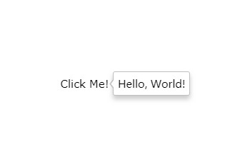
<div className="tooltip-body">Hello, World!</div>
</div>
)}
>
{({ getTriggerProps, triggerRef }) => (
<span
{...getTriggerProps({
ref: triggerRef,
className: 'trigger'
/* your props here */
})}
>
Click Me!
</span>
)}
</TooltipTrigger>,
document.getElementById('root')
);
TooltipTrigger is the only component exposed by the package. It's just a positioning engine. What to render is left completely to the user, which can be provided using render props. Your props should be passed through getTriggerProps, getTooltipProps and getArrowProps.
Read more about render prop pattern if you're not familiar with this approach.
Quick start
If you would like our opinionated container and arrow styles for your tooltip for quick start, you may import react-popper-tooltip/dist/styles.css, and use the classes tooltip-container and tooltip-arrow as follows:
Tooltip.js
import React from 'react';
import TooltipTrigger from 'react-popper-tooltip';
import 'react-popper-tooltip/dist/styles.css';
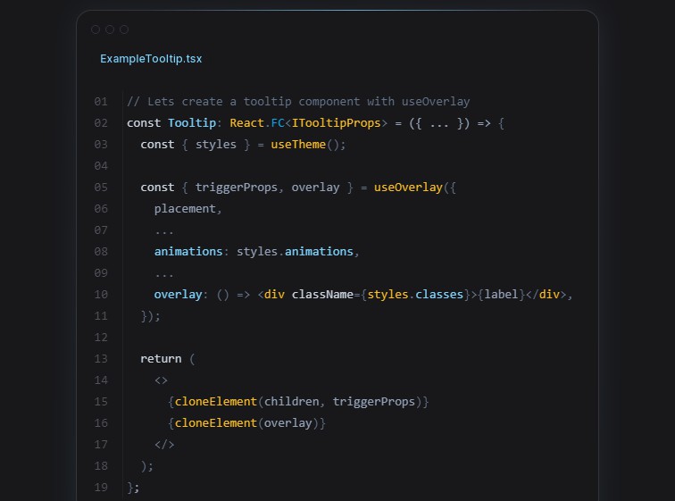
const Tooltip = ({ tooltip, children, ...props }) => (
<TooltipTrigger
{...props}
tooltip={({
getTooltipProps,
getArrowProps,
tooltipRef,
arrowRef,
placement
}) => (
<div
{...getTooltipProps({
ref: tooltipRef,
className: 'tooltip-container'
})}
>
<div
{...getArrowProps({
ref: arrowRef,
'data-placement': placement,
className: 'tooltip-arrow'
})}
/>
{tooltip}
</div>
)}
>
{({ getTriggerProps, triggerRef }) => (
<span
{...getTriggerProps({
ref: triggerRef,
className: 'trigger'
})}
>
{children}
</span>
)}
</TooltipTrigger>
);
export default Tooltip;
Then you can use it as shown in the example below.
<Tooltip placement="top" trigger="click" tooltip="Hi there!">Click me</Tooltip>
Props
children
function({})| required
This is called with an object. Read more about the properties of this object in
the section "Children and tooltip functions".
tooltip
function({})| required
This is called with an object. Read more about the properties of this object in
the section "Children and tooltip functions".
defaultTooltipShown
boolean| defaults tofalse
This is the initial visibility state of the tooltip.
tooltipShown
boolean| control prop
Use this prop if you want to control the visibility state of the tooltip.
Package manages its own state internally. You can use this prop to pass the visibility state of the
tooltip from the outside.
delayShow
number| defaults to0
Delay in showing the tooltip (ms).
delayHide
number| defaults to0
Delay in hiding the tooltip (ms).
placement
string| defaults toright
The tooltip placement. Valid placements are:
autotoprightbottomleft
Each placement can have a variation from this list:
-start-end
trigger
string| defaults tohover
The event that triggers the tooltip. One of click, hover, right-click, none.
closeOnOutOfBoundaries
boolean| defaults totrue
Whether to close the tooltip when it's trigger is out of the boundary.
modifiers
object
Modifiers passed directly to the underlying popper.js instance.
For more information, refer to Popper.js’
modifier docs
Modifiers, applied by default:
{
  preventOverflow: {
    boundariesElement: 'viewport',
    padding: 0
  }
}
You also have the ability to attach ref to the TooltipTrigger component which exposes following
methods for programmatic control of the tooltip:
showTooltip(show immediately)hideTooltip(hide immediately)toggleTooltip(toggle immediately)scheduleShow(show respecting delayShow prop)scheduleHide(hide respecting delayHide prop)scheduleToggle(toggle respecting delayShow and delayHide props)
Children and tooltip functions
This is where you render whatever you want. react-popper-tooltip uses two render props children
and tooltip. Children prop is used to trigger the appearance of the tooltip and tooltip
displays the tooltip itself.
You use it like so:
const tooltip = (
  <TooltipTrigger
    tooltip={tooltip => (<div>{/* more jsx here */}</div>)}
  >
    {trigger => (<div>{/* more jsx here */}</div>)}
  </TooltipTrigger>
)
prop getters
These functions are used to apply props to the elements that you render.
It's advisable to pass all your props to that function rather than applying them on the element
yourself to avoid your props being overridden (or overriding the props returned). For example
<button {...getTriggerProps({ onClick: event => console.log(event))}>Click me</button>
children function
| property | type | description |
|---|---|---|
| getTriggerProps | function({}) |
returns the props you should apply to the trigger element you render. |
| triggerRef | node |
returns the react ref you should apply to the trigger element. |
tooltip function
| property | type | description |
|---|---|---|
| getTooltipProps | function({}) |
returns the props you should apply to the tooltip element you render. |
| tooltipRef | node |
return the react ref you should apply to the tooltip element. |
| getArrowProps | function({}) |
return the props you should apply to the tooltip arrow element. |
| arrowRef | node |
return the react ref you should apply to the tooltip arrow element. |
| placement | string |
return the placement of the tooltip. |