react-image-appear
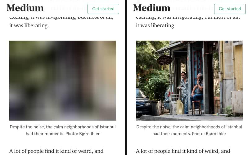
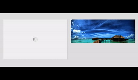
Wraps an img within a placeholder element and adds a gif loader in between. No more ugly-looking progressively loading images!

This project has also been ported to AngularJS 1.x - ng-image-appear.
Installation
via npm
npm install react-image-appear --save
via yarn
yarn add react-image-appear
Usage
Import the component and provide the src with any of the available props.
import ReactImageAppear from 'react-image-appear';

<ReactImageAppear
    src="https://newevolutiondesigns.com/images/freebies/tropical-beach-background-8.jpg"
    animation="zoomIn"
    animationDuration="1s"
/>
Props
src {string} | required
The image source.
<ReactImageAppear
    src="https://newevolutiondesigns.com/images/freebies/tropical-beach-background-8.jpg"
/>
loader {string}
Adds a custom loader to the component. When not provided, applies a default one.
<ReactImageAppear
    src="https://newevolutiondesigns.com/images/freebies/tropical-beach-background-8.jpg"
    loader="https://cache.dominos.com/nolo/ca/en/010048/assets/build/images/img/spinner.gif"
/>

loaderStyle {object}
Adds custom styling to the loader.
<ReactImageAppear
    src="https://newevolutiondesigns.com/images/freebies/tropical-beach-background-8.jpg"
    loaderStyle={{ border: "2px solid red" }}
/>
loaderClass {string}
Adds CSS classes to the loader.
<ReactImageAppear
    src="https://newevolutiondesigns.com/images/freebies/tropical-beach-background-8.jpg"
    loaderClass="my-loader"
/>
placeholder {boolean | string}
Adds a placeholder background to the component.
<ReactImageAppear
    src="https://newevolutiondesigns.com/images/freebies/tropical-beach-background-8.jpg"
    placeholder
/>

You can override the default placeholder background and add your own by passing an image URL to this prop.
<ReactImageAppear
    src="https://newevolutiondesigns.com/images/freebies/tropical-beach-background-8.jpg"
    placeholder="http://getuikit.com/docs/images/placeholder_600x400.svg"
/>

placeholderStyle {object}
Adds custom styling to the placeholder.
<ReactImageAppear
    src="https://newevolutiondesigns.com/images/freebies/tropical-beach-background-8.jpg"
    placeholderStyle={{ border: "2px solid red", backgroundColor: 'black' }}
/>
placeholderClass {string}
Adds CSS classes to the placeholder.
<ReactImageAppear
    src="https://newevolutiondesigns.com/images/freebies/tropical-beach-background-8.jpg"
    loaderClass="my-placeholder"
/>
animation {string} | Default: fadeIn
Add a CSS3 powered animation to the image as it appears.
<ReactImageAppear
    src="https://newevolutiondesigns.com/images/freebies/tropical-beach-background-8.jpg"
    animation="bounceIn"
/>

react-image-appear has the following built-in CSS3 animations -
fadeIn (default)
fadeInUp
fadeInRight
fadeInDown
fadeInLeft
bounceIn
bounceInUp
bounceInRight
bounceInDown
bounceInLeft
flipInX
flipInY
zoomIn
blurIn
blurInUp
blurInRight
blurInDown
blurInLeft
fillIn
animationDuration {string} | Default: 700ms
Specifies the animation duration for the image to appear.
<ReactImageAppear
    src="https://newevolutiondesigns.com/images/freebies/tropical-beach-background-8.jpg"
    animation="bounceIn"
    animationDuration="1s"
/>
easing {string} | Default: ease-in-out
Specifies the timing-function for the CSS3 powered animation.
<ReactImageAppear
    src="https://newevolutiondesigns.com/images/freebies/tropical-beach-background-8.jpg"
    animation="bounceIn"
    easing="ease-in"
/>
showLoader {boolean} | Default: true
Specifies whether to show the loader or not.
<ReactImageAppear
    src="https://newevolutiondesigns.com/images/freebies/tropical-beach-background-8.jpg"
    animation="bounceIn"
    showLoader={false}
/>

Testing
ReactImageAppear uses the jest test runner along with enzyme for easier assertion and manipulation. Run the following command to start the jest test runner -
npm test