DragDropContainer and DropTarget
ReactJS drag and drop functionality for mouse and touch devices.
Make something draggable:
import { DragDropContainer } from 'react-drag-drop-container';

<DragDropContainer>
    <div>Look, I'm Draggable!</div>
</DragDropContainer>
Set up a drop target:
import { DragDropContainer, DropTarget } from 'react-drag-drop-container';

<DragDropContainer targetKey="foo" >
    <div>Drag Me!</div>
</DragDropContainer>

<DropTarget targetKey="foo" >
    <p>I'm a valid drop target for the object above since we both have the same targetKey!</p>
</DropTarget>
Wire up events and data on the DragDropContainer:
<DragDropContainer targetKey="foo" dragData={some object} onDragStart={some method} onDrop={some method}...>
    <div>Drag Me!</div>
</DragDropContainer>
dragData: Data to pass to the drop target.
onDragStart, onDrag, onDragEnd: Callbacks during the drag process. These are passed the dragData object set
above. onDrag and onDragEnd are also passed dropTarget (the DOM element we're currently over),
x, and y (current position).
onDrop: Callback that fires after a successful drop on a compatible target. It gets passed an event object that
contains all this:
{
    dropData: [whatever you put in the dropData prop for the DropTarget]
    dropElem: [reference to the DOM element being dragged]
    containerElem: [reference to the DragDropContainer DOM element]
    target: [reference to the DropContainer DOM element]
}
Wire up events and data in the DropTarget:
<DropTarget targetKey="foo" dropData={some object} onDragEnter={highlight method} onDragLeave={unHighlight} onHit={some function}>
    <p>Drop something on me</p>
</DropTarget>
dropData: Data to pass back to the DragDropContainer.
onDragEnter, onDragLeave, onHit: Callbacks that fire when a compatible DragDropContainer
passes over. onHit is when a compatible container is dropped on the target. These
are passed an event containing...
{
    dragData: [whatever you put in the dragData prop for the DragDropContainer]
    dragElem: [reference to the DOM element being dragged]
    containerElem: [reference to the DragDropContainer DOM element]
    target: [reference to the DropContainer DOM element]
}
Wrapper components for dragging an element and dropping it on a target.
-
Works on mouse and touch devices.
-
Can set it up to drag the element itself or drag a "ghost" node that
represents the element. -
Use prop targetKey to to identify compatible drag elements
and targets. -
Can specify drag handle(s) (if desired) with prop dragHandleClassName.
-
Can tell the element to return-to-base after dragging, or to stay where you put it.Removed in v 5.0.0. It now always returns to base after dragging. -
Can constrain dragging to one dimension, horizontal or vertical.
-
Includes callback props for onStartDrag, onDragging, onEndDrag,
and onDropped. -
Data from the target element is included with the onDropped event triggered in
the DragDropContainer.
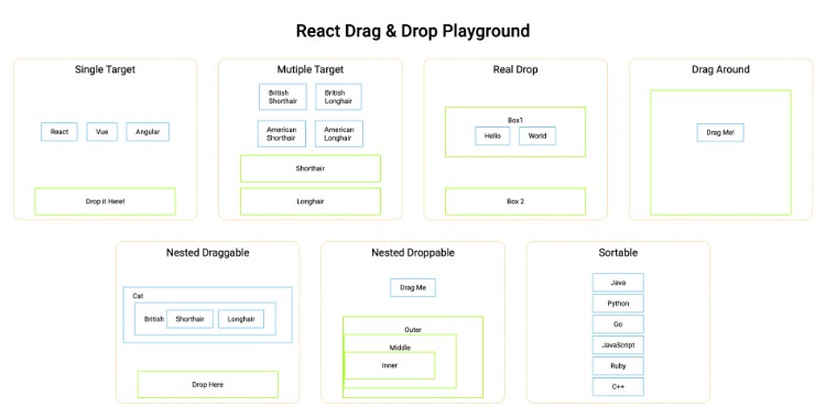
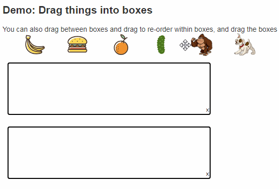
Demo
To build the demo locally, run:
npm install
npm run launch
This should open the demo in a browser window on
localhost:8080.
This error means you're already running
something on port 8080:
events.js:160
      throw er; // Unhandled 'error' event
Installation
Install it in your project using npm:
npm install react-drag-drop-container --save
Usage
Set up Draggable Element
Wrap your element in a DragDropContainer:
import { DragDropContainer } from 'react-drag-drop-container';

<DragDropContainer>
    <span>Example</span>
</DragDropContainer>
The element should now be draggable.
Set up for dragging to a target
Add the data you want to send to the target when you drop the element on it:
<DragDropContainer dragData={{label: 'Example', id: 123}}>
	<span>Example</span>
</DragDropContainer>
Specify targetKey. This determines what dropTargets will accept your drag:
<DragDropContainer dragData={{label: 'Example', id: 123}} targetKey="foo">
	<span>Example</span>
</DragDropContainer>
Set up Target(s)
Wrap an element in a DropTarget, giving it the same targetKey as your draggable:
  import { DropTarget } from 'react-drag-drop-container';

  <DropTarget targetKey="foo">
      [some element or text]
  </DropTarget>
In DropTarget's parent, add handlers for the enter, leave, and drop events. For example:
  highlight(ev){
    this.setState({'highlighted': true})
  }

  unHighlight(ev){
 	this.setState({'highlighted': false})
  }

  dropped(ev){
    ... do something with event data ...
  }
Wire them up to DropTarget. In this example we are passing the "highlighted" state
to the child element, which we assume toggles some highlighted style.
  <DropTarget targetKey="foo" onDragEnter={this.highlight} onDragLeave={this.unHighlight} onHit={this.dropped}>
    <ChildElement highlighted=this.state.highlighted />
  </DropTarget>
DragDropContainer Props
Key Props
These are not required, but you'll almost always want to set them.
dragData
Data about the dragged item that you want to pass to the target. Default is empty object.
targetKey
Optional string to specify which DropTargets will accept which DragDropContainers.
Other Props
customDragElement
If a DOM node is provided, we'll drag it instead of the actual object (which
will remain in place).
Example:
let elem = <div class="drag_elem">Drag Me</div>;

<DragDropContainer customDragElement={elem}>
disappearDraggedElement
If true, then dragging an element causes it to disappear such that it takes up no space. Defaults to
false, so that the element space is still reserved while you are dragging it. Not compatible with
dragClone.
dragClone
If true, then the user appears to be dragging a copy of the original element (this is false by
default, so that the user appears to be dragging the element itself).
dragElemOpacity
Opacity of the element while it's dragging. (Sometimes you want to be able to see what's below the
element you're dragging.) Default is 0.9 (e.g. 90%).
dragHandleClassName
Class name for drag handle(s). Optional. If omitted, the whole thing is grabbable.
Tip: If you are using drag handles on an element that contains an image,
use <img draggable="false"... to prevent the browser from letting users
drag the image itself, which can be confusing.
noDragging
If true, dragging is turned off.
xOnly, yOnly
If true, then dragging is constrained to the x- or y direction, respectively.
zIndex
The z-index for the dragged item defaults to 1000 (so that it floats over the target).
If that doesn't work for you, change it here.
Callbacks
All optional; specify in props.
onDragStart(dragData)
Runs when you start dragging. dragData is whatever you passed in with
the dragData prop.
onDrag(dragData, currentTarget, x, y)
Runs as you drag. currentTarget is the DOM element you're currently dragging
over; x and y are the current position.
onDragEnd(dragData, currentTarget, x, y)
When you drop.
onDrop(dropData, dropTarget)
Triggered after a drop onto a compatible DropTarget. dropTarget is the DOM
element of the DropTarget you dropped on, and dropData
is an optional prop of DropTarget.
DropTarget Props
targetKey
Optional string to specify which DragDropContainers this target will accept.
dropData
Data to be provided to the DragDropContainer when it is dropped on the target.
DropTarget Callbacks
All optional; specify in props.
onDragEnter(e), onDragLeave(e), onHit(e)
The event e contains
{
    dragData: [whatever you put in the dragData prop for DragDropContainer]
    dragElem: [reference to the DOM element being dragged]
    containerElem: [reference to the DragDropContainer DOM element]
    sourceElem: [reference to the DOM element containing children of DragDropContainer]
}
Example: make the target "consume" the draggable
Use event.containerElem to hide or delete the original element after a successful
drop.
  dropped(ev){
      ev.containerElem.style.visibility = 'hidden';
  }
Development
To view locally, clone the repository then
$ npm run install
$ npm run build
$ npm run watch
The demo will run on http://localhost:8080/
File locations:
/src    Source code for components
/demo   Source code for demo
/lib/bundle.js  Transpiled output
/public   Demo files, compiled