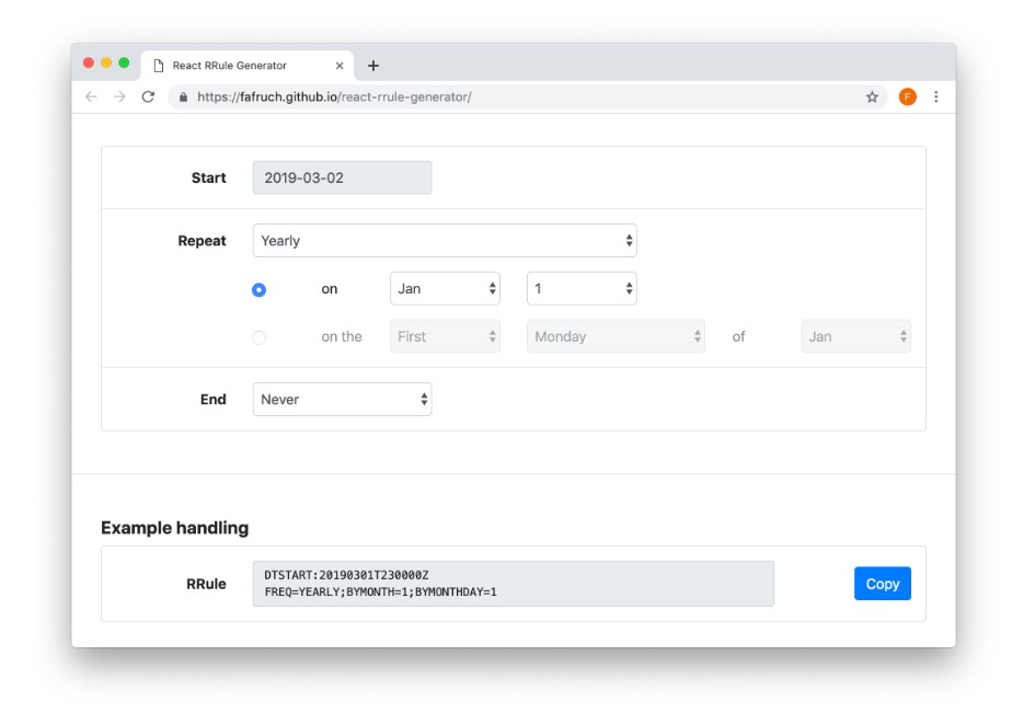
React RRule Generator
This is ReactJS project based on Create React Library and using Bootstrap styling. It's built with the help of a great rrule.js library.
It also uses:
- lodash
- moment
- react-datetime
Installation
npm install --save react-rrule-generator
Usage
In your CSS index file don't forget to import styles:
@import '~bootstrap/dist/css/bootstrap.css';       // this lib uses boostrap (v. 4.0.0-beta.2)
@import '~react-rrule-generator/build/styles.css'; // react-rrule-generator's custom CSS
Then you're good to go.
Just use it:
import RRuleGenerator from 'react-rrule-generator';

// render it as it is

const SimpleRender = () => (
  <RRuleGenerator onChange={(rrule) => console.log(`RRule changed, now it's ${rrule}`)} />
);


// or with your own forms configuration

import MyCustomCalendar from './MyCustomCalendar';

const CustomizedRender = () => (
  <RRuleGenerator
    onChange={(rrule) => console.log(`RRule changed, now it's ${rrule}`)}
    config={{
      repeat: ['Monthly', 'Weekly'],
      yearly: 'on the',
      monthly: 'on',
      end: ['Never', 'On date'],
      weekStartsOnSunday: true,
      hideError: true,
    }}
    customCalendar={MyCustomCalendar}
  />
);


// you can also use it as controlled input component and feed it with your own RRule!

class ControlledRender extends Component {
  state = {
    rrule: 'SOME REALLY COOL RRULE'
  };

  render() {
    return (
      <RRuleGenerator
        onChange={(rrule) => this.setState({ rrule })}
        value={this.state.rrule}
      />
    );
  }
}
API
Props
| Name | Type | Description |
|---|---|---|
| onChange | function |
REQUIRED. Callback trigger when the RRule changes. The callback receives newly generated RRule string. |
| value | string |
You can pass your own RRule value to RRuleGenerator and use it like controlled input component. |
| config | object |
Accepts object of what options will be rendered. This object's structure is described in #config |
| translations | function or object |
Accepts a function or an object with translations for all labels in the component. By default all labels are in English. You can pass your own translation object or function, which has the following signature: (key: string, replacements: object) => string. It receives key of the label in form of 'repeat.yearly.on_the' and an object for placeholder replacements, e.g., { value: error.value }. Example translation objects are placed in /src/lib/translations/. |
| customCalendar | React Component or stateless function |
This accepts custom calendar / datepicker for choosing a date in EndOnDate view. It receives following props by default:
|
config
config is an object which accepts following:
| Name | Type | Description |
|---|---|---|
| frequency | array of string |
You can optionally choose if you want to show repeating options 'Yearly', 'Monthly', 'Weekly', 'Daily', 'Hourly'. You can pass for example ['Monthly', 'Weekly'] if you want to show only options for repeating monthly and weekly. |
| yearly | string |
If 'on' provided, only choosing a particular day of a month is available, if 'on the' is provided, you have ability to choose for example 'fourth Wednesday of February' |
| monthly | string |
If 'on' provided, only choosing a particular day of a month is available, if 'on the' is provided, you have ability to choose for example 'fourth Wednesday' |
| end | array of string |
You can optionally choose if you want to show ending options 'Never', 'After', 'On date'. You can pass for example ['Never', 'On date'] if you want to show only options for ending never or on a particular date without showint 'After' option. |
| hideStart | boolean |
If true start date form is not rendered. Default: true |
| hideEnd | boolean |
If true ending form is not rendered. Default: false |
| hideError | boolean |
If true error alert is not rendered. Default: false |
| weekStartsOnSunday | boolean |
If set to true, weeks starts on Sunday (both for views and RRule string). Default: false |