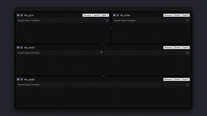
split-pane-react
Features
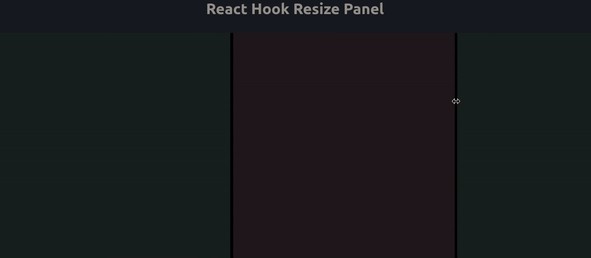
- Supports vertical & horizontal layouts.
- Supports fluid pane.
- Use controlled component mode, flexible use
- Built in different themes
Installing
# use npm
npm install split-pane-react

# or if you use yarn
yarn add split-pane-react
Example Usage
import SplitPane, { Pane } from 'split-pane-react';
import 'split-pane-react/esm/themes/default.css'

function Basic () {
    const [sizes, setSizes] = useState([
        100,
        '30%',
        'auto',
    ]);

    const layoutCSS = {
        height: '100%',
        display: 'flex',
        alignItems: 'center',
        justifyContent: 'center',
    };

    return (
        <div style={{ height: 500 }}>
            <SplitPane
                split='vertical'
                sizes={sizes}
                onChange={setSizes}
            >
                <Pane minSize={50} maxSize='50%'>
                  <div style={{ ...layoutCSS, background: '#ddd' }}>
                    pane1
                  </div>
                </Pane>
                <div style={{ ...layoutCSS, background: '#d5d7d9' }}>
                    pane2
                </div>
                <div style={{ ...layoutCSS, background: '#a1a5a9' }}>
                    pane2
                </div>
            </SplitPane>
        </div>
    );
};
props
** SplitPane **
| Property | Description | Type | Default |
|---|---|---|---|
| split | Determine layout of panes. | ‘vertical’ |’horizontal’ | ‘vertical’ |
| sizes | Collection of different panel sizes,Only support controlled mode, so it’s required | (string | number)[] | [] |
| resizerSize | Specify the size for resizer | number | 4 |
| allowResize | Should allowed to resized | boolean | true |
| className | split pane custom class name | string | void |
| sashClassName | split sash custom class name | string | void |
| paneClassName | split pane custom class name | string | void |
| onChange | Callback of size change | (sizes: number[]) => void | void |
** Pane **
| Property | Description | Type | Default |
|---|---|---|---|
| className | pane class name | string | void |
| minSize | Limit the minimum size of the panel | string | number | void |
| maxSize | Limit the maximum size of this panel | string|number | void |
themes
Three different theme styles are built into this component:
- The default theme style refers to vscode style,The reference path is as follows:
import 'split-pane-react/esm/themes/default.css';
- The style1 theme style refers to sublime style,The reference path is as follows:
import 'split-pane-react/esm/themes/theme1.css';
- The style 2 theme has a permanent axis,The reference path is as follows:
import 'split-pane-react/esm/themes/theme2.css';
License
split-pane-react licensed under MIT.
PS: I would love to know if you’re using split-pane-react. If you have any use problems, you can raise the issue, and I will try my best to solve them.