react-break
A utility React component based on BreakJS. Create declarative breakpoint components for your React apps. Render different components for different layouts.
Install
npm install react-break --save
Compatibility
Compatible with React versions ^15.3.0 and ^16.0.0. For earlier versions of React,
use version 1.2.2.
Usage examples
Create components declaratively using layoutGenerator:
import React from 'react';
import { layoutGenerator } from 'react-break';

const layout = layoutGenerator({
  mobile: 0,
  phablet: 550,
  tablet: 768,
  desktop: 992,
});

const OnMobile = layout.is('mobile');
const OnAtLeastTablet = layout.isAtLeast('tablet');
const OnAtMostPhablet = layout.isAtMost('phablet');
const OnDesktop = layout.is('desktop');

const myApp = () => (
  <div>
    <OnMobile>
      Displayed on mobile layout only
    </OnMobile>

    <OnAtLeastTablet>
      Displayed on tablet and desktop layouts
    </OnAtLeastTablet>

    <OnAtMostPhablet>
      Displayed on mobile and phablet layouts
    </OnAtMostPhablet>

    <OnDesktop>
      Displayed on desktop layout only
    </OnDesktop>
  </div>
);
See also demos/demo1.
Create layout components manually by using <Break /> component:
import React from 'react';
import Break from 'react-break';
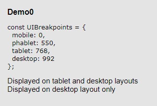
const UIBreakpoints = {
mobile: 0,
phablet: 550,
tablet: 768,
desktop: 992,
};
const myApp = () => (
<div>
<Break
breakpoints={UIBreakpoints}
query={{ method: 'is', breakpoint: 'mobile' }}>
<div>Displayed on mobile layout only</div>
</Break>
<Break
breakpoints={UIBreakpoints}
query={{ method: 'isAtLeast', breakpoint: 'tablet' }}>
<div>Displayed on tablet and desktop layouts</div>
</Break>
<Break
breakpoints={UIBreakpoints}
query={{ method: 'isAtMost', breakpoint: 'phablet' }}>
<div>Displayed on mobile and phablet layouts</div>
</Break>
</div>
);
See also demos/demo0.
Props
forceWrap: Set to true if you want the layout components to create
a wrapping div also for single child elements. By default the component creates
a wrapper only for multiple child elements. Note that setting style
or className props has no effects without a wrapping div.
Break component props
Break component takes two props, breakpoints and query.
Breakpoints are key-value pairs of arbitrary names and values for
layout breakpoints of your choice. Query has two properties:
method and breakpoint. The breakpoint-property must be one of the
options you defined for the breakpoints attribute. The method-property
has three choices: is, isAtLeast and isAtMost, which are described below.
Methods
is matches exactly the given breakpoint, e.g. in the example
above is('mobile') matches window sizes from 0px to 549px.
isAtLeast matches the given and any larger breakpoint, e.g.
in the example above atLeast('tablet') matches window sizes above 768px.
isAtMost matches the given and any smaller breakpoint, e.g.
in the example above atMost('tablet') matches window size below 767px.
layoutGenerator(String [layout method], String [layout name]) -> Component
layoutGenerator is a utility function that allows you to
create custom components for breaking the layout, with declarative names.
First you constructing the generator by calling it with the breakpoints
object (key-value pairs of breakpoint name and the pixel value). It returns a
function that takes two parameters, layout method and a breakpoint name.