React Native Responsive Styles
rn-responsive-styles Create responsive styles for react-native and react-native-web with minimal rerenders
This library adds support for dynamic styling based on device size, it was built to replace inline dynamic styles for
individual components.
This library builds a single stylesheet from the provided styles and conditionally returns them based on device size. It
uses a custom version of React Native’s useWindowDimensions so that it only re-renders when the device size passes
over one of the breakpoints, instead of re-rendering on every pixel change.
Installation
yarn add rn-responsive-styles
or
npm install rn-responsive-styles --save
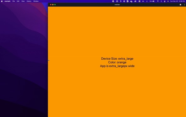
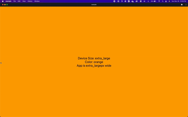
Demo
Usage
import { Text, View } from 'react-native'
import { CreateResponsiveStyle, DEVICE_SIZES } from 'rn-responsive-styles'

export default function App() {
  const { styles, deviceSize } = useStyles()

  return (
    <View style={styles('container')}>
      <Text style={styles('text')}>Device Size: {deviceSize}</Text>
    </View>
  )
}

const useStyles = CreateResponsiveStyle(
  {
    container: {
      flex: 1,
      backgroundColor: '#fff',
      alignItems: 'center',
      justifyContent: 'center',
    },
    text: {
      fontSize: 30,
      color: 'white',
    },
  },
  {
    [DEVICE_SIZES.EXTRA_LARGE_DEVICE]: {
      container: {
        backgroundColor: 'blue',
      },
    },
    [DEVICE_SIZES.SMALL_DEVICE]: {
      container: {
        backgroundColor: 'red',
      },
      text: {
        fontSize: 20,
      },
    },
  },
)
Options
The currently configured breakpoints are:
| Size | Value | Breakpoints |
|---|---|---|
| small | DEVICE_SIZES.SMALL_DEVICE |
width <= 768 |
| medium | DEVICE_SIZES.MEDIUM_DEVICE |
768 < width <= 992 |
| large | DEVICE_SIZES.LARGE_DEVICE |
992 < width <= 1200 |
| extra large | DEVICE_SIZES.EXTRA_LARGE_DEVICE |
1200 < width |
Right now there is no way to customize the breakpoint values, but I plan on adding that in the future.