If you are enjoying react-shamsi and want to see it improve, please consider giving it a star. Thank you in advance!
What is react-shamsi?
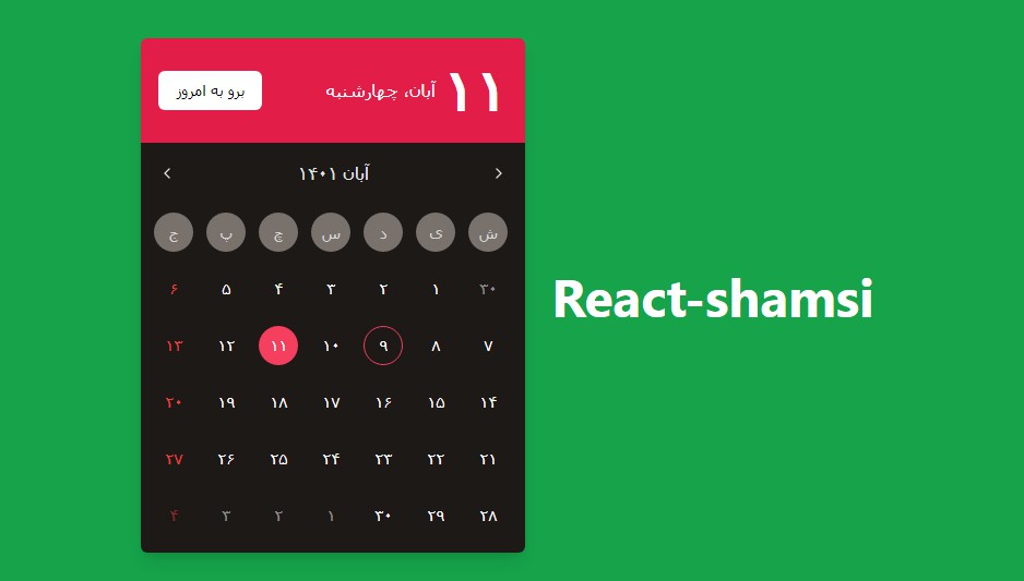
React-shamsi is a set of React components that help you create utilities related to jalali dates such as calendars and date pickers and (coming in a future update) time pickers.
Demo: https://react-jalali-demo.vercel.app/
Installation
npm install @react-shamsi/calendar
npm install @react-shamsi/datepicker
or if using Yarn:
yarn add @react-shamsi/calendar
yarn add @react-shamsi/datepicker
Jalali calendar
Let’s start by displaying a very simple Jalali calendar using react-shamsi. We do it by import the styles and the component itself like so:
import { Calendar } from "@react-shamsi/calendar";
import "@react-shamsi/calendar/dist/styles.css";
// If you want to use the time picker
import "@react-shamsi/timepicker/dist/styles.css";

export default function Example() {
  return <Calendar />;
}
Configuration
Now we are going to explore every single prop that could be passed to Calendar.
| Prop name | Description | Default value |
|---|---|---|
| highlightToday | Highlights the current day that is displayed in the calendar. | true |
| onChange | Function that is called when the user selects a date | n/a |
| activeDate | Controls the active date in the calendar | n/a |
| defaultActiveDate | Sets the default date in the calendar without explicitly controlling it. | n/a |
| theme | Customizes how the calendar looks. Has 3 pre-built themes that are dark, darkRed and light and also could have a completely customized theme. For more information on how to customize the calendar’s appearance, please visit the following section. |
light |
| showGoToToday | When enabled, it shows the go to today button which is written as: برو به امروز | true |
| minDate | When you pass a date to this prop, the user can’t select any date older than the minDate. | n/a |
| maxDate | When you pass a date to this prop, the user can’t select any date newer than the maxDate. | n/a |
| disabledDates | When a list of dates is passed to this prop, those dates will become unselectable | [] |
| showFooter | Controls whether or not the footer should be shown | true |
| disableTransitions | When set to true, it disables all the transitions across the calendar. | false |
| bodyTransition | Can be set to either of these options: zoomIn, zoomOut and fade |
zoomIn |
| showFridaysAsRed | When set to true, any friday appearing on the calendar will appear as red/selected color in the theme. | true |
| months | Names of the 12 months as an array. | [“فروردین”,”اردیبهشت”,”خرداد”,”تیر”,”مرداد”,”شهریور”,”مهر”,”آبان”,”آذر”,”دی”,”بهمن”,”اسفند”,] |
| onConfirm | Function that gets called when the user clicks the confirm button | n/a |
| onCancel | Function that gets called when the user clicks the cancel button | n/a |
Jalali date picker
Let’s start by displaying a very simple Jalali date picker using react-jalali. We do it by import the styles and the component itself like so:
import { DatePicker } from "@react-shamsi/datepicker";
import "@react-shamsi/calendar/dist/styles.css";
import "@react-shamsi/datepicker/dist/styles.css";
// If you want to use the time picker
import "@react-shamsi/timepicker/dist/styles.css";

export default function Example() {
  return <DatePicker />;
}
Configuration
Now we are going to explore every single prop that could be passed to DatePicker.
| Prop name | Description | Default value |
|---|---|---|
| autoUpdate | Automatically updates the input whenever the user changes the active date. This means that the confirm button won’t be needed for saving the date anymore. | false |
| defaultDate | The date that will be displayed on the input by default | n/a |
| calendarProps | Every prop for configuring the calendar component | n/a |
| date | Changes the date in a controlled manner | n/a |
| dateFormat | The format that the date will be displayed in | “yyyy/MM/dd” |
| onChange | Function that gets called whenever the user selects a date. The new date will be passed as it’s argument | n/a |
| persianDigits | Will convert the input’s date to persian digits | false |
| …Input element props | Every other prop that can be passed to an input can be also passed to this component. | n/a |
Credits
Design credit goes to https://dribbble.com/eanlami for their awesome design: https://www.figma.com/file/tuXbhHlGs8eQpL1l0NAHHe/Calender?node-id=0%3A1
Todo
- Time Picker
- Ranged dates
React-shamsi is used in:
Horoofun – https://horoofun.ir
Issues and contribution
Every single issue is welcomed and so is every contribution. I would be glad to hear your suggestions/requests for future updates.