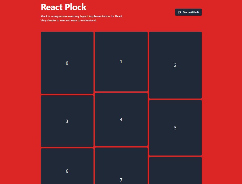
react-xmasonry
Responsive, minimalistic and full-featured native masonry layout (grid) for React JS.
Simple, minimalistic and featured native masonry layout for React JS.
Features
- Native masonry layout implementation for React JS with no dependencies.
- Minimalistic by design.
- Responsive, mobile-friendly approach (so there is no "fixed block width in pixels" option).
- Configurable width of blocks (in columns) and width of columns (targeting width in pixels), maximum number of columns, centering, etc.
- Fully customizable using CSS. Put animations and transitions you like using .xmasonry and .xblock selectors.
- Works with server rendering.
Installation
npm install react-xmasonry --save-dev
Or, if you use the old-style <script> tag or need an UMD module for demos, use this:
<script type="text/javascript" src="https://unpkg.com/react-xmasonry/dist/index.js"></script>
Having trouble installing react-xmasonry?
Check this issue or
open a new one if you still
struggling.
Usage
Import XMasonry and XBlock components:
import { XMasonry, XBlock } from "react-xmasonry"; // Imports JSX plain sources
import { XMasonry, XBlock } from "react-xmasonry/dist/index.js"; // Imports precompiled bundle
The simplest layout using JSX and some styling may look like the following:
render () {
    return <XMasonry>
        <XBlock>
            <div className="card">
                <h1>Simple Card</h1>
                <p>Any text!</p>
            </div>
        </XBlock>
        <XBlock width={ 2 }>
            <div className="card">
                <h1>Wider card</h1>
                <p>Any text!</p>
            </div>
        </XBlock>
    </XMasonry>
}
There is no more JavaScript than positioning and sizing! Use any CSS to make animations and
transitions you like (.xmasonry and .xblock selectors). And all the further magic XMasonry will
do for you. See the demos page sources
here.
Styling
Animations and Transitions
If you want to put transitions/animations on XMasonry, using the .xmasonry and .xblock
selectors. For example:
@keyframes comeIn {
    0% { transform: scale(0) }
    75% { transform: scale(1.03) }
    100% { transform: scale(1) }
}

.xmasonry .xblock {
    animation: comeIn ease 0.5s;
    animation-iteration-count: 1;
    transition: left .3s ease, top .3s ease;
}

.card {
    margin: 7px;
    padding: 5px;
    border-radius: 3px;
    box-shadow: 0 1px 3px darkgray;
}
Warning: do not apply any display/positioning/margin styles to .xblock selector. Instead, create a
child element to XBlock, for example, .card, and put any styles you need to it. XBlock's
dimensions are used in calculations and any styling like adding margins may create an unwanted
result.
Warning: do not stick XBlock's content styling to .xblock selector. Use .xmasonry instead. See
how XMasonry works to understand why: the .xblock class is applied
only after the content measurements are done.
Server Rendering Note
XMasonry, being rendered on the server (renderToStaticMarkup),
will be unable to detect content heights due server rendering algorithm limitations.
Nevertheless, rendering on the server is possible and won't affect anything (like SEO) but the
consistent view with the client-rendered result. To make even this behavior configurable, XMasonry,
when triggered to render contents on the server, puts additional .xmasonry-static and
.xblock-static classes respectively, as well as changes some styles to make each XBlock render as
a static-positioned block (by default). You can apply additional styles to this selector to make the
server-rendered result look more consistent with the client's one, for example:
.xmasonry-static {
    text-align: center;
    overflow: auto;
}

.xblock-static {
    float: left;
    text-align: left;
}
Configuring Components
There are several properties you can assign to XMasonry and XBlock components.
<XMasonry> Component Properties
| Property | Default | Description |
|---|---|---|
center |
true |
A boolean value determining whether nested <XBlock>s should be centered if there are some empty columns left. |
maxColumns |
Infinity |
A number identifying the maximum columns number. |
responsive |
true |
A boolean value determining whether the layout should be responsive to window size changes. |
smartUpdate |
true |
A boolean value indicating whether Smart Updates are enabled. Smart Update is an XMasonry feature that performs silent checks on XMasonry XBlocks sizes and updates the layout when any size changes are detected. These checks work in the next way: when any update on XMasonry happens, Smart Update will schedule sizes check through the 100 ms (default), then, if no sizes changed, through the 200 ms, 400 ms and so on. When any change happens, this procedure repeats, starting from 100 ms check. These checks and updates are highly optimized - use it for your convenience! |
smartUpdateCeil |
Infinity |
A number in milliseconds which determines the maximum size check interval for XMasonry Smart Update. If you are just too lazy to update dynamic layout manually with update method, it's okay to set this prop to some value in milliseconds (for example, 1000 ms). After Smart Update checks interval reaches the specified value, it will start looping to continuously perform checks with smartUpdateCeil interval of time. All size checks are optimized and does not waste computing power. |
targetBlockWidth |
300 |
A number which determines the "target" width in pixels of the nested <XBlock>s. The layout takes all available space, and determines the number of columns using this value. For example, if container has 600 px of available width and we specify targetBlockWidth={200}, we will get exactly 3 columns of 200 px width. It will still be 3 columns if there is 660 pixels available, this time with each column taking 220 px. The simplified expression for number of columns is the following: Math.max(1, Math.round(containerWidth / targetBlockWidth)). |
updateOnFontLoad |
true |
A boolean value determining whether the layout should be updated when fonts are loaded. |
updateOnImagesLoad |
true |
A boolean value determining whether the layout should be updated when images finish loading. It normally takes a little while until images are loaded, and this causes incorrect blocks heights calculations at the beginning. This option allows to auto-update grid sizes when images complete loading. If layout contains no images, no handlers will be assigned. |
<XBlock> Component Properties
| Property | Default | Description |
|---|---|---|
width |
1 |
A number which determines nested block width in columns. If the number of columns available is less than the specified width, nested block will shrink to fit available space. |
Accessing <XMasonry> by Reference
You can access <XMasonry> component by reference, but do it only if it is necessarily (for example,
when inner content dynamically changes in size):
<XMasonry ref={ (x) => this.xMasonry = x }>
    // ...
</XMasonry>
Note that all the listed properties of <XMasonry> component are read-only.
| Ref Property | Type | Description |
|---|---|---|
columns |
number |
The number of currently rendered columns. |
container |
HTMLElement |
The <div> block containing the layout. |
update |
function |
Trigger this function to update nested XBlocks sizes and positions. It is safe to trigger this function multiple times, updates are optimized. Technically, this function will check if any of containers changed its size and re-render XMasonry only if size was changed. |
By default, XMasonry sniff and automatically update on the next events:
- Window size changes, see
responsiveprop. - Font load events, see
updateOnFontLoadprop. - Image load events, see
updateOnImagesLoadprop. - Children changes like adding, replacing or deleting children.
- After any change in layout happens, see
smartUpdateprop.
XMasonry Under the Hood
Technically, XMasonry component renders 3 times:
- "Empty Render" (ER), when XMasonry just renders its empty container and measures the available width;
- "Invisible Render" (IR), when XMasonry renders
visibility: hiddenblocks width computed column widths to measure their heights; - And finally "Actual Render" (AR), when it renders elements with computed dimensions and positions. The
.xblockstyle gets applied here only, so you can put animations on it.
This stages take around 3-4 frames to appear on the screen (~60ms).
Each time when elements change in masonry layout (images load or animation end, depending on initial
configuration), the XMasonry update method is triggered. It goes through rendered elements this
time, and looks for any size changes there. Thanks to React, all the DOM updates are optimized here
and this function is very light to call. You can manually trigger XMasonry update function,
whenever you need to update the layout. By default, after any change in layout, Smart Update will
be performed. Check smartUpdate prop description for more information.
Once the window size gets changed (default behavior), the "force update" technique is applied, which
do the IR and AR phases again.