react-collapsy
Simple lightweight (1.5kb minified+gzipped) accordion component.
Usability
This plugin require for you to have react, after that import react-collapsy
import Accordion from 'react-collapsy';
and include css files
require('../node_modules/react-collapsy/lib/index.css');
Usage
After you imported libs, somewhere in your component's code:
<Accordion>
    <span>Some content</span>
</Accordion>
props/options
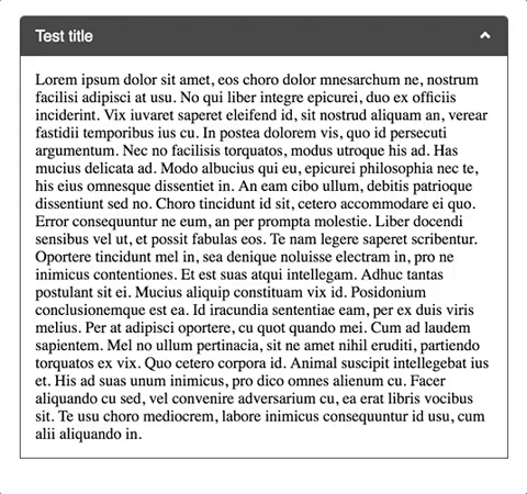
isOpen
If passed Accordion will be render expanded
<Accordion isOpen />
onToggle
onToggle will fire after Accordion expands/collapses with boolean value passed in which will indicated if Accordion is open or closed (true, false)
<Accordion onToggle={isOpen => console.log('Is Accordion open?:', isOpen) } /> // if expanded true will be passed
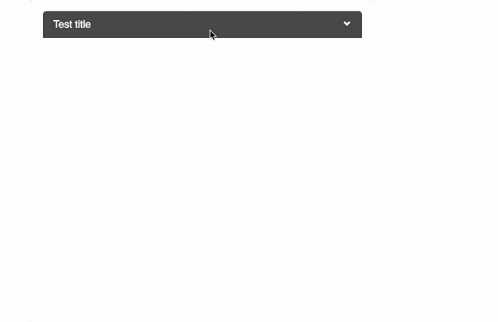
title
If passed title will be displayed
<Accordion title='Some title' />
headerClass/contentWrapperClass
If passed classes will be added to header div and content wrapper div, respectfully. (e.g. 'Accordion__header ' + this.props.headerClass)
<Accordion headerClass='YourCustomHeaderClass' contentWrapperClass='YourCustomAccordionContentClass' />
Example project
Clone/download the repo followed by npm (i) install && npm start, so you can check this magnificent component in local. If you have any comment, suggestion, issue, please report it, as I will try to keep this component alive.