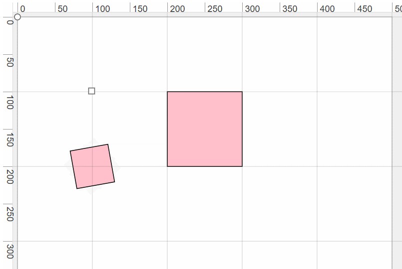
React Shape Editor
Simple shape editor component.
Installation
npm i react-shape-editor
Components
ShapeEditor
The wrapper for the entire editor component. Contains the <svg> element.
| Prop | Type | Default | Description |
|---|---|---|---|
| children | renderable elements | null |
Will include components such as wrapShape-wrapped shapes, other library components (SelectionLayer/ImageLayer/DrawLayer) or arbitrary SVG elements |
| focusOnAdd | bool |
true |
If true, focus on newly created elements. |
| focusOnDelete | bool |
true |
If true, focus on the next-closest element after a shape is deleted. |
| scale | number |
1 |
Scale factor of the svg contents. For example, given a vectorWidth of 100 and a scale of 0.5, the rendered DOM element will be 50 px wide. |
| style | object |
{} |
Style to apply to the <svg> element. |
| vectorHeight | number |
0 |
Height of the <svg> element viewBox. |
| vectorWidth | number |
0 |
Width of the <svg> element viewBox. |
wrapShape (HOC)
When used to wrap an SVG element, enables resize and movement functionality.
Usage
const WrappedRect = wrapShape(({ height, width /* ... "wrapShape Props Received" */ }) => (
  <rect fill="blue" height={height} width={width} />
))

// later, in render()

<WrappedRect
  shapeId={myId}
  x={12}
  y={56}
  width={20}
  /* ... "WrappedShape Props" */
/>
wrapShape Props Received
| Prop | Type | Description |
|---|---|---|
| height | number |
Height of the shape. |
| width | number |
Width of the shape. |
| scale | number |
Scale of the parent <svg> element, provided so you can render strokes or other components that maintain a constant size at every zoom level. |
| shapeId | string |
Unique identifier for the shape. |
| x | number |
x-axis offset of the shape. NOTE: You should not use this to set the position of your shape, because the <g> that wraps the shape already includes this offset. |
| y | number |
y-axis offset of the shape. NOTE: You should not use this to set the position of your shape, because the <g> that wraps the shape already includes this offset. |
| disabled | bool |
If true, the shape cannot be moved or resized, and shows no resize handles. |
| isBeingChanged | bool |
If true, the shape is currently being moved or scaled. |
| active | bool |
If true, the shape has HTML-native focus or is selected via a SelectionLayer. |
| nativeActive | bool |
If true, the shape has HTML-native focus (keyboard events will get applied to it). |
| isInSelectionGroup | bool |
If you assigned it via a prop on the WrappedShape, this will be available to tell whether or not the shape is in a group of two or more selected shapes (when using the SelectionLayer component). Useful for hiding the resize handles when selected in a group, or adding an outline. |
| other props | any | Any extra props passed to the WrappedShape are passed down as-is to this component. |
WrappedShape Props
| Prop | Type | Default |
Description |
|---|---|---|---|
| height (required) |
number |
Height of the shape. | |
| shapeId (required) |
string |
Unique identifier for the shape, to aid in data handling. | |
| width (required) |
number |
Width of the shape. | |
| x (required) |
number |
x-axis offset of the shape. | |
| y (required) |
number |
y-axis offset of the shape. | |
| onChange | func |
()=>{} |
Listener for transformation of this shape triggered by interactions with resize handles, panning, or keyboard shortcuts. Required for user-triggered shape transformations to work. Signature: (newRect: { x: number, y: number, height: number, width: number }, WrappedShapeProps: object) => void |
| onDelete | func |
()=>{} |
Listener for the deletion of this shape via backspace or delete keys. Required for user-triggered shape deletion to work. Signature: (event: Event, WrappedShapeProps: object) => void |
| active | bool |
false |
If true, the shape is rendered as focused (particularly important when using a SelectionLayer). When not using a selection layer, this prop can be left unset, as native HTML focus will handle focus state. |
| constrainMove | func |
non-constraining function | A callback for restricting movement during shape transformations (e.g., to lock movement to one axis, keeping the shape inside a predefined boundary or snapping it to a grid). Signature: ({ originalX: number, originalY: number, x: number, y: number, width: number, height: number }) => ({ x: number, y: number }) |
| constrainResize | func |
non-constraining function | A callback for restricting resizing during shape transformations (e.g., to lock resizing to one axis, keeping the shape inside a predefined boundary or snapping it to a grid). Signature: ({ originalMovingCorner: { x: number, y: number }, startCorner: { x: number, y: number }, movingCorner: { x: number, y: number }, lockedDimension: one of "x" or "y" }) => ({ x: number, y: number }) |
| disabled | bool |
false |
If true, the shape cannot be moved or resized, and shows no resize handles. |
| isInSelectionGroup | bool |
false |
Whether or not the shape is in a group of two or more selected shapes (when using the SelectionLayer component). Prop is merely forwarded to the wrapped component to be used in customized rendering, e.g., hiding the resize handles when selected in a group, or adding an outline. |
| keyboardTransformMultiplier | number |
1 |
Multiplier for keyboard-triggered transforms, such as ↑↓←→ keys to move or shift+↑↓←→ keys to resize. For example, with the default setting of 1, pressing → would move the shape 1 px to the right. With a setting of 5, it would move 5px. |
| onKeyDown | func |
()=>{} |
Listener for shape keydown event. If event.preventDefault() is called inside, it will override the default keyboard shortcut behavior. Signature: (event: Event, WrappedShapeProps: object) => void |
| onBlur | func |
()=>{} |
Listener for shape blur event. Signature: (event: Event, WrappedShapeProps: object) => void |
| onFocus | func |
()=>{} |
Listener for shape focus event. Signature: (event: Event, WrappedShapeProps: object) => void |
| ResizeHandleComponent | Component |
DefaultResizeHandleComponent |
The component to use for shape handles. |
| wrapperProps | object |
{} |
Extra props to add to the SVG <g> element wrapping the shape. |
| other props | any | Any extra props passed to the WrappedShape are passed down as-is to the component being wrapped. |
ImageLayer
Renders an svg image element.
| Prop | Type | Default | Description |
|---|---|---|---|
| src (required) |
string |
URL for the image to display. | |
| onLoad | func |
()=>{} |
Callback for the image load. Signature: ({ naturalWidth: number, naturalHeight: number }) => void |
DrawLayer
Creates an invisible layer of the SVG that allows users to draw shapes via mouse click-and-drag.
| Prop | Type | Default |
Description |
|---|---|---|---|
| onAddShape (required) |
func |
Callback for when a shape has finished being drawn. Use it to add the new shape to your data. Signature: (newRect: { x: number, y: number, height: number, width: number }) => void |
|
| constrainMove | func |
non-constraining function | A callback for restricting the initial starting location for the drawing (e.g., to lock movement to one axis, keeping the shape inside a predefined boundary or snapping it to a grid). Signature: ({ originalX: number, originalY: number, x: number, y: number, width: number, height: number }) => ({ x: number, y: number }) |
| constrainResize | func |
non-constraining function | A callback for restricting the dragged corner when drawing a shape (e.g., to lock resizing to one axis, keeping the shape inside a predefined boundary or snapping it to a grid). Signature: ({ originalMovingCorner: { x: number, y: number }, startCorner: { x: number, y: number }, movingCorner: { x: number, y: number }, lockedDimension: one of "x" or "y" }) => ({ x: number, y: number }) |
| DrawPreviewComponent | wrapShape(Component) |
DefaultDrawPreviewComponent |
The component to preview the shape while dragging. Must be wrapped with wrapShape. |
SelectionLayer
Creates an invisible layer of the SVG that allows users to select shapes via mouse click-and-drag.
| Prop | Type | Default |
Description |
|---|---|---|---|
| selectedShapeIds (required) |
string[] |
shapeIds that belong to the currently selected group. Should be populated with shapeIds passed back from onSelectionChange. |
|
| onSelectionChange | func |
()=>{} |
Listener for the addition or removal of shapes from the selection group (e.g., by shift+clicking extra shape or drawing new selection). Required for user-triggered selection to work. Signature: (selectedShapeIds: string[]) => void |
| onChange | func |
()=>{} |
Listener for transformation of shapes in the selection triggered by interactions with resize handles, panning, or keyboard shortcuts. Required for user-triggered shape transformations on selections to work. Signature: (newRects: { x: number, y: number, height: number, width: number }[], selectedShapesProps: object[]) => void |
| onDelete | func |
()=>{} |
Listener for the deletion of all shapes in this selection via backspace or delete keys. Required for user-triggered shape deletion to work. Signature: (event: Event, selectedShapesProps: object[]) => void |
| SelectionDrawComponent | wrapShape(Component) |
DefaultSelectionDrawComponent |
The component to preview the selection while dragging. Must be wrapped with wrapShape. |
| SelectionComponent | wrapShape(Component) |
DefaultSelectionComponent |
The component that visually wraps around the selected shapes (i.e., the selection outline). Must be wrapped with wrapShape. |
| minimumDistanceForSelection | number |
15 |
Minimum height or width that the drawn selection must be in order to perform the selection. |
| keyboardTransformMultiplier | number |
1 |
Multiplier for keyboard-triggered transforms, such as ↑↓←→ keys to move or shift+↑↓←→ keys to resize. For example, with the default setting of 1, pressing → would move shapes in the selection 1 px to the right. With a setting of 5, they would move 5px. |
| selectionComponentProps | object |
{} |
Extra props to pass to the SelectionComponent. |
| children | renderable elements | null |
wrapShape-wrapped shapes that are targets for selection by this selection group. Can also include other library components (SelectionLayer/ImageLayer/DrawLayer) or arbitrary SVG elements. |
Usage
import React from 'react';
import {
  ShapeEditor,
  ImageLayer,
  DrawLayer,
  wrapShape,
} from 'react-shape-editor';

function arrayReplace(arr, index, item) {
  return [
    ...arr.slice(0, index),
    ...(Array.isArray(item) ? item : [item]),
    ...arr.slice(index + 1),
  ];
}

const RectShape = wrapShape(({ width, height }) => (
  <rect width={width} height={height} fill="rgba(0,0,255,0.5)" />
));

let idIterator = 1;
export default class Editor extends React.Component {
  constructor(props) {
    super(props);

    this.state = {
      items: [
        { id: '1', x: 20, y: 50, width: 50, height: 25 },
        { id: '2', x: 120, y: 0, width: 20, height: 75 },
      ],
      vectorWidth: 0,
      vectorHeight: 0,
    };
  }

  render() {
    const { items, vectorWidth, vectorHeight } = this.state;

    return (
      <div style={{ height: 400 }}>
        <ShapeEditor vectorWidth={vectorWidth} vectorHeight={vectorHeight}>
          <ImageLayer
            src="https://raw.githubusercontent.com/fritz-c/react-shape-editor/d8661b46d07d832e316aacc906a0d603a3bb13a2/website/blank.png"
            onLoad={({ naturalWidth, naturalHeight }) => {
              this.setState({
                vectorWidth: naturalWidth,
                vectorHeight: naturalHeight,
              });
            }}
          />
          <DrawLayer
            onAddShape={({ x, y, width, height }) => {
              this.setState(state => ({
                items: [
                  ...state.items,
                  { id: `id${idIterator}`, x, y, width, height },
                ],
              }));
              idIterator += 1;
            }}
          />
          {items.map((item, index) => {
            const { id, height, width, x, y } = item;
            return (
              <RectShape
                key={id}
                shapeId={id}
                height={height}
                width={width}
                x={x}
                y={y}
                onChange={newRect => {
                  this.setState(state => ({
                    items: arrayReplace(state.items, index, {
                      ...item,
                      ...newRect,
                    }),
                  }));
                }}
                onDelete={() => {
                  this.setState(state => ({
                    items: arrayReplace(state.items, index, []),
                  }));
                }}
              />
            );
          })}
        </ShapeEditor>
      </div>
    );
  }
}
Contributing
After cloning the repository and running npm install inside, you can use the following commands to develop and build the project.
# Starts a dev server that hosts a demo page with the component.
npm start

# Runs the library tests
npm test

# Lints the code with eslint
npm run lint

# Lints and builds the code, placing the result in the dist directory.
# This build is necessary to reflect changes if you're
#  `npm link`-ed to this repository from another local project.
npm run build
Pull requests are welcome!