React Selection Popup

React Selection Popup is an npm package that allows you to show a popup when a user selects text in html. The package is built on top of React and provides an easy-to-use API for developers who want to add selection popups to their projects.
Installation
You can install the package using either npm or yarn.
npm install react-selection-popup
yarn add react-selection-popup
Usage
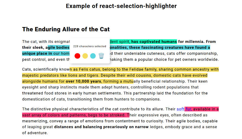
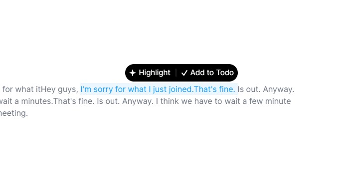
To use React Selection Popup, you need to import it into your project and then wrap the content you want to make selectable inside the component. Here’s an example:
import React from 'react';
import ReactSelectionPopup from 'react-selection-popup';

const App = () => {
  return (
    <div>
      <ReactSelectionPopup
        selectionClassName="selection"
        onSelect={(text) => console.debug(text)}
      >
        <div>Popup Content</div>
      </ReactSelectionPopup>
      <p className="selection">
        Select me to see the popup.
      </p>
    </div>
  );
};
In this example, we have a simple React component with two elements. The first element is the ReactSelectionPopup component, which wraps the second element. The second element is a p tag that has the class name ‘selection’ and a data attribute ‘data-meta’. When the user selects the text inside this p tag, the popup defined in the ReactSelectionPopup component will appear.
Props
| name | type | description |
|---|---|---|
onSelect |
(text: string, meta?: any) => void |
This is an optional function property that takes two parameters: a string representing the selected text and an optional parameter metadata, which could be a boolean, string, number or object. The function is called when a user selects text in HTML. |
children |
React.ReactNode |
required This property is required and represents child elements to be displayed within the component. |
selectionClassName |
string |
required This property is required and specifies the class name used to identify selectable element(s). |
multipleSelection |
boolean |
This is an optional boolean property that specifies whether multiple elements can be selected at once. The default value is false. |
metaAttrName |
string |
This is an optional string property that represents the name of the metadata attribute associated with the selected text. The metadata value should be JSON stringified. This is useful in case there are multiple metadata attributes for different types of data on the same page. |
offsetToLeft |
number |
This is an optional numerical property representing the offset (in pixels) to move the popup along the x-axis relative to its initial position on the screen. A positive value moves it to the left and a negative value moves it to the right. The default pivot point is the right side of the popup. |
offsetToTop |
number |
This is an optional numerical property representing the offset (in pixels) to move the popup along the y-axis relative to its initial position on the screen. A positive value moves it upwards and a negative value moves it downwards. The default pivot point is the bottom of the popup. |
License
This package is licensed under the MIT License.