Create React Content Loader
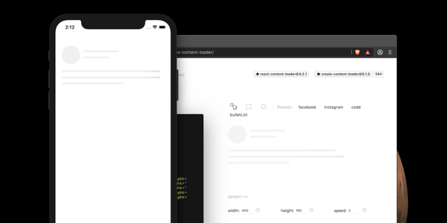
Have you heard about react-content-loader? It's a SVG component to create placeholder loading, like Facebook cards loading or also known as skeleton UI. So now you can use this online tool to create your own loader easily. You just need to draw using the canvas or code using the live editing!
Share your loader with the community.
That's is a way to share your custom loader with the React community. Besides you can help the other developers to create amazing loader to their interfaces. There are so many ways to build a content loader, show off here!
How to insert a loader?
- Build your custom amazing loader;
- Create a file with a custom name, here;
- Use the following boilerplate (don't forget to fill the metadata);
- Insert the file in the gallery, here;
- Open a PR;
Boilerplate
import React from "react"
import ContentLoader from "react-content-loader"

const __NAME_OF_LOADER__ = props => {
  return (
    <ContentLoader
      height={40}
      width={1060}
      speed={2}
      primaryColor="#d9d9d9"
      secondaryColor="#ecebeb"
      {...props}
    >
    // your loader
    </ContentLoader>
  )
}

__NAME_OF_LOADER__.metadata = {
  name: __WRITEHERE__, // My name
  github: __WRITEHERE__, // Github username
  description: __WRITEHERE__, // Little tagline
  filename: __WRITEHERE__ // filename of your loader
}

export default __NAME_OF_LOADER__
It'll be amazing to see the creativity of the community!
Available Scripts
This project was bootstrapped with Create React App, so in the project directory, you can run:
npm start
Runs the app in the development mode.
Open http://localhost:3000 to view it in the browser.
The page will reload if you make edits.
You will also see any lint errors in the console.