react-table
React Table component.
Installation
- Install the latest version of react and react-table:
npm install --save react @trendmicro/react-table @trendmicro/react-paginations
- At this point you can import
@trendmicro/react-table and its styles in your application as follows:
import Table from '@trendmicro/react-table';
import { TablePagination } from '@trendmicro/react-paginations';

// Be sure to include styles at some point, probably during your bootstraping
import '@trendmicro/react-table/dist/react-table.css';
import '@trendmicro/react-paginations/dist/react-paginations.css';
Usage
<Table
    bordered
    hoverable
    sortable
    rowKey={record => record.id}
    columns={columns}
    data={data}
    title={() => (
        <div className={styles.tableToolbar}>
            <Button btnStyle="flat">
                Export
            </Button>
            <TablePagination
                page={page}
                pageLength={pageLength}
                totalRecords={totalRecords}
                onPageChange={({ page, pageLength }) => {
                    this.actions.fetchRecords({ page, pageLength });
                }}
                prevPageRenderer={() => <i className="fa fa-angle-left" />}
                nextPageRenderer={() => <i className="fa fa-angle-right" />}
            />
        </div>
    )}
/>
Sortable Table
import PropTypes from 'prop-types';
import React, { Component } from 'react';
import Table from '@trendmicro/react-table';

class SortableTable extends Component {
    static propTypes = {
        ...Table.propTypes
    };
    static defaultProps = {
        ...Table.defaultProps
    };
    state = {
        sortColumnKey: '',
        sortOrder: 'asc'
    };

    toggleSortOrder = (column) => (event) => {
        this.setState(state => ({
            sortColumnKey: column.key
            sortOrder: state.sortOrder === 'asc' ? 'desc' : 'asc';
        }));
    };

    render() {
        const { sortColumnKey, sortOrder } = this.state;
        const { columns, ...props } = this.props;

        return (
            <Table
                {...props}
                columns={columns.map(column => ({
                    ...column,
                    onClick: this.toggleSortOrder(column),
                    sortOrder: (column.key === sortColumnKey) ? sortOrder : ''
                }))
            />
        );
    }
}

export default SortableTable;
Expanded Row
const actions = {
handleExpandedRowRender: (record, key) => {
return (
<div style={{ padding: '16px' }}>
Sub content
</div>
);
},
handleToggleDetails: (record) => (e) => {
e.preventDefault();
e.stopPropagation();
const rowIndex = this.state.expandedRowKeys.indexOf(record.id);
const expanded = (rowIndex >= 0);
let data = [];
// Only display one detail view at one time
if (expanded) {
data = [];
} else {
data = [record.id];
}
this.setState({ expandedRowKeys: data });
},
handleRenderActionColumn: (text, record) => {
const expandedRowKeys = this.state.expandedRowKeys;
const expanded = (expandedRowKeys.indexOf(record.id) >= 0);
let className = styles.expandIcon;
if (expanded) {
className += ' ' + styles.rowExpanded;
} else {
className += ' ' + styles.rowCollapsed;
}
return (
<i
className={className}
onClick={this.actions.handleToggleDetails(record)}
/>
);
}
};
const columns = [
{ title: '', dataIndex: 'detail', render: actions.handleRenderActionColumn, width: 40 },
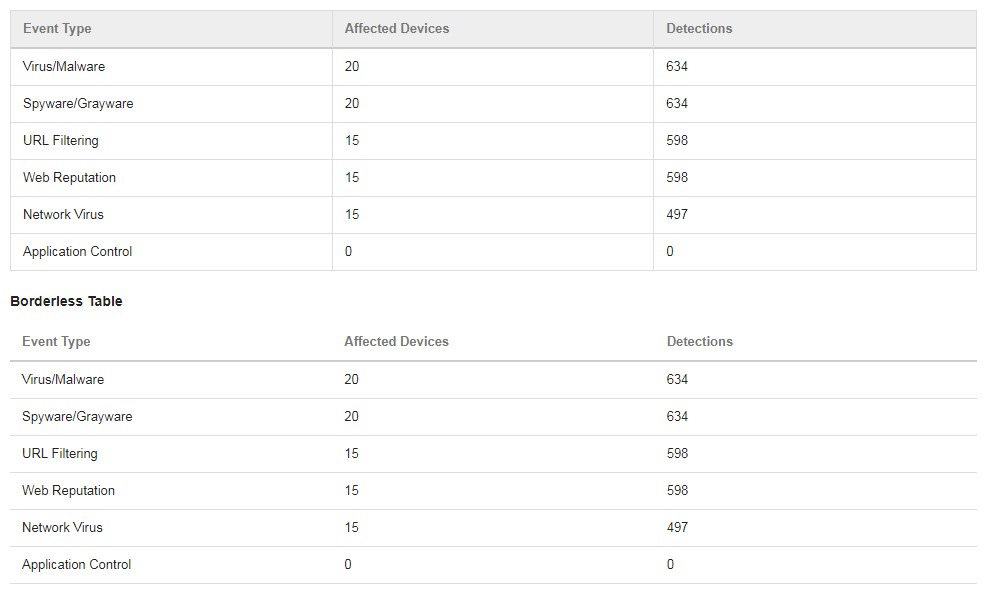
{ title: 'Event Type', dataIndex: 'eventType' },
{ title: 'Affected Devices', dataIndex: 'affectedDevices' },
{ title: 'Detections', dataIndex: 'detections', width: 300 }
];
<Table
hoverable
justified={false}
maxHeight={320}
rowKey="id"
columns={columns}
data={data}
expandedRowRender={this.actions.handleExpandedRowRender}
expandedRowKeys={this.state.expandedRowKeys}
useFixedHeader={true}
/>
Fixed Columns
<Table
    justified={false}
    hoverable
    maxHeight={180}
    useFixedHeader={true}
    rowKey={record => record.id}
    columns={columns}
    data={data}
/>
Fix left columns
const columns = [
    { title: 'Event Type', dataIndex: 'eventType' },
    { title: 'Affected Devices', dataIndex: 'affectedDevices', fixed: true },
    { title: 'Detections', dataIndex: 'detections', width: 800 }
];
<Table
    justified={false}
    hoverable={false}
    maxHeight={180}
    useFixedHeader={true}
    rowKey="id"
    columns={columns}
    data={data}
/>
Row selection
import React, { Component } from 'react';
import Table from '@trendmicro/react-table';

class SelectableTable extends Component {

    state = {
        selectionData: [
            { id: 1, checked: true, eventType: 'Virus/Malware', affectedDevices: 20, detections: 634 },
            { id: 2, checked: false, eventType: 'Spyware/Grayware', affectedDevices: 20, detections: 634 },
            { id: 3, checked: false, eventType: 'URL Filtering', affectedDevices: 15, detections: 598 },
            {
                id: 4,
                checked: false,
                eventType: 'Test long long long long long long long long long long long long long long long long content',
                affectedDevices: 15,
                detections: 598
            },
            { id: 5, checked: false, eventType: 'Network Virus', affectedDevices: 15, detections: 497 },
            { id: 6, checked: false, eventType: 'Application Control', affectedDevices: 0, detections: 0 }
        ]
    };

    actions = {
        handleClickRow: (record, index, e) => {
            const checked = record.checked;
            const data = this.state.selectionData.map(item => {
                if (record.id === item.id) {
                    return {
                        ...item,
                        checked: !checked
                    };
                }
                return item;
            });

            this.setState({ selectionData: data });
            e.stopPropagation();
            e.preventDefault();
        },
        handleRowClassName: (record, key) => {
            const checked = record.checked;
            if (checked) {
                return styles['tr-active'];
            } else {
                return null;
            }
        },
        handleHeaderCheckbox: (e) => {
            const checkbox = e.target;
            const data = this.state.selectionData.map((item, i) => {
                return {
                    ...item,
                    checked: checkbox.checked
                };
            });
            this.setState({ selectionData: data });
            e.stopPropagation();
        },
        renderHeaderCheckbox: () => {
            let className = 'input-checkbox';
            const selectedItems = _.filter(this.state.selectionData, { 'checked': true });
            const dataLength = this.state.selectionData.length;
            const selectedLength = selectedItems.length;
            const isSelectedAll = selectedLength > 0 && selectedLength === dataLength;
            if (selectedLength > 0 && selectedLength < dataLength) {
                className += ' checkbox-partial';
            }
            return (
                <div className="checkbox">
                    <input
                        type="checkbox"
                        id="headerCheckbox"
                        checked={isSelectedAll}
                        className={className}
                        onChange={this.actions.handleHeaderCheckbox}
                    />
                    <label htmlFor="headerCheckbox" />
                </div>
            );
        },
        renderCheckbox: (value, row) => {
            return (
                <div className="checkbox">
                    <input
                        type="checkbox"
                        id={row.id}
                        className="input-checkbox"
                        checked={row.checked}
                        onChange={(e) => {}}
                    />
                    <label />
                </div>
            );
        }
    };

    columns = [
        { title: this.actions.renderHeaderCheckbox, dataIndex: 'checked', render: this.actions.renderCheckbox, width: 38 },
        { title: 'Event Type', dataIndex: 'eventType' },
        { title: 'Affected Devices', dataIndex: 'affectedDevices' },
        { title: 'Detections', dataIndex: 'detections' }
    ];

    render() {
        const columns = this.columns;
        const data = this.state.selectionData;

        return (
            <Table
                rowKey="id"
                columns={columns}
                data={data}
                rowClassName={this.actions.handleRowClassName}
                onRowClick={this.actions.handleClickRow}
            />
        );
    }

}

export default SelectableTable;
import React, { Component } from 'react';
import Table from '@trendmicro/react-table';

class DynamicHeaderTable extends Component {

    state = {
        data: [
            { id: 1, eventType: 'Virus/Malware', affectedDevices: 20, detections: 634 },
            { id: 2, eventType: 'Spyware/Grayware', affectedDevices: 20, detections: 634 },
            { id: 3, eventType: 'URL Filtering', affectedDevices: 15, detections: 598 },
            { id: 4, eventType: 'Web Reputation', affectedDevices: 15, detections: 598 },
            { id: 5, eventType: 'Network Virus', affectedDevices: 15, detections: 497 },
            { id: 6, eventType: 'Application Control', affectedDevices: 0, detections: 0 }
        ]
    };

    renders = {
        renderEventTypeCell: () => {
            const { data } = this.state;
            return `Event Type (${data.length})`;
        },
        renderActionCell: (value, row) => {
            return (
                <i
                    className="fa fa-trash"
                    onClick={(e) => {
                        this.handleClickDelete(row);
                    }}
                />
            );
        }
    }

    columns = [
        { dataIndex: 'eventType', title: this.renders.renderEventTypeCell },
        { dataIndex: 'affectedDevices', title: 'Affected Devices' },
        { dataIndex: 'detections', title: 'Detections' },
        { title: 'Delete', render: this.renders.renderActionCell }
    ];

    handleClickDelete(row) {
        const { data } = this.state;
        const index = data.findIndex((o) => {
            return o.id === row.id;
        });
        data.splice(index, 1);
        this.setState({
            data: data.map(o => o)
        });
    }

    render() {
        const columns = this.columns;
        const data = this.state.data;

        return (
            <Table
                bordered
                hoverable
                rowKey="id"
                columns={columns}
                data={data}
            />
        );
    }

}

export default DynamicHeaderTable;
API
Properties
Table
| Name |
Type |
Default |
Description |
| bordered |
Boolean |
true |
Specify whether the table should be bordered. |
| justified |
Boolean |
true |
Specify whether to keep table columns equal width. |
| columns |
Object[] |
[] |
The columns config of table, see Column below for details. |
| data |
Object[] |
[] |
Data record array to be rendered. |
| emptyText |
Function |
() => { return 'No Data'; } |
Display text when data is empty. |
| expandedRowKeys |
String[] |
|
Current expanded rows keys. |
| expandedRowRender |
Function(record, rowIndex) |
|
Expanded content render function. |
| footer |
React Node or Function(): React Node |
|
Table footer render function. |
| hoverable |
Boolean |
true |
Whether use row hover style. |
| loading |
Boolean |
false |
Whether table is loading. |
| maxHeight |
Number |
|
Table maximum height. |
| onRowClick |
Function(record, rowIndex, event) |
|
Handle rowClick action. |
| showHeader |
Boolean |
true |
Whether table head is shown. |
| sortable |
Boolean |
false |
Whether table head is sortable. |
| title |
React Node or Function(): React Node |
|
Table title render function. |
| useFixedHeader |
Boolean |
false |
Whether table head is fixed. |
| rowClassName |
Function(record, key):string |
|
Get row's className. |
| rowKey |
string or Function(record):string |
'key' |
If rowKey is string, record[rowKey] will be used as key. If rowKey is function, the return value of rowKey(record) will be use as key. |
Column
| Name |
Type |
Default |
Description |
| key |
String |
|
key of this column is for sortable attribute. |
| className |
String |
|
className of this column. |
| style |
String |
|
style of this column. |
| headerClassName |
String |
|
className to assign to the column header. |
| headerStyle |
String |
|
style to assign to the column header. |
| cellClassName |
String |
|
className to assign to each cell in the column. |
| cellStyle |
Object |
|
style to assign to each cell in the column. |
| onClick |
Function(event) |
|
onClick event handler for header cell. |
| title |
React Node or Function(): React Node |
|
Title of this column. |
| dataIndex |
String |
|
Display field of the data record. |
| dataKey |
String |
|
dataKey is an alias for dataIndex. |
| width |
String or Number |
|
Width of the specific proportion calculation according to the width of the columns. |
| fixed |
Boolean |
false |
This column will be fixed at left side when table scroll horizontally. |
| render |
Function(value, record, rowIndex) |
|
The render function of cell, has two params: the text of this cell, the record of this row, it's return a react node. |
GitHub