React Variable Width Grid
React Component used for displaying a responsive grid of aligned, variable width items.
When you need to responsively lay out a dynamic number of dynamically sized items.

Installation
yarn add react-variable-width-grid
npm install react-variable-width-grid --save
Usage
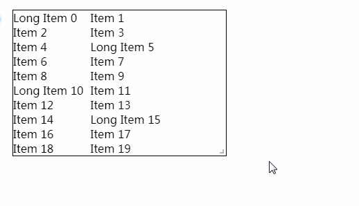
function App() {
  const items = [...Array(20).keys()].map((_, idx) => {
    if (idx % 5 === 0) {
      return <span key={idx}>Long Item {idx}</span>;
    }
    return <span key={idx}>Item {idx}</span>;
  });
  return <VariableWidthGrid>{items}</VariableWidthGrid>;
}
Props
| Name | Required | Type | Default | Description |
|---|---|---|---|---|
| children | Y | Node | undefined | The children to display in a grid layout |
| columnGap | N | number | 10 | The width of the column gap in px. |
FAQ
Why not use Flexbox?
Flexbox is awesome for one dimensional responsive wrapping, but aligning items within the "columns" is very difficult, unless you have fixed size items. You also need to apply some logic on margins, which feels clunky.
What about column-gap in Flexbox?
I'm super excited about this; but as of this time (Feb. 2021) it's not supported in Safari, so I don't feel comfortable using it and still having to write fallbacks or polyfills.
Why not just CSS Grid?
CSS Grid is great; adding an extra dimension onto flexbox is fantastic for everything from large scale app layouts to positioning icons. However, CSS Grid requires knowledge ahead of time on either a) the number of columns you want to render, or b) the size of each item.
Essentially, this component seeks to implement grid-template-columns: repeat(auto-fill, max-content).