styled-components
Visual primitives for the component age. Use the best bits of ES6 and CSS to style your apps without stress.
Utilising tagged template literals (a recent addition to JavaScript) and the power of CSS, styled-components allows you to write actual CSS code to style your components. It also removes the mapping between components and styles – using components as a low-level styling construct could not be easier!
styled-components is compatible with both React (for web) and React Native – meaning it's the perfect choice even for truly universal apps! See the documentation about React Native for more information.
Supported by Front End Center. Thank you for making this possible!
Example
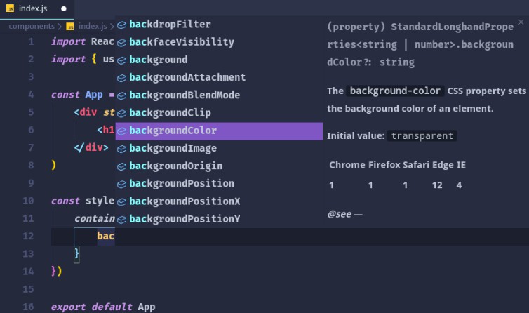
import React from 'react';

import styled from 'styled-components';

// Create a <Title> react component that renders an <h1> which is
// centered, palevioletred and sized at 1.5em
const Title = styled.h1`
  font-size: 1.5em;
  text-align: center;
  color: palevioletred;
`;

// Create a <Wrapper> react component that renders a <section> with
// some padding and a papayawhip background
const Wrapper = styled.section`
  padding: 4em;
  background: papayawhip;
`;

// Use them like any other React component – except they're styled!
<Wrapper>
  <Title>Hello World, this is my first styled component!</Title>
</Wrapper>
This is what you'll see in your browser:

Built with styled-components
A lot of hard work goes into community libraries, projects, and guides. A lot of them make it easier to get started or help you with your next project! There’s also a whole lot of interesting apps and sites that people have built using styled-components.
Make sure to head over to awesome-styled-components to see them all! And please contribute and add your own work to the list so others can find it.