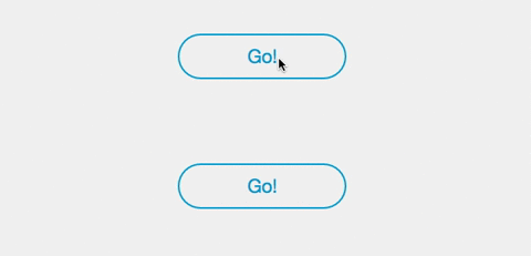
Reactive Button
3D animated react button component with progress bar.
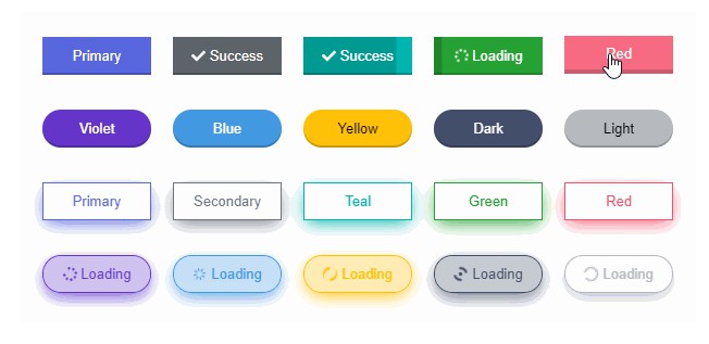
Reactive Button is a beautiful 3D animated react component to replace the traditional boring buttons. Comes with progress bar and the goal is to let the users visualize what is happening after a button click.
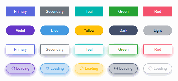
- 3D
- Animated
- Progress indicator
- Lightweight <20KB
- Supports icons
- Zero dependency
- Super easy to setup
- Super easy to customize
- And much more !
Installation
Install via NPM
npm install reactive-button
Install via Yarn
yarn add reactive-button
Usage
For complete usage, visit the docs.
Below example demonstrates an asynchronous task. When clicking the button, an asynchronous task (e.g. Data fetch, form submit) will be processed and after processing, a success or error message will be displayed.
- Initialize a state with string value
'idle'and assign it as 'buttonState' prop. Now it will render an idle text. - When the button is clicked, set state's value to
'loading'. - When the task is completed, set state to
'success','error'or'idle'according to your need.
Basic Usage:
import React, { useState } from 'react';
import ReactiveButton from 'reactive-button';

function App() {
    const [state, setState] = useState('idle');

    const onClickHandler = () => {
        setState('loading');
        setTimeout(() => {
            setState('success');
        }, 2000);
    }

    return (
        <ReactiveButton
            buttonState={state}
            onClick={onClickHandler}
        />
    );
}

export default App;
Full Usage:
import React, { useState } from 'react';
import ReactiveButton from 'reactive-button';

function App() {
    const [state, setState] = useState('idle');

    const onClickHandler = () => {
        setState('loading');
        setTimeout(() => {
            setState('success');
        }, 2000);
    }

    return (
        <ReactiveButton
            buttonState={state}
            onClick={onClickHandler}
            color={'primary'}
            idleText={'Button'}
            loadingText={'Loading'}
            successText={'Success'}
            errorText={'Error'}
            type={'button'}
            className={'class1 class2'}
            style={{ borderRadius: '5px' }}
            outline={false}
            shadow={false}
            rounded={false}
            size={'normal'}
            block={false}
            messageDuration={2000}
            disabled={false}
            buttonRef={null}
            width={null}
            height={null}
            animation={true}
        />
    );
}

export default App;
For non asynchronous task, state management is not needed. Use as like normal button.
Available Props
| Props | Type | Description | Default |
|---|---|---|---|
| buttonState | string | Current button state | 'idle' |
| onClick | function | Callback function when clicking button | () => {} |
| color | string | Button color | 'primary' |
| idleText | string | ReactNode | Button text when idle | 'Click Me' |
| loadingText | string | ReactNode | Button text when loading | 'Loading' |
| successText | string | ReactNode | Button text when loading successful | 'Success' |
| errorText | string | ReactNode | Button text when loading failed | 'Error' |
| type | string | Button type attribute | 'button' |
| className | string | Button classnames | '' |
| style | React.CSSProperties | Custom style | {} |
| outline | boolean | Enable outline effect | false |
| shadow | boolean | Enable shadow effect | false |
| rounded | boolean | Enable rounded button | false |
| size | string | Button size | 'normal' |
| block | boolean | Block Button | false |
| messageDuration | number | Success/Error message duration in millisecond | 2000 |
| disabled | boolean | Disable button | false |
| buttonRef | React.Ref | null | Button reference | null |
| width | string | null | Override button width | null |
| height | string | null | Override button height | null |
| animation | boolean | Button hover and click animation | true |