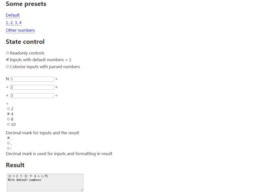
React's state-control
A bunch of lightweight components for updating model stored in React’s stateful components for fast prototyping. It fits to strings, numbers (automatically detected) as <Input />, booleans as <Check /> and sets of values as <Radio />.
This package also provides component for presets of values (<SettersBlock />) and helper to reduce your source code size (<Connector />). It can be even used with Redux (see below).
Quick start
Install package to your project:
npm i state-control
Include required components and helpers to jsx:
import { Check, Connector, Input, Radio, SettersBlock, selectAll } from 'state-control'
Most likely you will also need an array of identifiers:
const IDS = {
  firstStateParameter: 'firstStateParameter',
  secondStateParameter: 'secondStateParameter',
}
Use this identifiers as names in state and add a changeHandler:
class Demo extends Component {
  state = {
    [IDS.firstStateParameter] = 1,
    [IDS.secondStateParameter] = 'second',
  }

  changeHandler = (name, value) => {
    // input value may be proceded here
    this.setState({ [name]: value })
  }

  ...
}
And also us the array in id of component to connect it to corresponding property of state:
<Input
  state={this.state}
  onChange={this.changeHandler}
  id={IDS.firstStateParameter}
  label={'First state parameter'}
/>
That's it!
<Connector />
You can use Connector component for passing common props to all children:
<Connector
  state={this.state}
  onChange={this.changeHandler}
>
  <Input
    id={IDS.firstStateParameter}
    label={'First state parameter'}
  />
  <Input
    id={IDS.secondStateParameter}
    label={'Second state parameter'}
  />
</Connector>
<SettersBlock />
This component generates elements for activation of presets:
<SettersBlock
  setters={SETTERS}
  setHandler={this.changeHandler}
/>
It uses an object of presets:
const SETTERS = [
  Default: {
    [IDS.firstStateParameter]: 1,
    [IDS.secondStateParameter]: 'second',
  },
  'This text will be used as a label': {
    [IDS.firstStateParameter]: 'first',
    [IDS.secondStateParameter]: 2,
  },
]
It also accepts array of presets:
const SETTERS = [
  {
    text: 'Default',
    params: {
      [IDS.firstStateParameter]: 1,
      [IDS.secondStateParameter]: 'second',
    },
  },
  {
    text: 'This text will be used as a label',
    params: {
      [IDS.firstStateParameter]: 'first',
      [IDS.secondStateParameter]: 2,
    },
  },
]
It's good idea to use preset as a default state:
class Demo extends Component {
  state = SETTERS.Default

  // For array setters there will be
  // state = SETTERS[0].params

  ...
}
Properties
Common for control components
id: PropTypes.string.isRequired
Name of property of state and identifier for element.
state: PropTypes.object
State that we want to change.
label: PropTypes.string
Label for the element. It able to have a node type in <Radio />.
value: PropTypes.oneOfType(string, number, bool)
Value will be used instead of state[id] if passed.
readOnly: PropTypes.bool
Control read only.
className: PropTypes.string
Classname passed to wrapper div tag.
onClick: PropTypes.func
Handler for onClick event.
onFocus: PropTypes.func
Handler for onFocus event. Handler will be called with input component as argument.
Example for selecting all on focus:
handleFocus = (control) => {
  control.setSelectionRange(0, control.value.length)
}

// or just include and use predefined handler
import { selectAll } from 'state-control'
<Input
  onFocus={selectAll}
  ...
/>
trimOnPaste: PropTypes.bool
Flag turns on trimming spaces, tabs and new line characters on paste. It also removes trailing zeros on pasting numbers. True by default.
<Input />
suffix: PropTypes.string
Text for showing after input field.
multiLine: PropTypes.bool
Flag can change input tag to textarea.
defaultNum: PropTypes.number
Number will replace empty value if passed. Use it if you need default numeric values.
decimalMark: PropTypes.string
Symbol for using as decimal mark.
thousandsSeparator: PropTypes.oneOfType([PropTypes.string, PropTypes.array])
Symbol or array of symbols for using as thousands separator for removing.
alternateDecimalMark: PropTypes.oneOfType([PropTypes.string, PropTypes.array])
Symbol or array of symbols for replacing to decimal mark after removing all thousand separator symbols.
numberColor: PropTypes.oneOfType([PropTypes.bool, PropTypes.string])
String for background color or just flag for coloring fields where numbers had been parsed. It makes the implicit explicit.
All props will be passed to an inner element, and specifically to
<input />. So type may be passed for entering only integer numbers:<Input type="number" ... />
<Check />
No special properties.
<Radio />
values: PropTypes.array
Array of available values.
suffix: PropTypes.oneOfType(string, node)
Text for showing after radio buttons.
Using with Redux
This integration is not very well made, but can be used.
For the beginning create a mapping for identifiers and paths in store:
const IDS = {
  parameter: 'firstReducer.parameter',
  anotherParameter: 'secondReducer.parameter',
}
There's two new helpers:
import { extendConnection, mapStateToIds } from 'state-control'
Use first helper to add mapped identifiers to connected props:
mapStateToProps = extendConnection((state) => ({
  thirdParam: state.firstReducer.anotherParameter,
}), IDS)
And second helper for pick out props:
<Connector
  state={mapStateToIds(this.props, IDS)}
  onChange={this.changeHandler}
/>
In addition, of course, you need appropriate actions and reducers. Example of action:
import _ from 'lodash'

export const setState = (name, value) => ({
  type: types.SET_STATE,
  data: { [name]: value },
})
And reducer:
export default function (state, action) {
  switch (action.type) {
    case types.SET_STATE:
      return _.extend({}, state, action.data.firstReducer)
    default:
      return state
  }
}