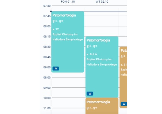
react-native-calendar-timetable
Timetable (schedule) component for React Native applications


Installation
npm install react-native-calendar-timetable
yarn add react-native-calendar-timetable
expo install react-native-calendar-timetable
Usage
Initialization example
import React from "react";
import moment from "moment";
import Timetable from "react-native-calendar-timetable";

export default function App() {
    /**
     * By default Timetable renders one column.
     * This sets date for that column, by default equals to new Date().
     * Can be instance of Date or an ISO string.
     * Essentially, a shortcut for range {from: date, till: date}.
     */
    const [date] = React.useState(new Date());

    /**
     * If you would like to have multiple columns (e.g. from Monday to Sunday),
     * you can specify range of dates. Each day of said range will have its own column.
     *
     * 'from' and 'till', just like 'date', can be instances of Date or an ISO strings.
     *
     * It is safe to keep 'from' and 'till' in separate states if you need to
     * because Timetable only check if 'from' or 'till' had changed and
     * not the object that contains them.
     */
    const [from] = React.useState(moment().subtract(3, 'days').toDate());
    const [till] = React.useState(moment().add(3, 'days').toISOString());
    const range = {from, till};

    const [items] = React.useState([
        {
            title: 'Some event',
            startDate: moment().subtract(1, 'hour').toDate(),
            endDate: moment().add(1, 'hour').toDate(),
        },
    ]);

    return (
        <ScrollView>
            <Timetable
                // these two are required
                items={items}
                cardComponent={MyItemCard}

                // provide only one of these if you need to
                date={date} // optional
                range={range} // optional
            />
        </ScrollView>
    );
}
CardComponent example
/**
 * Example item component
 * @param style Object with pre-calculated values, looks like {position: 'absolute', zIndex: 3, width: Number, height: Number, top: Number, left: Number}
 * @param item One of items supplied to Timetable through 'items' property
 * @param dayIndex For multiday items inicates current day index
 * @param daysTotal For multiday items indicates total amount of days
 */
export default function MyItemCard({style, item, dayIndex, daysTotal}) {
    return (
        <View style={{
            ...style, // apply calculated styles, be careful not to override these accidentally (unless you know what you are doing)
            backgroundColor: 'red',
            borderRadius: 10,
            elevation: 5,
        }}>
            <Text>{item.title}</Text>
            <Text>{dayIndex} of {daysTotal}</Text>
        </View>
    );
}
Customization
Styles
All of these keys must be defined on style prop, e.g. style.container.
⚠️ Please be careful while customizing styles as some properties may override those calculated by Timetable, such as
widthandheightofstyle.headerContainer.
They were not ignored to allow customization in some extreme edge cases.
Refer to Layout segment for layout customization.
| Key | Style type | Description |
|---|---|---|
| container | View | Styles of the main container |
| headerContainer | View | Styles of the container of column’s header |
| headerText | Text | Styles of the Text of column’s header |
| headersContainer | View | Styles of the View that wraps all header containers |
| contentContainer | View | Styles of the container of lines and cards |
| timeContainer | View | Styles of time containers |
| time | Text | Styles of time text |
| lines | View | Styles of Views that render lines |
| nowLine.dot | View* | Styles of the circle of the ‘current time’ line |
| nowLine.line | View** | Styles of the line of the ‘current time’ line |
*, ** due to how these Views are used, their customization options were limited:
*: width, height, backgroundColor, borderRadius, zIndex, elevation
**: height, backgroundColor, zIndex, elevation
Layout
| Key | Type | Default | Description |
|---|---|---|---|
| width | Number | useWindowDimensions().width |
Width of whole component |
| timeWidth | Number | 50 |
Width of time containers |
| hourHeight | Number | 60 |
Height of hour row |
| columnWidth | Number | width - (timeWidth - linesLeftInset) |
Width of day columns |
| columnHeaderHeight | Number | hourHeight / 2 |
Height of the container of column’s header |
| linesTopOffset | Number | 18 |
How far the lines are from top border |
| linesLeftInset | Number | 15 |
How far the lines are moved left from time’s right border |
| columnHorizontalPadding | Number | 10 |
Space between column borders and column cards |
Misc
| Key | Type | Default | Description |
|---|---|---|---|
| scrollViewProps | Object | Props for horizontal ScrollView | |
| renderHeader | Function | Function that renders column header text ({date, start, end}) => {} where start and end are start and end of the day (column) |
|
| startProperty | String | 'startDate' |
Name of the property that has item’s start date |
| endProperty | String | 'endDate' |
Name of the property that has item’s end date |
| fromHour | Number | 0 |
First hour of the timetable |
| toHour | Number | 24 |
Last hour of the timetable |
License
MIT