chakra-react-select
This component is a wrapper for the popular react component react-select made using the UI library Chakra UI.

Check out the demo here: https://codesandbox.io/s/chakra-react-select-demo-65ohb?file=/example.js
Usage
In order to use this package, you’ll need to have @chakra-ui/react set up like in the guide in their docs. Then install this package:
npm i chakra-react-select
Then you can import the base select package, the async select, the creatable select or the async creatable select:
import {
  Select,
  AsyncSelect,
  CreatableSelect,
  AsyncCreatableSelect,
} from "chakra-react-select";
In order to use this component, you can implement it and use it like you would normally use react-select. It should accept all of the props that the original takes, however customizing the theme or the components could break this implementation so change them at your own risk. There are also a few extra things you can do with this wrapper that pull from the chakra library.
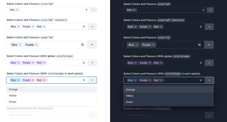
- You can pass the
sizeprop with eithersm,md, orlg(default ismd). These will reflect the sizes available on the Chakra<Input />component (with the exception ofxsbecause it’s too small to work).
return (
  <Select size="sm" />
  <Select size="md" /> // default
  <Select size="lg" />
)
- You can pass the
colorSchemeprop to the select component to change all of the selected options tags’ colors. You can view the whole list of available color schemes in the Chakra docs, or if you have a custom color palette, any of the custom color names in that will be available instead.- Alternatively you can add the
colorSchemekey to any of your options objects and it will only style that option when selected.
- Alternatively you can add the
return (
  <Select
    {/* The global color scheme */}
    colorScheme="purple"
    options={[
      {
        label: "I am red",
        value: "i-am-red",
        colorScheme: "red", // The option color scheme overrides the global
      },
      {
        label: "I fallback to purple",
        value: "i-am-purple",
      },
    ]}
  />
);
- You can pass the
tagVariantprop with eithersubtle,solid, oroutline(default issubtle). These will reflect thevariantprop available on the Chakra<Tag />component.- Alternatively you can add the
variantkey to any of your options objects and it will only style that option when selected. This will override thetagVariantprop on the select if both are set
- Alternatively you can add the
return (
  <Select
    {/* The global variant */}
    tagVariant="solid"
    options={[
      {
        label: "I have the outline style",
        value: "i-am-outlined",
        variant: "outline", // The option variant overrides the global
      },
      {
        label: "I fallback to the global `solid`",
        value: "i-am-solid",
      },
    ]}
  />
);
- You can pass
isInvalidto the select component to style it like the Chakra<Input />is styled when it receives the same prop.- You can pass
isInvalidorisDisabledto a<FormControl />which surrounds this component and it will output their corresponding<Input />styles.
- You can pass
return (
  <>
    {/* This will show up with a red border */}
    <Select isInvalid />

    {/* This will show up with a red border, and grayed out */}
    <FormControl isInvalid isDisabled>
      <FormLabel>Invalid & Disabled Select</FormLabel>
      <Select />
      <FormErrorMessage>
        This error message shows because of an invalid FormControl
      </FormErrorMessage>
    </FormControl>
  </>
);
- One thing I added which isn’t specific to Chakra or react-select is sticky group headers. It adds a border to the bottom of the header and keeps it in view while its corresponding group of options is visible. This can be very nice for when you have long lists of grouped options so you can always tell which group of options you’re looking at. To add it, pass the
hasStickyGroupHeadersprop to the select component.
return <Select hasStickyGroupHeaders />;

- In your options objects, you can add the key
isFixed: trueto emulate the example in the react-select docs. This will prevent the options which have this flag from having the remove button on its corresponding tag. This only applies when usingisMultiis passed.
return (
  <Select
    isMulti
    options={[
      {
        label: "I can't be removed",
        value: "fixed",
        isFixed: true,
      },
      {
        label: "I can be removed",
        value: "not-fixed",
      },
    ]}
  />
);
If you have any other questions or requests, leave it as an issue. I’m sure there are some features of react-select that I missed and I definitely want to make this wrapper as good as it can be!