react-grid
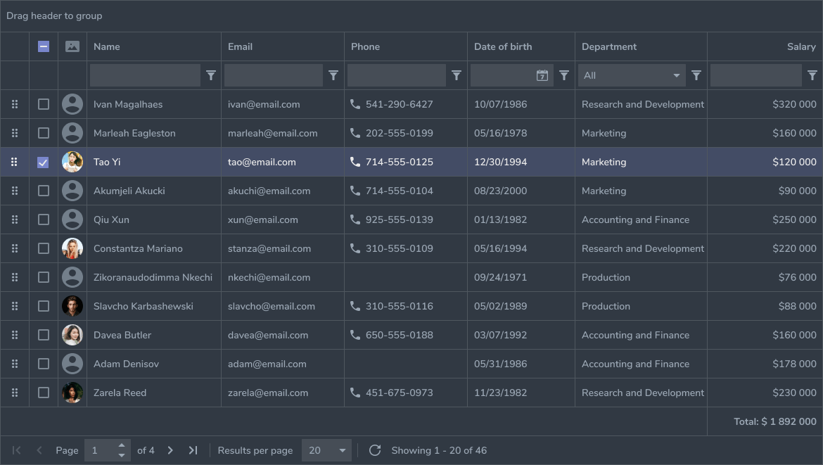
Datagrid is a component that can be used to present data in table. It supports inline edit, action bar and lot more. Component is highly customizable to meet different use cases.
Underneath it uses originally Facebook's, but later continued by Schrodinger fixed-data-table-2 react component, which is designed to handle large amounts amounts of data without sacraficing performance.
Installation
npm install @opuscapita/react-grid
npm install font-awesome
npm install react-immutable-proptypes
Redux dependency
Datagrid uses redux as data store, so you must have redux set up in your project. It also depends on redux-thunk and react-intl-redux to be present. These dependencies comes from the fact that this component is separated from another project and it is known that these dependencies should be removed at some point.
Usage
First you have to connect your component to the redux. Then you can map the datagrid's state and actions to your component's props. The mappings are needed only for those parts that you need in your component. For example if you only load data to the grid, you can only map the setData action. If you need to know currently selected items, you need to map selectedItems from the grid state.
- Create a
GRIDobject that containsidandidKeyPathof your grid. This object is passed to every action you call and to the Datagrid component itself as prop. - Create a column array that configures your grid's columns. Some actions needs this information as well.
- Add Datagrid component to your render method and pass in the
gridandcolumnsprops. - Then to set the data to the grid, call setData action with
grid,columnsanddataparameters. - You should now have a grid with data loaded.
- Check the API section below to see what props the Datagrid supports, also GRID object and columns are documented there.
- To see what actions are available, check the actions file.
Builds
UMD
The default build with compiled styles in the .js file. Also minified version available in the lib/umd directory.
CommonJS/ES Module
You need to configure your module loader to use cjs or es fields of the package.json to use these module types.
Also you need to configure sass loader, since all the styles are in sass format.
- With webpack use resolve.mainFields to configure the module type.
- Add SASS loader to support importing of SASS styles.
API
Datagrid
| Prop name | Type | Default | Description |
|---|---|---|---|
| grid | object | required | Grid attributes and config object |
| columns | array | required | Array of column configuration objects |
| rowsCount | number | Override rows count otherwise calculated from data | |
| idKeyPath | array of strings | Key path to unique ID value in the grid data, used in many features like row selecting and inline editing | |
| gridHeader | node | Grid header displayed on top of grid | |
| actionBar | node | Action bar element displayed at top right | |
| actionBarLeft | node | Action bar element displayed at top left | |
| cellSelect | boolean | false | Enable cell selecting |
| disableDropdown | boolean | false | Don't use dropdown menu in the action bar |
| disableFilteringControls | boolean | false | Don't display the filtering controls (only used if disableDropdown is true) |
| dropdownMenuItems | array | Additional dropdown menu items | |
| inlineEdit | boolean | false | Enable inline editing |
| inlineAdd | boolean | true | Enable inline adding (defaults to true if inlineEdit is enabled) |
| filtering | boolean | false | Enable column filtering |
| removing | boolean | false | Enable item removing |
| columnSettings | boolean | false | Enable column settings popup (column selecting and re-ordering) |
| rowSelect | boolean | false | Enable row selecting |
| rowSelectCheckboxColumn | boolean | false | Enable additional checkbox column for row selecting |
| multiSelect | boolean | false | Enable multi selecting on row selecting |
| selectComponentOptions | Immutable.Map | Options data for the react-select components | |
| selectComponentTranslations | object | Translation strings for react-select placeholder and noResultsText texts. | |
| disableActions | boolean | false | Disable action bar actions, eg. when other grid busy |
| disableActionsMessage | object | { messageId: 'GridActionsDisabledOtherGridBusy' } | Message about the reason of disabled action bar actions |
| disableActionBar | boolean | false | Disable action bar rendering |
| disableActionSave | boolean | false | Disable Save action button |
| enableArrowNavigation | boolean | false | Enable navigation with arrow keys in editing mode |
| onSave | function | Callback that is called when save button is clicked | |
| onRemove | function | Callback that is called when delete is clicked | |
| onCancel | function | Callback that is called when cancel is clicked | |
| onAddClick | function | Callback that is called when add is clicked | |
| onEditClick | function | Callback that is called when edit is clicked | |
| tabIndex | number | 1 | tabIndex start value, needed when multiple grids on same page |
| extraColumn | object | Extra column that cannot be hidden or re-ordered. It's rendered always as first colunn | |
| headerHeight | number | 40 | Pixel height of the header row |
| rowHeight | number | 40 | Pixel height of rows |
| containerStyle | object | Additional styles to be set on the container div | |
| scrollToColumn | number | Index of column to scroll to | |
| scrollTop | number | Value of vertical scroll | |
| scrollToRow | number | Index of row to scroll to | |
| onRowClick | function | Callback that is called when a row is clicked | |
| onRowDoubleClick | function | Callback that is called when a row is double clicked | |
| onRowMouseDown | function | Callback that is called when a mouse-down event happens on a row | |
| onRowMouseEnter | function | Callback that is called when a mouse-enter event happens on a row | |
| onRowMouseLeave | function | Callback that is called when a mouse-leave event happens on a row | |
| onScrollStart | function | Callback that is called when scrolling starts with current horizontal and vertical scroll values | |
| onScrollEnd | function | Callback that is called when scrolling ends or stops with new horizontal and vertical scroll values | |
| rowClassNameGetter | function | To get any additional CSS classes that should be added to a row, rowClassNameGetter(index) is called | |
| rowHeightGetter | function | If specified, rowHeightGetter(rowData, rowIndex) is called for each row and the returned value overrides rowHeight for particular row | |
| onContentHeightChange | function | Callback that is called when rowHeightGetter returns a different height for a row than the rowHeight prop. This is necessary because initially table estimates heights of some parts of the content | |
| contextMenuItems | array | Array of items in the context menu | |
| pagination | object | Object of pagination options |
Datagrid - grid prop attributes
| Prop name | Type | Default | Description |
|---|---|---|---|
| id | string | required | ID of the datagrid |
| idKeyPath | array of strings | Key path to unique ID value in the grid data, used in many | |
| defaultShowFilteringRow | boolean | false | Show filtering row as default |
| defaultSortColumn | string | columnKey of column sorted by default. ColumnKey is joined with '/' from valueKeyPath array, if columnKey is not defined in the column props | |
| defaultSortOrder | string | 'asc' | Default sort order of default sort [asc/desc] |
| disableRememberSelectedItems | boolean | false | Disable remembering the selected rows |
| disableRememberIsFiltering | boolean | false | Disable remembering is filtering ebabled |
| disableRememberFilteData | boolean | false | Disable remembering the filters |
| disableRememberSortData | boolean | false | Disable remembering the sorting |
| disableRememberColumnWidths | boolean | false | Disable remembering the column widths |
| language | string | 'en' | Default taken from redux user state used in OC apps |
| region | string | 'en-GB' | Default taken from redux user state used in OC apps |
| dateFormat | string | 'L' | Default taken from redux user state used in OC apps |
| thousandSeparator | string | '' | Default taken from redux user state used in OC apps |
| decimalSeparator | string | '.' | Default taken from redux user state used in OC apps |
| pagination | boolean | false | True, if grid data is paginated. Otherwise false. |
Datagrid - column prop attributes
| Name | Type | Default | Description |
|---|---|---|---|
| header | node | Column header content | |
| columnKey | string | Column identifier key (required if no valueKeyPath, otherwise autogenerated) | |
| valueKeyPath | string | Column content value key path | |
| valueType | string | Value type [text/number/float/currency/boolean/date] | |
| valueOptions | object | Options for the value rendering | |
| componentType | string | Input component type [text/number/float/select/boolean/date] | |
| valueRender | function | Override value render, (rowData, rowIndex) as parameters | |
| editValueRender | function | Override value render in editing mode, (rowData, rowIndex) as parameters | |
| createValueRender | function | Override value render in creating mode, (rowData, rowIndex) as parameters | |
| filterValueRender | function | Override value render in filtering mode, (rowData, rowIndex) as parameters | |
| cell | function | Override cell content renderer, rowIndex as parameter | |
| cellEdit | function | Override content renderer in editing mode | |
| cellCreate | function | Override cell content renderer in creating mode | |
| cellFilter | function | Override cell content renderer in filtering mode | |
| renderComponentProps | object | Additional props for the render component | |
| editComponentProps | object | Additional props for the edit component | |
| createComponentProps | object | Additional props for the create component | |
| filterComponentProps | object | Additional props for the filter component | |
| width | number | 200 | The pixel width of the column |
| minWidth | number | 20 | The minimum pixel width of the column |
| maxWidth | number | The maximum pixel width of the column | |
| align | number | The horizontal alignment of the column | |
| fixed | boolean | Column is fixed | |
| allowCellsRecycling | boolean | Recycle cells that are outside viewport horizontally, better horizontal scrolling performance. | |
| disableResizing | boolean | Disable column resizing this column | |
| disableSorting | boolean | Disable column sorting this column | |
| disableEditing | boolean | Disable inline editing this column | |
| flexGrow | number | The grow factor relative to other columns | |
| valueEmptyChecker | function | Checker function defined when data is empty | |
| sortValueGetter | function | Getter function for the sort data | |
| sortComparator | function | Comparator function for the sort data | |
| filterMatcher | function | Matcher function that matches filter to data (parameters: rowData, filterValue) | |
| defaultValue | string, number | Default value for the item when creating new item | |
| isRequired | bool | Indicating if column value is required | |
| onValueMatchChangeValue | object | Change other column value if own value matches | |
| disableEditingOnValueMatch | object | Disable input element of this column when value at keyPath matches | |
| onEditValueChange | function | Called on edit value change, called with (value, valueKeyPath, rowIndex, dataId) | |
| onCreateValueChange | function | Called on create value change, called with (value, valueKeyPath, rowIndex) | |
| onCreateBlur | function | Called on create cell input blur, called with (value, rowIndex) | |
| onEditBlur | function | Called on edit cell input blur, called with (value, rowIndex, dataId) | |
| onLastCellTabPress | function | Called on tab keypress in edit/create cell when the last cell in the grid is being focused, called with original KeyPress event | |
| selectComponentOptions | array | Options data fot the react-select component |
Datagrid - valueOptions prop attributes for currency value type
| Name | Type | Default | Description |
|---|---|---|---|
| currencyKeyPath | array | ['currency'] | Currency code key path to calculate number of decimals from |
| decimals | number | Number of decimals | |
| thousandSeparator | string | Defaults to datagrid config | |
| decimalSeparator | array | Defaults to datagrid config |
Datagrid - onValueMatchChangeValue prop attributes
| Name | Type | Default | Description |
|---|---|---|---|
| matchValue | any | When this columns data match to this | |
| newValueKeyPath | array of strings | Change value at this keyPath | |
| newValue | any | The new value to be inserted |
Datagrid - disableEditingOnValueMatch prop attributes
| Name | Type | Default | Description |
|---|---|---|---|
| matchValueKeyPath | array of strings | Keypath of the value to be matched | |
| matchValue | any | The value to be matched |
Datagrid - extraColumn prop attributes
| Name | Type | Default | Description |
|---|---|---|---|
| width | number | 40 | Column width in pixels |
| valueRender | function | Value render function | |
| cellEdit | function | Render function for edit mode | |
| cellCreate | function | Render function for create mode | |
| cellFilter | function | Render function for create mode | |
| isResizable | boolean | false | Is column resisable |
Datagrid - contextMenuItems prop array attributes
| Name | Type | Default | Description |
|---|---|---|---|
| id | string | Item id | |
| title | any | Value to display in the menu | |
| icon | any | Icon element to display with item | |
| onClick | function | onClick handles, parameters (selectedIds :: List, selectedData :: List) | |
| disabled | boolean, function | false | Is item disabled, parameters (selectedIds :: List, selectedData :: List) |
Datagrid - contextMenuItems prop array attributes
| Name | Type | Default | Description |
|---|---|---|---|
| value | any | Value to display in the menu | |
| onClick | function | onClick handles, parameters (selectedIds :: List, selectedData :: List) | |
| title | string | Item title to show when mouse overing | |
| disabled | boolean, function | false | Is item disabled, parameters (selectedIds :: List, selectedData :: List) |
| header | boolean | false | Is item a header |
| divider | boolean | false | Is item a divider |
Datagrid - pagination prop attributes
| Name | Type | Default | Description |
|---|---|---|---|
| pageSize | number | Row count on page | |
| totalSize | number | Total amount of rows | |
| getData | function | Callback function to request paginated data, parameters (offset :: number, count :: number, filters :: Map, sortColumn :: string or number, sortOrder :: string) |
Code example
import React from 'react';
import { Datagrid } from '@opuscapita/react-grid';

export default class DatagridView extends React.Component {
  render() {
    const GRID = {
      id: 'accounts',
      idKeyPath: ['accountId'],
    };
    const columns = [
      {
        header: 'Account Name',
        valueKeyPath: ['name'],
        valueType: 'text',
        width: 200,
      },
      {
        header: 'Account number',
        valueKeyPath: ['accountNumber'],
        valueType: 'text',
        width: 200,
      },
      {
        header: 'Amount',
        valueKeyPath: ['amount'],
        valueType: 'currency',
        valueOtions: {
          decimals: 3,
        },
        width: 200,
      },
    ];

    return (
      <Datagrid
        grid={GRID}
        columns={columns}
      />
    );
  }
}