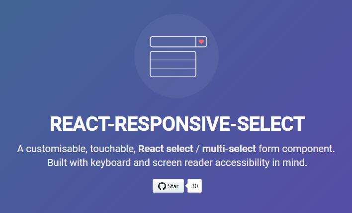
React Responsive Select
A customisable, touchable, React single-select / multi-select form control.
Built with keyboard and screen reader accessibility in mind.
Getting started
Install the dependency - https://www.npmjs.com/package/react-responsive-select
npm install react-responsive-select -D
Add ReactResponsiveSelect.js
And include the CSS file in your project via an import, or by copy/pasting the CSS from: ../node_modules/react-responsive-select/dist/ReactResponsiveSelect.css
Example usage:
import React from 'react';
import ReactResponsiveSelect from 'react-responsive-select';

const reportChange = (newValue) => console.log(newValue);

const Form = () => (
  <form ref={r => this.form = r}>
    <ReactResponsiveSelect
      name="make"
      options={[
        { text: 'Any', value: 'null' },
        { text: 'Oldsmobile', value: 'oldsmobile', markup: <span>Oldsmobile</span> },
        { text: 'Ford', value: 'ford', markup: <span>Ford</span> }
      ]}
      prefix="Make:"
      selectedValue="mazda"
      onSubmit={() => { this.form.submit(); }}
      onChange={reportChange}
      caretIcon={<span>+</span>}
    />
  </form>
);
A more detailed usage example can be found here:
https://github.com/benbowes/react-responsive-select/blob/master/demo/src/index.js
Altering styling
The CSS in ./dist/ReactResponsiveSelect.css is plain css. Include it in your project via an import or copy paste it's contents into your stylesheet.
Customisations can be done via overriding the styles or rewriting the classes.
The class names themselves are not configurable.
To aid in styling the hover/selected states in the options list, I would suggest overriding the class that hides the options temporarily e.g.
.rrs__button + .rrs__options {
  /* height: 0;
  visibility: hidden; */
  height: auto;
  visibility: visible;
}
Custom labeling
You can hook into the onChange function via the customLabelRenderer function prop. This allows you to render a custom label. See the API table for what the selectedOption object has in it.
<ReactResponsiveSelect
  name="make2"
  options={options}
  onSubmit={() => { this.form.submit(); }}
  // (Optional) format your own label text like this
  customLabelRenderer={selectedOption => `Selected make is ${selectedOption.text} :)`}
/>
API
Single Select
| prop | type | description |
| name (required) | String | The name to send with the selected option value(s) on form submit |
| options (required) | Array of objects |
Note: |
| onSubmit | Function | Some function that submits your form |
| onChange | Function | Listen for changes on selected option change returns Note: |
| caretIcon | JSX | Add a dropdown icon by using JSX markup |
| selectedValue | String | Pre-select an option with this value - should match an existing option.value, or if omitted the first item will be selected |
| prefix | String | Prefix for the select label |
| disabled | Boolean | Disables the select control |
| customLabelRenderer | Function | Allows you to format your own select label The customLabelRenderer function returns an option object e.g. To use this feature you need to return some JSX; using values from the above object to create your own custom label. |
Multi Select
Same as Single Select API but with the following amendments
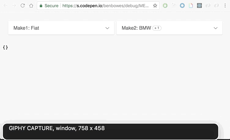
| multiselect | Boolean | Makes the select control handle multiple selections. Check the implementation example here: https://benbowes.github.io/react-responsive-select/demo/ |
| selectedValues | Array of String values | Pre-select several options with this value - should match against an existing option.value, or if omitted, the first item will be selected.
e.g. selectedValues={['mazda','ford']}
|
| customLabelRenderer | Function | Allows you to format your own select label The customLabelRenderer function returns an array option objects e.g. To use this feature you need to return some JSX; using values from the above object to create your own custom label. |