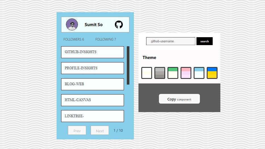
github-insights-card
React component library that simplifies the integration of GitHub user information into web applications. Display followers, repositories, and their links effortlessly, providing an intuitive interface for GitHub data exploration and utilization.
Installation
Install the package using npm:
npm install github-insights-card
quick example
| props | value |
|---|---|
| theme | “Default”, “DarkKnight”, “EmeraldGreen”, “PastelDreams”, “SereneMeadow”, “GolderBreeze” |
| width | min “290px” default |
| username | add github username |
Here’s an example of how to use the GithubProfileCard component in your React application:
import { GithubProfileCard } from "github-insights-card";

const GihubProfile = () => {
  return (
    <div>
      <GithubProfileCard
        username="GithutUserName"
        theme="default"
        width="380px" // (default value is 290px)
      />
    </div>
  );
};

##
export default GitubProfile;
customize on web
demo Link

Environment Variables
If you would like to contribute to this project, you’ll need a GitHub access token. Create an access token named GITHUB_ACCESS_TOKEN , which you can find in GitHub developer settings