FlexLayout
FlexLayout is a layout manager that arranges React components in multiple tab sets, these can be resized and moved.
Features:
- splitters
- tabs
- tab dragging and ordering
- tabset dragging (move all the tabs in a tabset in one operation)
- dock to tabset or edge of frame
- maximize tabset (double click tabset header or use icon)
- tab overflow (show menu when tabs overflow)
- border tabsets
- submodels, allow layouts inside layouts
- tab renaming (double click tab text to rename)
- themeing - light and dark
- touch events - works on mobile devices (iPad, Android)
- add tabs using drag, indirect drag, add to active tabset, add to tabset by id
- preferred pixel size tabsets
- headed tabsets
- tab and tabset attributes: enableHeader, enableTabStrip, enableDock, enableDrop...
- customizable tabs and tabset header rendering
- esc cancels drag
- typescript type declarations included
- supports overriding css class names via the classNameMapper prop, for use in css modules
Installation
FlexLayout is in the npm repository. Simply install React and FlexLayout from npm:
npm install react --save
npm install react-dom --save
npm install flexlayout-react --save
Import React and FlexLayout in your modules:
import React from "react";
import ReactDOM from "react-dom";
import FlexLayout from "flexlayout-react";
Include the light or dark style in your html:
<link rel="stylesheet" href="node_modules/flexlayout-react/style/dark.css" />
Usage
The <Layout> component renders the tabsets and splitters, it takes the following props:
| Prop | Required/Optional | Description |
|---|---|---|
| model | required | the layout model |
| factory | required | a factory function for creating React components |
| onAction | optional | function called whenever the layout generates an action to update the model (allows for intercepting actions before they are dispatched to the model, for example, asking the user to confirm a tab close) |
| onRenderTab | optional | function called when rendering a tab, allows leading (icon) and content sections to be customized |
| onRenderTabSet | optional | function called when rendering a tabset, allows header and buttons to be customized |
| onModelChange | optional | function called when model has changed |
| classNameMapper | optional | function called with default css class name, return value is class name that will be used. Mainly for use with css modules. |
The model is tree of Node objects that define the structure of the layout.
The factory is a function that takes a Node object and returns a React component that should be hosted by a tab in the layout.
The model can be created using the Model.fromJson(jsonObject) static method, and can be saved using the model.toJson() method.
this.state = {model: FlexLayout.Model.fromJson(json)};

render() {
	<Layout model={this.state.model} factory={factory}/>
}
Example Configuration:
var json = {
	global: {},
	borders: [],
	layout:{
		"type": "row",
		"weight": 100,
		"children": [
			{
				"type": "tabset",
				"weight": 50,
				"selected": 0,
				"children": [
					{
						"type": "tab",
						"name": "FX",
						"component":"grid",
					}
				]
			},
			{
				"type": "tabset",
				"weight": 50,
				"selected": 0,
				"children": [
					{
						"type": "tab",
						"name": "FI",
						"component":"grid",
					}
				]
			}
		]
	}
};
Example Code
import React from "react";
import ReactDOM from "react-dom";
import FlexLayout from "flexlayout-react";

class Main extends React.Component {

    constructor(props) {
        super(props);
        this.state = {model: FlexLayout.Model.fromJson(json)};
    }

    factory(node) {
        var component = node.getComponent();
        if (component === "button") {
            return <button>{node.getName()}</button>;
        }
    }

    render() {
        return (
            <FlexLayout.Layout model={this.state.model} factory={this.factory.bind(this)}/>
        )
    }
}

ReactDOM.render(<Main/>, document.getElementById("container"));
(See the examples for full source code)
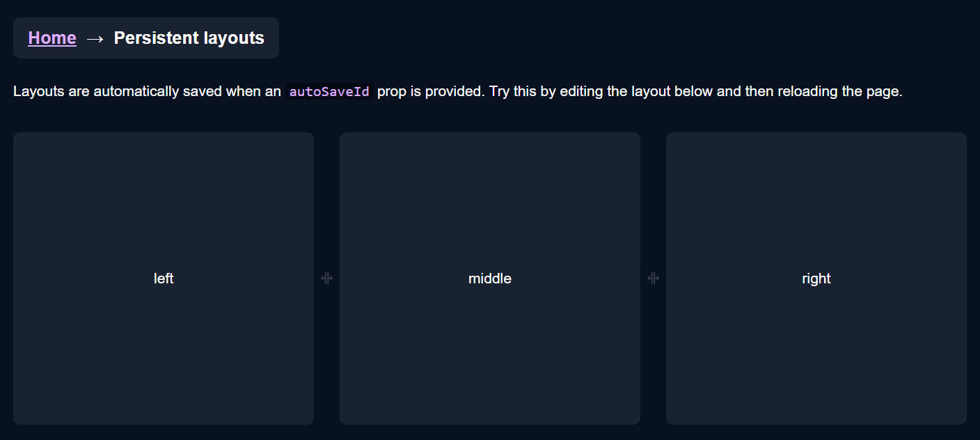
The above code would render two tabsets horizontally each containing a single tab that hosts a button component. The tabs could be moved and resized by dragging and dropping. Additional grids could be added to the layout by sending actions to the model.
Try it now using JSFiddle
The model is built up using 4 types of 'node':
-
row - rows contains a list of tabsets and child rows, the top level row will render horizontally, child 'rows' will render in the opposite orientation to their parent.
-
tabset - tabsets contain a list of tabs and the index of the selected tab
-
tab - tabs specify the name of the component that they should host (that will be loaded via the factory) and the text of the actual tab.
-
border - borders contain a list of tabs and the index of the selected tab, they can only be used in the borders
top level element.
The main layout is defined with rows within rows that contain tabsets that themselves contain tabs.
The model json contains 3 top level elements:
- global - where global options are defined
- layout - where the main row/tabset/tabs layout hierarchy is defined
- borders - (optional) where up to 4 borders are defined ("top", "bottom", "left", "right").
Weights on rows and tabsets specify the relative weight of these nodes within the parent row, the actual values do not matter just their relative values (ie two tabsets of weights 30,70 would render the same if they had weights of 3,7).
example borders section:
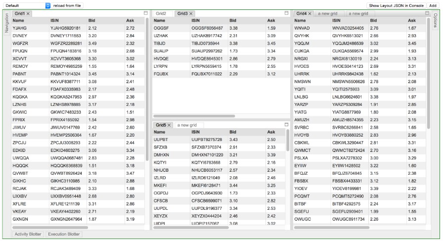
	"borders": [
		 {
		    "type":"border",
		 	"location": "left",
			"children": [
				{
					"type": "tab",
					"enableClose":false,
					"name": "Navigation",
					"component": "grid",
				}
			]
		},
		{
		    "type":"border",
		 	"location": "right",
			"children": [
				{
					"type": "tab",
					"enableClose":false,
					"name": "Options",
					"component": "grid",
				}
			]
		},
		{
		    "type":"border",
			"location": "bottom",
			"children": [
				{
					"type": "tab",
					"enableClose":false,
					"name": "Activity Blotter",
					"component": "grid",
				},
				{
					"type": "tab",
					"enableClose":false,
					"name": "Execution Blotter",
					"component": "grid",
				}
			]
		}
	]
To control where nodes can be dropped you can add a callback function to the model:
model.setOnAllowDrop(this.allowDrop);
example:
    allowDrop(dragNode, dropInfo) {
        let dropNode = dropInfo.node;

        // prevent non-border tabs dropping into borders
        if (dropNode.getType() == "border" && (dragNode.getParent() == null || dragNode.getParent().getType() != "border"))
            return false;

        // prevent border tabs dropping into main layout
        if (dropNode.getType() != "border" && (dragNode.getParent() != null && dragNode.getParent().getType() == "border"))
            return false;

        return true;
    }
By changing global or node attributes you can change the layout appearance and functionality, for example:
Setting tabSetEnableTabStrip:false in the global options would change the layout into a multi-splitter (without
tabs or drag and drop).
global: {tabSetEnableTabStrip:false},
Global Config attributes
Attributes allowed in the 'global' element
| Attribute | Default | Description |
|---|---|---|
| splitterSize | 8 | |
| enableEdgeDock | true | |
| tabEnableClose | true | |
| tabEnableDrag | true | |
| tabEnableRename | true | |
| tabClassName | null | |
| tabIcon | null | |
| tabEnableRenderOnDemand | true | |
| tabDragSpeed | 0.3 | CSS transition speed of drag outlines (in seconds) |
| tabSetEnableDeleteWhenEmpty | true | |
| tabSetEnableDrop | true | |
| tabSetEnableDrag | true | |
| tabSetEnableDivide | true | |
| tabSetEnableMaximize | true | |
| tabSetClassNameTabStrip | null | |
| tabSetClassNameHeader | null | |
| tabSetEnableTabStrip | true | |
| tabSetHeaderHeight | 20 | |
| tabSetTabStripHeight | 20 | |
| borderBarSize | 25 | |
| borderEnableDrop | true | |
| borderClassName | null |
Row Attributes
Attributes allowed in nodes of type 'row'.
| Attribute | Default | Description |
|---|---|---|
| type | row | |
| weight | 100 | |
| width | null | preferred pixel width |
| height | null | preferred pixel height |
| children | required | a list of row and tabset nodes |
Tab Attributes
Attributes allowed in nodes of type 'tab'.
Inherited defaults will take their value from the associated global attributes (see above).
| Attribute | Default | Description |
|---|---|---|
| type | tab | |
| name | required | |
| component | required | |
| config | null | a place to hold json config for the hosted component |
| id | auto generated | |
| enableClose | inherited | |
| enableDrag | inherited | |
| enableRename | inherited | |
| className | inherited | |
| icon | inherited | |
| enableRenderOnDemand | inherited |
Tab nodes have a getExtraData() method that initially returns an empty object, this is the place to
add extra data to a tab node that will not be saved.
TabSet Attributes
Attributes allowed in nodes of type 'tabset'.
Inherited defaults will take their value from the associated global attributes (see above).
Note: tabsets can be dynamically created as tabs are moved and deleted when all their tabs are removed (unless enableDeleteWhenEmpty is false).
| Attribute | Default | Description |
|---|---|---|
| type | tabset | |
| weight | 100 | |
| width | null | preferred pixel width |
| height | null | preferred pixel height |
| name | null | named tabsets will show a header bar above the tabs |
| selected | 0 | |
| maximized | false | |
| id | auto generated | |
| children | required | a list of tab nodes |
| enableDeleteWhenEmpty | inherited | |
| enableDrop | inherited | |
| enableDrag | inherited | |
| enableDivide | inherited | |
| enableMaximize | inherited | |
| classNameTabStrip | inherited | |
| classNameHeader | inherited | |
| enableTabStrip | inherited | |
| headerHeight | inherited | |
| tabStripHeight | inherited |
Border Attributes
Attributes allowed in nodes of type 'border'.
Inherited defaults will take their value from the associated global attributes (see above).
| Attribute | Default | Description |
|---|---|---|
| type | border | |
| size | 200 | size of the tab body when selected |
| selected | -1 | -1 is the unselected value |
| id | auto generated | border_ + border name e.g. border_left |
| show | true | show/hide this border |
| children | required | a list of tab nodes |
| barSize | inherited | |
| enableDrop | inherited | |
| className | inherited |
Model Actions
All changes to the model are applied through actions, you can intercept actions resulting from GUI changes before they are applied by
implementing the onAction callback property of the Layout. You can also apply actions directly using the Model.doAction()
method.
Example
        model.doAction(Actions.updateModelAttributes({
            splitterSize:40,
            tabSetHeaderHeight:40,
            tabSetTabStripHeight:40
        }));
The above example would increase the size of the splitters, tabset headers and tabs, this could be used to make
adjusting the layout easier on a small device.
| Action Creator | Description |
|---|---|
| Actions.addNode(newNodeJson, toNodeId, location, index) | add a new tab node to the given tabset node |
| Actions.moveNode(fromNodeId, toNodeId, location, index) | move a tab node from its current location to the new node and location |
| Actions.deleteTab(tabNodeId) | delete the given tab |
| Actions.selectTab(tabNodeId) | select the given tab |
| Actions.setActiveTabset(tabsetNodeId) | set the tabset as the active tabset |
| Actions.adjustSplit(splitterNodeId, value) | adjust the size of the given splitter |
| Actions.maximizeToggle(tabsetNodeId) | toggles whether the given tabset node is maximized |
| Actions.updateModelAttributes(attributes) | updates the global attributes |
| Actions.updateNodeAttributes(nodeId, attributes) | updates the attributes of the given node |
| Actions.adjustBorderSplit(borderNodeId, pos) | updates the size of the given border node |
for example:
model.doAction(Actions.addNode({type:"tab", component:"grid", name:"a grid", id:"5"}, "1", DropLocation.CENTER, 0));
This would add a new grid component to the center of tabset with id "1" and at the 0'th tab position (use value -1 to add to the end of the tabs).
Note: you can get the id of a node using the method node.getId(), if an id wasn't assigned when the node was created then one will be created for you of the form #
Layout Component Methods to Create New Tabs
Methods on the Layout Component for adding tabs, the tabs are specified by their layout json.
Example:
this.refs.layout.addTabToTabSet("NAVIGATION", {type:"tab", component:"grid", name:"a grid"});
This would add a new grid component to the tabset with id "NAVIGATION".
| Layout Method | Description |
|---|---|
| addTabToTabSet(tabsetId, json) | adds a new tab to the tabset with the given Id |
| addTabToActiveTabSet(json) | adds a new tab to the active tabset |
| addTabWithDragAndDrop(dragText, json, onDrop) | adds a new tab by dragging a marker to the required location, the drag starts immediately |
| addTabWithDragAndDropIndirect(dragText, json, onDrop) | adds a new tab by dragging a marker to the required location, the marker is shown and must be clicked on to start dragging |
Tab Node Events
You can handle events on nodes by adding a listener, this would typically be done
in the components constructor() method.
Example:
    constructor(props) {
        super(props);
        let config = this.props.node.getConfig();

        // save state in flexlayout node tree
        this.props.node.setEventListener("save", function (p) {
             config.subject = this.subject;
        }.bind(this));
    }
| Event | parameters | Description |
|---|---|---|
| resize | called when tab is resized during layout, called before it is rendered with the new size | |
| close | called when a tab is closed | |
| visibility | called when the visibility of a tab changes | |
| save | called before a tabnode is serialized to json, use to save node config by adding data to the object returned by node.getConfig() |
Building the Project
To compile the project just run webpack in the top level directory, this will compile and bundle flexlayout and the examples into
the bundles dir. Once compiled the examples can be run by opening their index.html files.
To build the npm distribution run 'npm run build', this will create the artifacts in the dist dir.