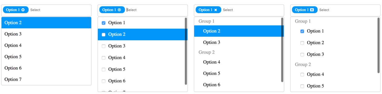
react-dropdown-tree-select
A lightweight and fast control to render a select component that can display hierarchical tree data. In addition, the control shows the selection in pills and allows user to search the options for quick filtering and selection.
Install
> npm i react-dropdown-tree-select

// or if using yarn

> yarn add react-dropdown-tree-select
Usage
import React from 'react'
import ReactDOM from 'react-dom'
import DropdownTreeSelect from 'react-dropdown-tree-select'

const tree = {
  "label": "search me",
  "value": "searchme",
  "children": [
    {
      "label": "search me too",
      "value": "searchmetoo",
      "children": [
        {
          "label": "No one can get me",
          "value": "anonymous"
        }
      ]
    }
  ]
}

const onChange = (currentNode, selectedNodes) => { console.log('onChange::', currentNode, selectedNodes) }
const onAction = ({action, node}) => { console.log(`onAction:: [${action}]`, node) }
const onNodeToggle = (currentNode) => { console.log('onNodeToggle::', currentNode) }

ReactDOM.render(<DropdownTreeSelect data={data} onChange={onChange} onAction={onAction} onNodeToggle={onNodeToggle} />, document.body)  // in real world, you'd want to render to an element, instead of body.
Props
className
Type: string
Additional classname for container. The container renders with a default classname of react-dropdown-tree-select.
onChange
Type: function
Fires when a node change event occurs. Currently the following actions trigger a node change:
- Checkbox click which checks/unchecks the item
- Closing of pill (which unchecks the corresponding checkbox item)
Calls the handler with the current node object and all selected nodes (if any). Example:
function onChange (currentNode, selectedNodes) {
  // currentNode: { label, value, children, expanded, checked, className, ...extraProps }
  // selectedNodes: [{ label, value, children, expanded, checked, className, ...extraProps }]
}

return <DropdownTreeSelect data={data} onChange={onChange} />
onNodeToggle
Type: function
Fires when a node is expanded or collapsed.
Calls the handler with the current node object. Example:
function onNodeToggle (currentNode) {
  // currentNode: { label, value, children, expanded, checked, className, ...extraProps }
}

return <DropdownTreeSelect data={data} onNodeToggle={onNodeToggle} />
data
Type: Object or Array
Data for rendering the tree select items. The object requires the following structure:
{
  label,        // required: Checkbox label
  value,        // required: Checkbox value
  children,     // optional: Array of child objects
  checked,      // optional: Initial state of checkbox. if true, checkbox is selected and corresponding pill is rendered.
  expanded,     // optional: If true, the node is expanded (children of children nodes are not expanded by default unless children nodes also have expanded: true).
  className,    // optional: Additional css class for the node. This is helpful to style the nodes your way
  tagClassName, // optional: Css class for the corresponding tag. Use this to add custom style the pill corresponding to the node.
  actions,      // optional: An array of extra action on the node (such as displaying an info icon or any custom icons/elements)
  ...           // optional: Any extra properties that you'd like to receive during `onChange` event
}
The action object requires the following structure:
{
  className, // required: CSS class for the node. e.g. `fa fa-info`
  onAction,  // required: Fired on click of the action. The event handler receives `action` object as well as the `node` object.
  title,     // optional: HTML tooltip text
  text,      // optional: Any text to be displayed. This is helpful to pass ligatures if you're using ligature fonts
  ...        // optional: Any extra properties that you'd like to receive during `onChange` event
}
An array renders a tree with multiple root level items whereas an object renders a tree with a single root element (e.g. a Select All root node).
placeholderText
Type: string
The text to display as placeholder on the search box. Defaults to Choose...
Performance
Search optimizations
- The tree creates a flat list of nodes from hierarchical tree data to perform searches that are linear in time irrespective of the tree depth or size.
- It also memoizes each search term, so subsequent searches are instantaneous (almost).
- Last but not the least, the search employs progressive filtering technique where subsequent searches are performed on the previous search set. E.g., say the tree has 4000 nodes altogether and the user wants to filter nodes that contain the text: "2002". As the user enters each key press the search goes like this:
key press  : 2-----20-----200-----2002
            |     |      |       |
search set: 967   834    49      7
The search for "20" happens against the previously matched set of 967 as opposed to all 4000 nodes; "200" happens against 834 nodes and so on.
Search debouncing
The tree debounces key presses to avoid costly search calculations. The default duration is 100ms.
Virtualized rendering
The dropdown renders only visible content and skips any nodes that are going to hidden from the user. E.g., if a parent node is not expanded, there is no point in rendering children since they will not be visible anyway.
Planned feature: Use react-virtualized to take this to the next level.
Reducing costly DOM manipulations
The tree tries to minimize the DOM manipulations as much as possible. E.g., during searching, the non-matching nodes are simply hidden and css adjusted on remaining to create the perception of a new filtered list.
Node toggling also achieves the expand/collapse effect by manipulating css classes instead of creating new tree with filtered out nodes.