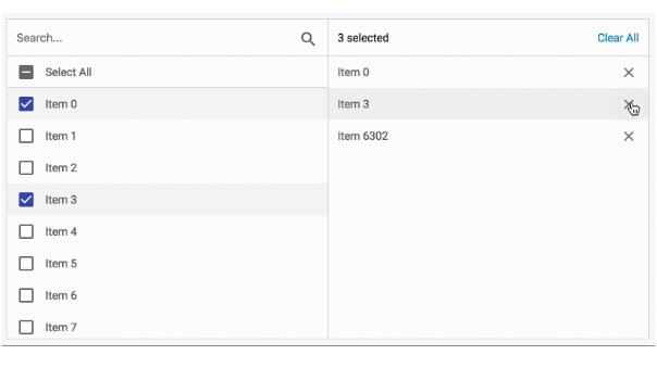
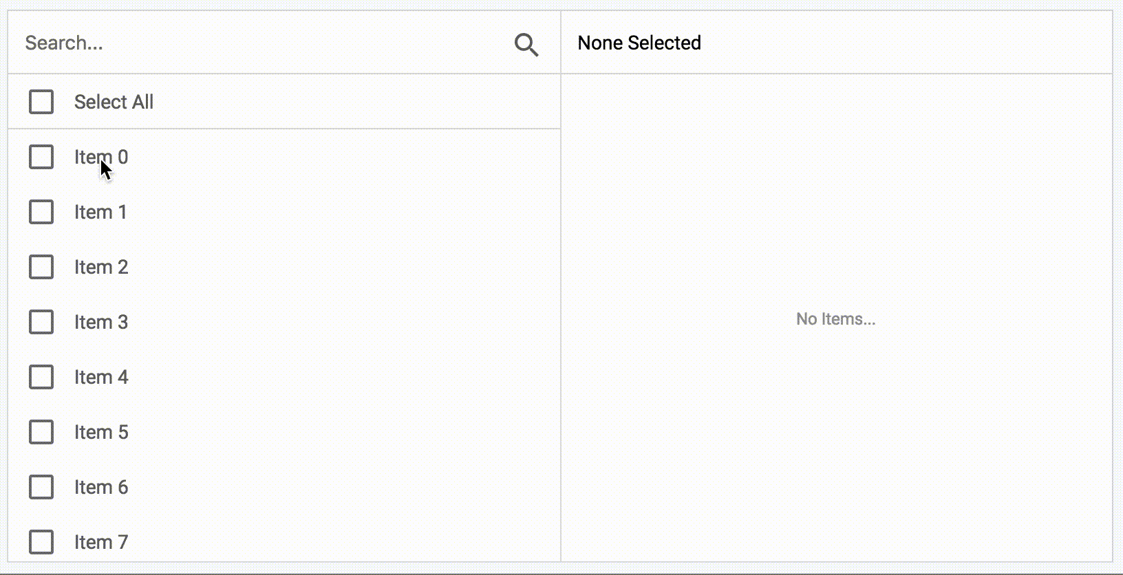
Multi select
Multi select is a straight forward component that helps a user select multiple items in a clear and filterable way.
Installation
Installation using npm:
npm install @kenshooui/react-multi-select --save
Installation using Yarn:
yarn add @kenshooui/react-multi-select
How to use
import React, { Component } from "react";
import MultiSelect from "@kenshooui/react-multi-select";

class Example extends Component {
  constructor(props) {
    super(props);
    this.handleChange = this.handleChange.bind(this);
    this.state = {
      items: [
        { id: 0, label: "item 1" },
        { id: 2, label: "item 2" },
        { id: 3, label: "item 3" },
        { id: 4, label: "item 4" }
      ],
      selectedItems: []
    };
  }

  handleChange(selectedItems) {
    this.setState({ selectedItems });
  }
  render() {
    const { items, selectedItems } = this.state;
    return (
      <MultiSelect
        items={items}
        selectedItems={selectedItems}
        onChange={this.handleChange}
      />
    );
  }
}
Properties
| Name | Type | Default | Description |
|---|---|---|---|
items |
List |
[] | list of items. |
selectedItems |
Array |
[] | selected list to start with (subgroup of items). |
onChange |
function |
()=>{} | callback for changed event. |
loading |
boolean |
false | toggle to show loading indication. |
messages |
Object |
{} | custom messages. Please see below for the availabale messages. |
showSearch |
boolean |
true | toggle to show search option. |
showSelectAll |
boolean |
true | toggle to show select all option in list. |
showSelectedItems |
boolean |
true | toggle to show selected items right pane. |
wrapperClassName |
String |
'' | wrapper class name - Used for customizing the style. |
height |
number |
400 | available items list height. |
itemHeight |
number |
40 | the height of an item in the list. |
selectAllHeight |
number |
itemHeight |
the height of the selectAll component, by default will use the value of the itemHeight. |
maxSelectedItems |
number |
defines the maximum items that can be selected, overrides showSelectAll. | |
filterFunction |
function |
based on label | The function used to filter items based on the search query. |
searchRenderer |
Component |
Component to replace the default Search component. | |
selectedItemRenderer |
Component |
Component to replace the default selected item component in the destination list. | |
loaderRenderer |
Component |
Component to replace the default loader component. | |
selectAllRenderer |
Component |
Component to replace the default select all component. | |
itemRenderer |
Component |
Component to replace the default item component in the source list. | |
selectionStatusRenderer |
Component |
Component to replace the default selection status component. | |
noItemsRenderer |
Component |
Component to replace the default no items component. |
Customization
Renderers
You can replace the renderers of the following components:
Item
Use the itemRenderer to replace the default component.
Each item receives the following props:
item - holds your item data
height - receives the height defined by the list
onClick - the event to toggle selection on the component
checked - indicates if the item is selected
indeterminate - used by the select all component to display indeterminate mode
disabled - defines if item should be disabled
Select All
Use the selectAllRenderer to replace the default component.
The SelectAll component receives the following props:
height - receives the height defined by the parent
onClick - Triggers the select all/clear all event on click
isAllSelected - Indicates that all items are selected
selectAllMessage - Defines the message for the SelectAll component
selectedIds - holds a list of ids of all the selected items
Selected Item
Use the selectAllRenderer to replace the default component.
The SelectedItem component receives the following props:
item - holds your item data
height - receives the height defined by the list
Search
Use the searchRenderer to replace the default component.
The Search component receives the following props:
searchPlaceholder - defines the message to display in the search placeholder
onChange - triggers the action of changing the search value
Selection Status
Use the selectionStatusRenderer to replace the default component.
The SelectionStatus component receives the following props:
selected - an array of all the selected ids
clearAll - callback to clear all selected items
clearAllMessage - text to display in the clear all text
noneSelectedMessage - text to display when no items are selected
selectedMessage - text to display when there are items selected
Loader
Use the loaderRenderer to replace the default component.
Does not receive any props.
No Items
Use the noItemsRenderer to replace the default component.
Does not receive any props.
Search Function
In order to accommodate complex item filters, you can provide your own filter method in the filterFunction prop.
Example (default):
value => item =>
  String(item.label)
    .toLowerCase()
    .includes(value.toLowerCase())
Performs search on server side
value => {
    callServer(value).then(items => this.setState({items}));
    // At the end return the expected method
    return item => true;
}
Messages
You can use your own messages. Here is the default messages object:
 messages: {
    searchPlaceholder: "Search...",
    noItemsMessage: "No Items...",
    noneSelectedMessage: "None Selected",
    selectedMessage: "delected",
    selectAllMessage: "Select All",
    clearAllMessage: "Clear All",
    disabledItemsTooltip: "You can only select 1 file"
  }