
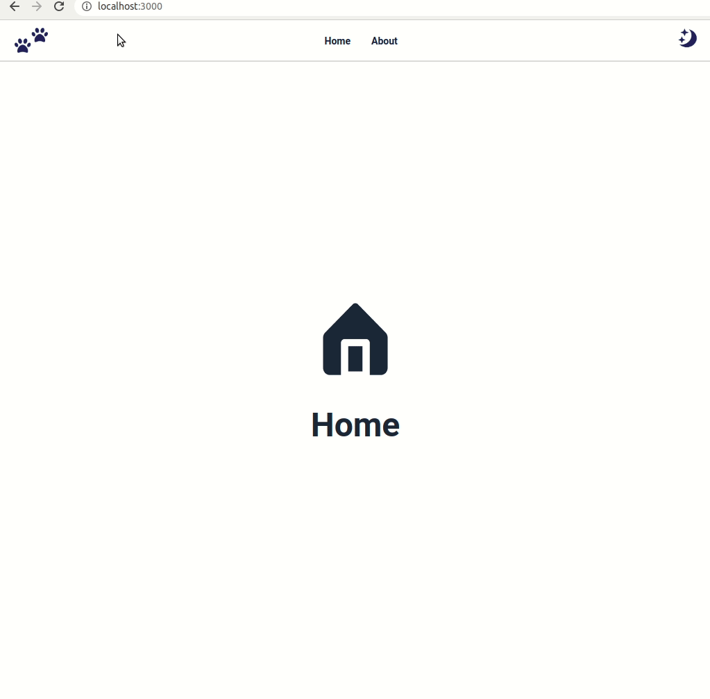
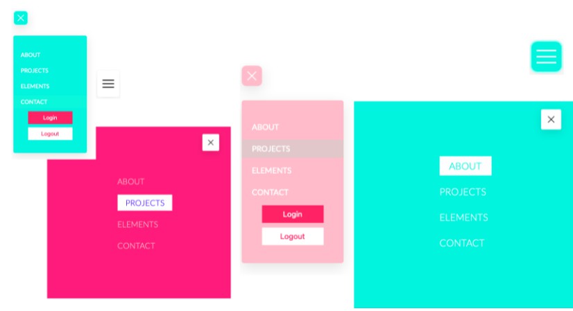
In this project, let’s build a Navbar with Context by applying the concepts we have learned till now.
Refer to the image below:
Design Files
Click to view
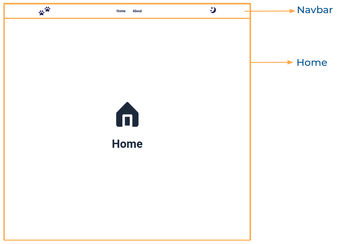
- Extra Small (Size < 576px) and Small (Size >= 576px) – Home
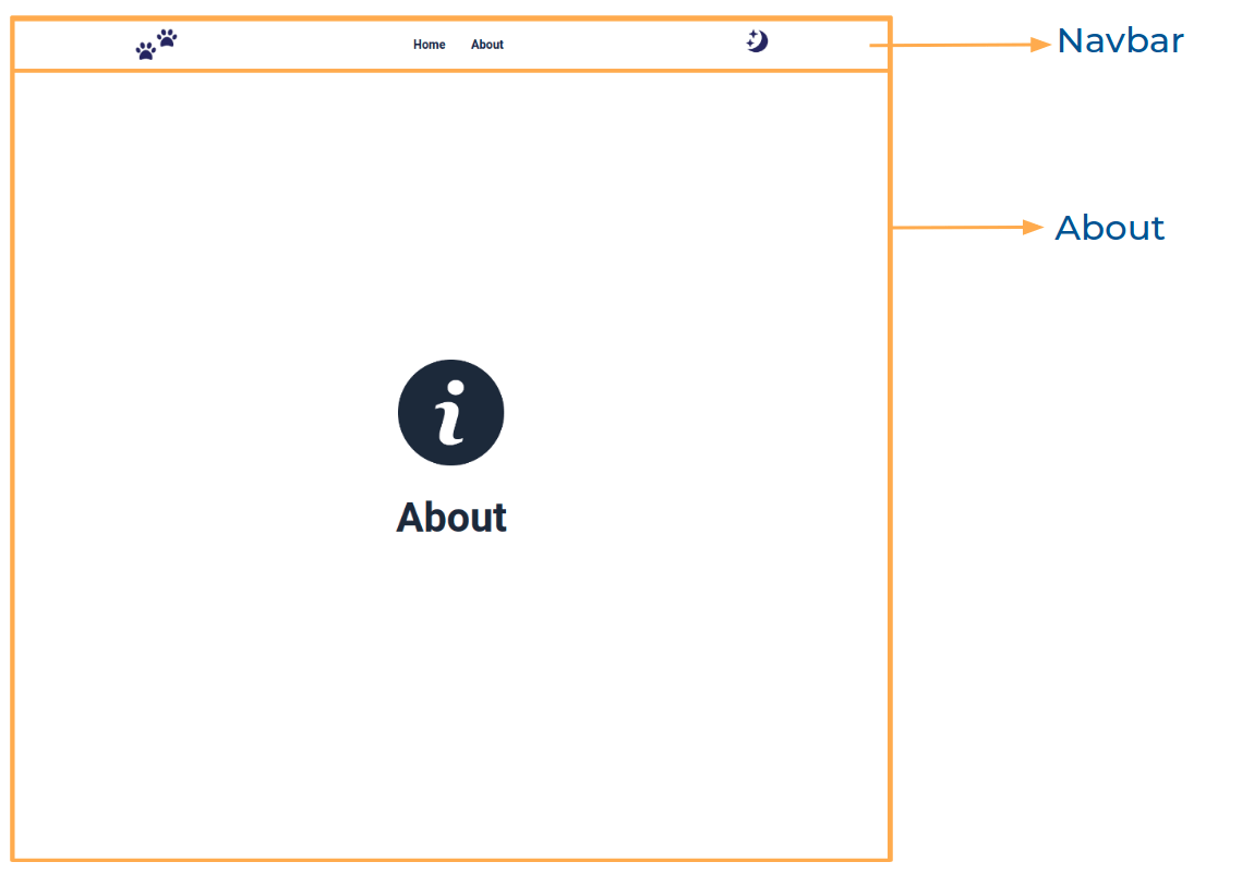
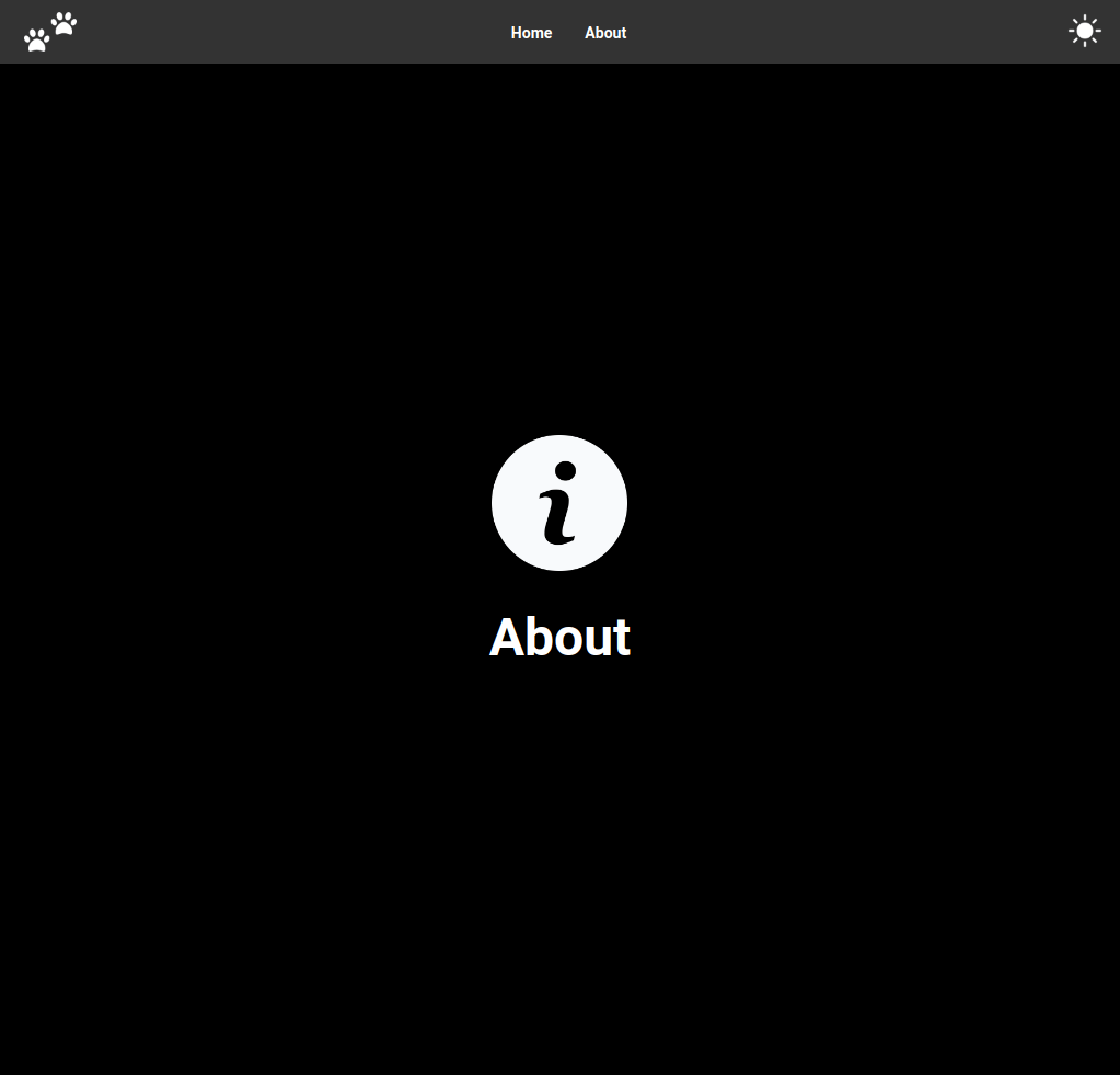
- Extra Small (Size < 576px) and Small (Size >= 576px) – About
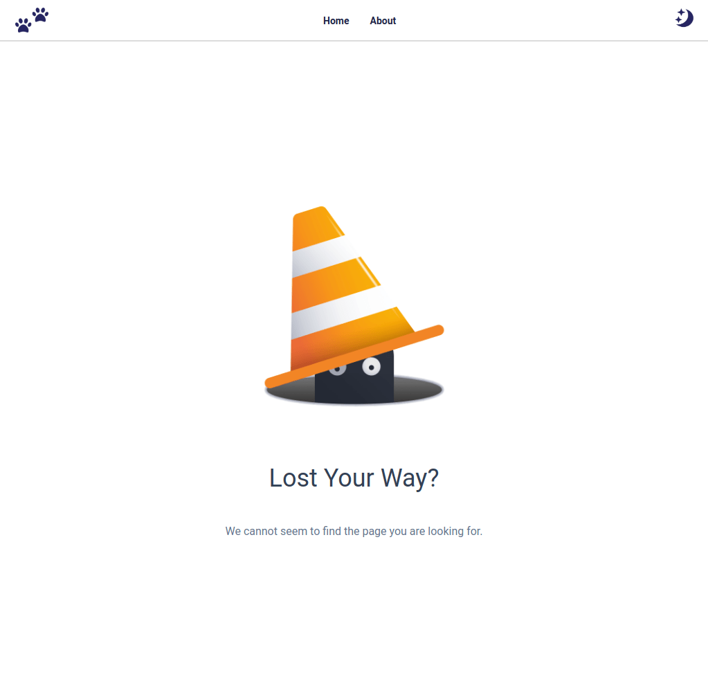
- Extra Small (Size < 576px) and Small (Size >= 576px) – Not Found
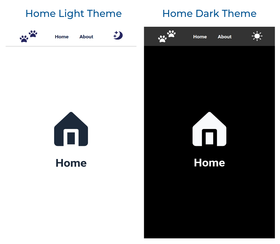
- Medium (Size >= 768px), Large (Size >= 992px) and Extra Large (Size >= 1200px) – Home Light Theme
- Medium (Size >= 768px), Large (Size >= 992px) and Extra Large (Size >= 1200px) – Home Dark Theme
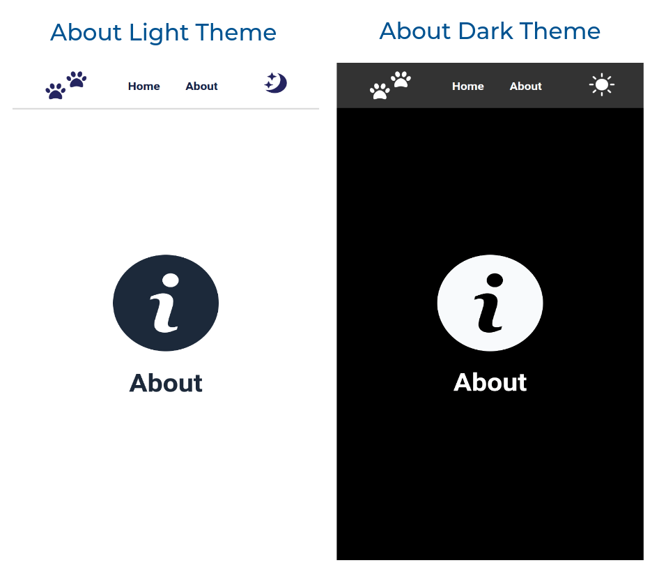
- Medium (Size >= 768px), Large (Size >= 992px) and Extra Large (Size >= 1200px) – About Light Theme
- Medium (Size >= 768px), Large (Size >= 992px) and Extra Large (Size >= 1200px) – About Dark Theme
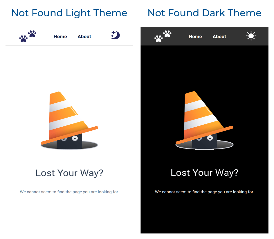
- Medium (Size >= 768px), Large (Size >= 992px) and Extra Large (Size >= 1200px) – Not Found Light Theme
- Medium (Size >= 768px), Large (Size >= 992px) and Extra Large (Size >= 1200px) – Not Found Dark Theme
Set Up Instructions
Click to view
- Download dependencies by running
npm install - Start up the app using
npm start
Completion Instructions
Functionality to be added
The app must have the following functionalities
- Initially, the app should consists of light theme
- When the dark theme image is clicked in the respective route
- The dark theme image should be changed to light theme image
- The app should be changed to dark mode
- when the light theme image is clicked in the Respective route
- The light theme image should be changed to dark theme image
- The app should be changed to light mode
- The Theme Context has an object as a value with the following properties
isDarkTheme– this key is used to change the themetoggleTheme– this method is used to update the value of theisDarkTheme
- When an undefined path is provided in the URL then the page should navigate to the NotFound Route
Components Structure
Implementation Files
Use these files to complete the implementation:
src/App.jssrc/components/Home/index.jssrc/components/Home/index.csssrc/components/About/index.jssrc/components/About/index.csssrc/components/Navbar/index.jssrc/components/Navbar/index.csssrc/components/NotFound/index.csssrc/components/NotFound/index.js
Important Note
Click to view
The following instructions are required for the tests to pass
- The Home image for light theme and dark theme should have the alt attribute value as
home - The About image for light theme and dark theme should have the alt attribute value as
about - The Website Logo image for light theme and dark theme should have the alt attribute value as
website logo - The Theme image for light theme and dark theme should have the alt attribute value as
theme - The Theme button should have the testid as
theme
Resources
Image URLs
-
https://assets.ccbp.in/frontend/react-js/about-light-img.png
-
https://assets.ccbp.in/frontend/react-js/website-logo-light-theme-img.png
-
https://assets.ccbp.in/frontend/react-js/website-logo-dark-theme-img.png
-
https://assets.ccbp.in/frontend/react-js/light-theme-img.png
-
https://assets.ccbp.in/frontend/react-js/not-found-img.png alt should be not found
Colors
Hex: #000000
Hex: #ffffff
Hex: #1e293b
Hex: #333333
Hex: #dcdcdc
Hex: #171f46
Hex: #334155
Hex: #64748b
Hex: #f8fafc
Font-families
- Roboto
Things to Keep in Mind
- All components you implement should go in the
src/componentsdirectory.- Don’t change the component folder names as those are the files being imported into the tests.
- Do not remove the pre-filled code
- Want to quickly review some of the concepts you’ve been learning? Take a look at the Cheat Sheets.