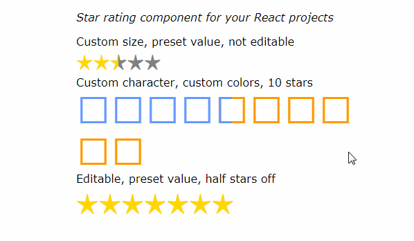
React Rating
React Rating is a react rating component which supports custom symbols both with inline styles and glyphicons found in popular CSS Toolkits like Fontawesome or Bootstrap.
This React component was inspired by the jQuery plugin bootstrap-rating.
Installation
You can install react-rating component using the npm package manager:
npm install --save react-rating
Dependencies
The react-rating component peer depends on the React library.
You can install React using npm too:
npm install --save react
Upgrade Warning
If you are using a version of React Rating < v1.0 be aware that there are API changes between anything < v1.0 and v1.0 . See the Properties and Deprecated Properties and Callbacks sections below for a documentation of the current API and how it compares to the old.
Usage
-
Require the Rating Component
var Rating = require('react-rating'); -
Start using it
With raw javascript:
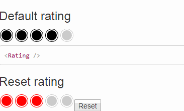
React.createElement(Rating)Or with JSX:
<Rating />
Properties
| Property | Type | Default | Description |
|---|---|---|---|
start |
number | 0 | Range starting value (exclusive). |
stop |
number | 5 | Range stop value (inclusive). |
step |
number | 1 | Describes how many values each Symbol represents. For example, for a start value of 0, a stop value of 10 and a step of 2, we will end up with 5 Symbols, with each Symbol representing value increments of 2. |
fractions |
number | 1 | Number of equal subdivisions that can be selected as a rating in each Symbol. For example, for a fractions value of 2, you will be able to select a rating with a precision of down to half a Symbol. Must be >= 1 |
initialRating |
number | 0 | The value that will be used as an initial rating. This is the old initialRate. |
placeholderRating |
number | 0 | If you do not define an initialRating value, you can use a placeholder rating. Visually, this will have the same result as if you had defined an initialRating value. If initialRating is set placeholderRating is not taken into account. This is the old placeholderRate |
readonly |
bool | false | Whether the rating can be modified or not. |
quiet |
bool | false | Whether to animate rate hovering or not. |
direction |
ltr or rtl | ltr | The direction of the rating element contents |
emptySymbol |
element or object or string or array | Style.empty | React element, inline style object, or classes applied to the rating symbols when empty. Can also be an array of such symbols that will be applied in a circular manner (round-robin). This is the old empty. |
fullSymbol |
element or object or string or array | Style.full | React element, inline style object, or classes applied to the rating symbols when full. Can also be an array of such symbols that will be applied in a circular manner (round-robin). This is the old full. |
placeholderSymbol |
element or object or string or array | Style.placeholder | React element, inline style object, or classes applied to the placeholder rating symbols. Can also be an array of such symbols that will be applied in a circular manner (round-robin). This is the old placeholder. |
Callbacks
| Callback | Type | Description |
|---|---|---|
onChange |
function (value) {} | Gets called with the value when you click on a different value than the currently set one. |
onHover |
function (value) {} | Gets called with the value when you hover over a symbol. The value is equal to the value that corresponds to that part of the symbol. Gets called in quiet mode too. When hover ends, gets called with no value (i.e. undefined as the value). |
Deprecated Properties and Callbacks
This is a list of deprecated properties and callbacks from versions older than v1.0
onClickonRateinitialRateplaceholderRateemptyfullplaceholder