Stickyroll
Stickyroll is the successor of react-over-scroll.
This project is maintained as a monorepo via lerna.
Stickyroll translates page scroll to paging and a progress timeline. The view uses position: sticky to remain in-view.
Render prop vs children
Stickyroll accepts the same function as a render property or child function.
props.children gives access to context based plugins and decorators
props.render is the lightweight version without context.
Event listeners
Stickyroll has 3 very basic listeners.
onStart(): void: fired when the start has been reached (undocked)onEnd(): void: fired when the end has been reached (undocked)onPage(currentPage: number): void: fired every time a page changes.currentPagehas a 0 based index. (docked)
More complex listeners can be implemented as Plugins using @stickyroll/decorators or @stickyroll/context
({Listener} is also available from @stickyroll/stickyroll)
Decorators (context based)
Stickyroll provides a set of decorators to allow injecting properties on-the-fly.
@page: injectspage: numberandpages: number@progress: injectsprogress: number
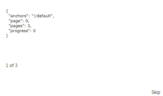
Example: page numbers
import {page} from "@stickyroll/decorators";
import React from "react";

@page
export default class Pagenumber extends React.Component {
	render() {
		return `${this.props.page + 1} of ${this.props.pages}`;
	}
}
Plugins
Stickyroll allows the creation and usage of plugins. With the help of context-aware
helpers it is easy to add a little spark to your roll.
Looking at Pagers is a good start to understand the plugin mechanism.
Styled components
Stickyroll provides styled components. It will remain fully optional to use styled-components since
the core is build purely on React and lodash.throttle
Available components
@stickyroll/pagers: Paging components to navigate to pages@stickyroll/inner: Content components to help with layout.@stickyroll/themes: A set of themes to use with styled-components
Examples
Example 1
roll.tsx
import React from "react";
import {Stickyroll} from "@stickyroll/stickyroll";

export default () => (
	<Stickyroll pages={5}>{({page, progress}) => `${page}:${progress}`}</Stickyroll>
);
Example 2
style.ts
import {createGlobalStyle} from "styled-components";

export const GlobalStyle = createGlobalStyle`
	body {
		margin: 0;
	}
	* {
		box-sizing: border-box;
	}
`;
app.tsx
import React from "react";
import {Stickyroll} from "@stickyroll/stickyroll";
import {Pagers, Skip} from "@stickyroll/pagers";
import {Inner} from "@stickyroll/inner";
import {GlobalStyle} from "./style";

const myContent = ["a", "b", "c", "d"];

export default class App extends React.Component {
	public render() {
		return (
			<React.Fragment>
				<GlobalStyle/>
				<Stickyroll pages={myContent} anchors={"!/examples"} onPage={p => {console.log(p)}}>
					{(context) => (
						<Inner withPagers={true}>
							<Pagers useContext={true}/>
							<pre>
								<code>
									{JSON.stringify({...context, content: myContent[context.page]}, null, 2)}
								</code>
							</pre>
							<Skip useContext={true}/>
						</Inner>
					)}
				</Stickyroll>
			</React.Fragment>
		);
	}
}
Development
To help develop Stickyroll follow these steps.
git clone [email protected]:stickyroll/react-stickyroll.git
cd react-stickyroll
yarn
For fast development use the dev script.
This will start a webpack dev-server on port:3000 and watch all packages.
Dev server (hot) (watches packages)
yarn dev
Build (production)
yarn build
Build packages
yarn rollup
Watch packages
yarn rollup:watch