LVD-FluentUi-MultiTextField
A multiple text field input component, built using the FluentUI library, with the following features:
- specify optional minimum, maximum and initial value count;
- controls for adding and removing input items;
- fine-grained control over input item configuration, including appearance and error message handling.
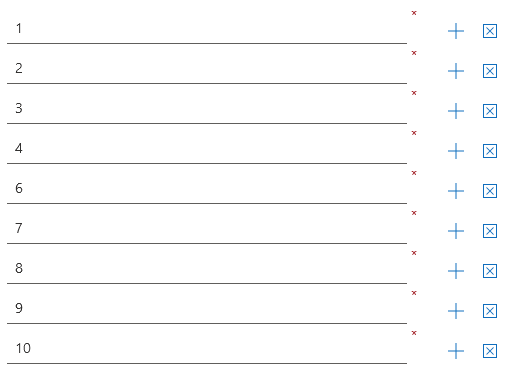
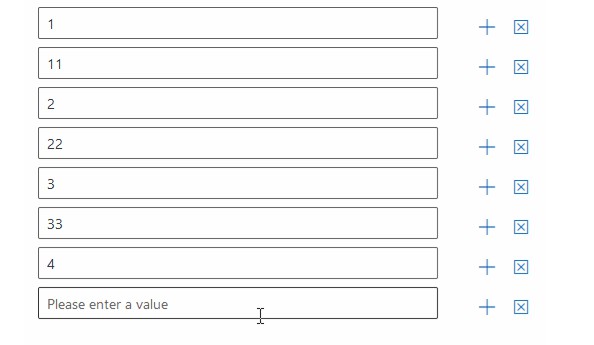
Also an animated demo which is configured for a minmum of 3 input items, a maximum of 10 and an initial count of 4.
Installation
npm install --save lvd-fluentui-multitextfield
Demo
The demo directory contains a compiled and ready-to-run example. Just open up the index.html file.
Basic Usage
import React from 'react';
import { MultiTextField } from 'lvd-fluentui-multitextfield';

class MultiTextFieldSamplePage extends React.Component {
	constructor(props) {
		super(props);

		this.state = {
			values: []
		};

		this._handleValuesChanged =
			this._handleValuesChanged.bind(this);
	}

	_handleValuesChanged(values) {
		// Do something with the values
		this.setState({
			values: values
		});
	}

	render() {
		return (
			<MultiTextField
				values={this.state.values}
				onChange={this._handleValuesChanged}
			/>
		);
	}
}
You can find a full working example here.
Styling
You can either directly include the dist/style.css into your html web page or use the @import directive inside your stylesheet if building using webpack:
@import '~lvd-fluentui-multitextfield/dist/style.css';
Also see the component itself.
Building
To build the demo application:
npm run build-app
To build the library:
npm run build-dist
To build both in one sitting:
npm run build
Customization Options
| What | Prop Name | Type | Notes |
|---|---|---|---|
| Set additional master container css class name | className |
string |
Defaults to null. |
| Set additional master inline css style properties | style |
object |
Key-value plain javascript object. Defaults to {}. |
| Set input label | label |
string |
Defaults to empty string. |
| Configure all input items | inputProps |
Input Items Configuration Object |
See below. |
| Configure the add input item action | addInputItemActionProps |
Add Input Action Configuration Object |
See below. |
| Configure the remove input item action | removeInputItemActionProps |
Remove Input Action Configuration Object |
See below. |
| Set minimum input item count | minItemCount |
Number |
Defaults to 1. |
| Set maximum input item count | maxItemCount |
Number |
Defaults to Number.MAX_SAFE_INTEGER. |
| Set initial input item count | initialItemCount |
Number |
Defaults to 1. Must be within specified minimum and maximum input item counts. |
| Set values | values |
string[] |
Defaults to an array of empty string values with the length equal to the specified initial item count. |
| Configure specific input item | onGetInputProps |
(itemValue:string, itemIndex:number): Input Items Configuration Object |
See below. |
| Get error message for specific input item | onGetInputItemErrorMessage |
(itemValue:string, itemIndex:number): string |
Return empty string if no error. By default, if the input item is required, but no error message is provided, the You must fill in a value message id displayed. |
| Get default value for specific input item | onGetDefaultInputItemValue |
(itemIndex:number): string |
Default value defaults to an empty string. |
Input Items Configuration Object
A plain javascript object with the following properties:
| Name | Type | Notes |
|---|---|---|
className |
string |
CSS class name for the actual input element. Defaults to null. |
style |
object |
Additional inline css style properties for the actual input element. Defaults to {}. |
label |
string |
Individual label for the input item. Defaults to null. |
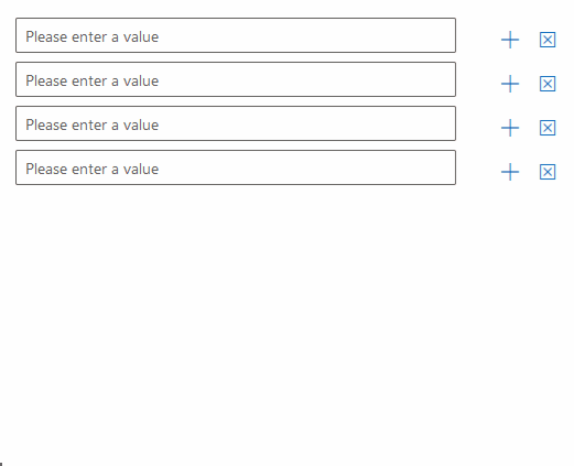
placeholder |
string |
Individual placeholder for the actual input element. Defaults to Please enter a value. |
description |
string |
Individual description for the actual input element. Defaults to null. |
required |
boolean |
Whether the actual input element is required or not. Defaults to false. |
underlined |
boolean |
Whether or not to display the actual input element in underlined style. Defaults to false. |
readOnly |
boolean |
Whether or not to make the actual input element read-only. Defaults to false. |
disabled |
boolean |
Whether or not to disable the actual input element. Defaults to false. |
borderless |
boolean |
Whether or not to make the actual input element borderless. Defaults to false. |
Add Input Action Configuration Object
A plain javascript object with the following properties:
| Name | Type | Notes |
|---|
Remove Input Action Configuration Object
A plain javascript object with the following properties:
| Name | Type | Notes |
|---|
Events
| Event | Prop Name | Arguments | Notes |
|---|---|---|---|
| Value added at index | onInputItemAdded |
(newValue:string, itemIndex:number) |
- |
| Value removed at index | onInputItemRemoved |
(removedValue:string, itemIndex:number) |
- |
| Input item focused | onInputItemFocus |
(itemIndex:number) |
Triggered when one of the underlying TextFields gains focus. |
| Input item lost focus | onInputItemBlur |
(itemIndex:number) |
Triggered when one of the underlying TextFields loses focus. |
| Value changed | onChange |
(values:string[]) |
Triggered when: a new input item is added, an existing input item is removed or the value of an existing input item is changed. |