react-styled-select
A Select control built with Reactjs, styled-components.
react-styled-select
Up to date with react/react-dom 16.2.0
ATTENTION: Work in Progress (sorry about that!)
This project was built with styled-components and is a "rethink" of the awesome project react-select. But what the differences between react-select and this project?
- Lightweight!
- It don`t force you to load any external css.
- Works with css-modules concept and not with global class names. Here has a good discussion about this problem (here).
- CSS Variables: Very easy to customize for your need.
- Shadow DOM: If you has or had problems with input fields globally stylized you can "encapsulate" your component using this awesome feature.
Installation
npm install react-styled-select --save
Example Usage
import React from 'react'
import Select from 'react-styled-select'

class MyComp extends React.Component {
  render() {
    const options = [
      { label: "One", value: 1},
      { label: "Two", value: 2},
    ]
    return (
      <Select
        options={options}
        onOpen={myOpenFunc}
        onChange={myChangeFunc}
        classes={{
          selectValue: 'my-custom-value',
          selectArrow: 'my-custom-arrow'
        }}
      />
    )
  }
}
Opptions
| Property | Type | Default | Description |
|---|---|---|---|
classes |
object | undefined |
You can specify className for each element. Possible values: selectArrow, selectArrowZone, selectClear, selectClearZone, selectControl, selectInput, selectInputField, selectMenu, selectMenuOuter, selectMultiValueWrapper, selectOption, selectPlaceholder, selectValue, selectValueLabel |
clearable |
bool | false |
should it be possible to reset value |
searchable |
bool | true |
whether to enable searching feature or not |
placeholder |
string | Select... |
The short hint is displayed in the input field before the user enters a value |
loadOptions |
function | undefined |
function that returns a promise or calls a callback with the options: function(input, [callback]) |
className |
string | undefined |
Root element className |
value |
any | undefined |
If you want to specify a pre selected value |
options |
array | [] |
List of values. Ex. [{"label": "Foo", value: "foo"}] |
onOpen |
function | undefined |
It calls when open outer menu |
onChange |
function | undefined |
It calls when change selected value |
onValueClick |
function | undefined |
It calls when click over a option value |
onInputClear |
function | undefined |
It calls when input is cleared |
valueRenderer |
function | undefined |
function which returns a custom way to render the value selected function (option) {} |
optionRenderer |
function | undefined |
function which returns a custom way to render the options in the menu (option) {} |
Async options (NEW)
Very similar with react-select API.
var getOptions = function(input, callback) {
  setTimeout(function() {
    callback(null, {
      options: [
        { value: 'one', label: 'One' },
        { value: 'two', label: 'Two' }
      ]
    });
  }, 500);
};

<Select.Async
    loadOptions={getOptions}
/>
Custom appearance with CSS Variebles
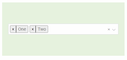
Multi Select (NEW)

Default

Customized

- Your react file ex.
MyForm.jsx
class MyForm extends React.Component {
  render() {
    return(){
      <Select className="dark-theme" options={[...]} />
    }
  }
}
- Your project CSS file ex.
mysite.css
.dark-theme {
  --styled-select-placeholder__color: #999;
  --styled-select__color: white;
  --styled-select__background-color: #555;
  --styled-select__border-color: black;
  --styled-select__border-width: 3px;
  --styled-select__border-radius: 5px;

  --styled-select-menu-outer__margin: 10px 0 0 0;
  --styled-select-menu-outer__padding: 0;
  --styled-select-menu-outer__background-color: #555;
  --styled-select-menu-outer__border-color: black;
  --styled-select-menu-outer__border-style: solid;
  --styled-select-menu-outer__border-width: 3px;

  --styled-select-option__background-color: #444;

  --styled-select-option__color--focused: #eee;
  --styled-select-option__background-color--focused: #333;

  --styled-select-option__color--selected: #eee;
  --styled-select-option__background-color--selected: #444;
}
Available CSS variables
--styled-select__background-color: #fff;
--styled-select__border-radius: 2px;
--styled-select__border-style: solid;
--styled-select__border-width: 1px;
--styled-select__color: #777;

--styled-select-arrow__color: #9b9ba5;
--styled-select-arrow__size: 8;

--styled-select-clear__color: #999;
--styled-select-clear__font-size: 14px;

--styled-select-control__border-color: #dcdce3;
--styled-select-control__border-color--focused: #40a3f5;
--styled-select-control__min-height: 36px;

--styled-select-input__height: 23px;
--styled-select-input__line-height: 23px;
--styled-select-input__padding: 0;

--styled-select-menu-outer__background-color: #fff;
--styled-select-menu-outer__border-color: #f0f0f5;
--styled-select-menu-outer__border-radius: 2px;
--styled-select-menu-outer__border-style: solid;
--styled-select-menu-outer__border-width: 1px;
--styled-select-menu-outer__box-shadow: 0 2px 4px rgba(0, 0, 0, 0.05);
--styled-select-menu-outer__margin: 5px 0 0 0;
--styled-select-menu-outer__max-height: 200px;
--styled-select-menu-outer__padding: 0;

--styled-select-menu__max-height: 198px;

--styled-select-multi-value-wrapper__padding: 3px 0 3px 5px;

--styled-select-multi-value__background-color: #eee;
--styled-select-multi-value__border: 1px solid #aaa;
--styled-select-multi-value__border--hover: 1px solid #777;
--styled-select-multi-value__border-radius: 3px;
--styled-select-multi-value__box-shadow: rgba(0,0,0,0.2) 0px 0px 3px;
--styled-select-multi-value__font-size: 0.9em;
--styled-select-multi-value__line-height: 1.4;
--styled-select-multi-value__margin: 2px 5px 2px 0;

--styled-select-no-results__color: #999;
--styled-select-no-results__font-family: Tahoma, Helvetica, Arial, sans-serif;
--styled-select-no-results__font-size: 14px;
--styled-select-no-results__padding: 8px 10px;

--styled-select-option__background-color: #fff;
--styled-select-option__background-color--focused: #f0f0f5;
--styled-select-option__background-color--selected: #ddd;
--styled-select-option__color--focused: #333;
--styled-select-option__color--selected: #333;
--styled-select-option__font-family: Tahoma, Helvetica, Arial, sans-serif;

--styled-select-placeholder__color: #d2d2d9;
--styled-select-placeholder__font-family: Tahoma, Helvetica, Arial, sans-serif;
--styled-select-placeholder__font-size: 12px;
--styled-select-placeholder__line-height: 34px;
--styled-select-placeholder__padding: 0 10px;

--styled-select-value-icon__background-color: transparent;
--styled-select-value-icon__background-color--hover: rgba(0, 0, 0, 0.1);
--styled-select-value-icon__font-family: arial;
--styled-select-value-icon__padding: 1px 5px;

--styled-select-value-label__font-family: Tahoma, Helvetica, Arial, sans-serif;
--styled-select-value-label__padding: 1px 6px;

--styled-select-value__color: Tahoma, Helvetica, Arial, sans-serif;
--styled-select-value__font-size: 14px;
--styled-select-value__line-height: 34px;
--styled-select-value__max-width: 100%;
--styled-select-value__overflow: hidden;
--styled-select-value__padding: 0 5px;
--styled-select-value__text-overflow: ellipsis;
--styled-select-value__white-space: nowrap;