react-color-picker
A React color picker component.
Install
NPM:
npm install @super-effective/react-color-picker
Yarn:
yarn add @super-effective/react-color-picker
Usage
Import the component:
import ReactColorPicker from '@super-effective/react-color-picker';
Render the component in your code:
<ReactColorPicker color={color} onChange={onColorChange} /
Props
| Prop | Type | Details |
|---|---|---|
className |
string |
The class name to put on the container div |
color |
string |
The initial/current selected color (hex value, e.g. #ff00ff) |
showSwatch |
bool |
Whether the selected color swatch should be displayed below the picker |
showHex |
bool |
Whether the hex value input should be displayed below the picker |
onChange |
func |
The callback function to be called when the color value changes |
Example
See the included example for reference
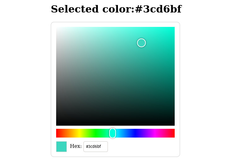
import React, { useState } from 'react';
import ReactColorPicker from '@super-effective/react-color-picker';

import styles from './App.module.scss';

const App = () => {
  const [color, setColor] = useState('#3cd6bf');

  const onColorChange = (updatedColor) => {
    setColor(updatedColor);
  };

  return (
    <div className={styles.app}>
      <h1>
        Selected color:
        {color}
      </h1>
      <div className={styles.color_picker}>
        <ReactColorPicker color={color} onChange={onColorChange} />
      </div>
    </div>
  );
};

export default App;