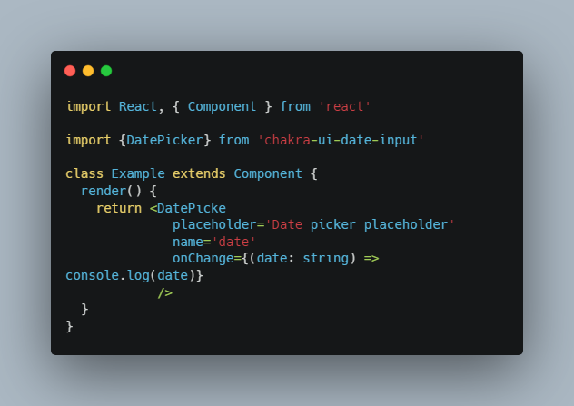
Datepicker
A simple datepicker component build with date-fns and Chakra-UI.
Requisites
You need to install date-fns and chakra-ui in order to use this library.
yarn add date-fns
yarn add @chakra-ui/react @emotion/react@^11 @emotion/styled@^11 framer-motion@^4
Installation and Usage
After install these dependencies you can now install the library and use this as below:
yarn add @uselessdev/datepicker
Before to use this you can create your own theme or use the default one.
import { ChakraProvider } from '@chakra-ui/react'
import { Calendar, CalendarDefaultTheme } from 'datepicker'

export function App() {
  const [dates, setDates] = useState()

  const handleSelectEndDate = (date) => setDates(dates => ({ ...dates, end: date }))
  const handleSelectStartDate = (date) => setDates(dates => ({ ...dates, start: date }))

  return (
    return (
      <ChakraProvider theme={CalendarDefaultTheme}>
        <Calendar
          values={dates}
          onSelectEndDate={handleSelectEndDate}
          onSelectStartDate={handleSelectStartDate}
        />
      </ChakraProvider>
    )
  )
}
note that the example above doens’t render an input but only the calendar
If you want to use this with inputs and a popover you can see this example
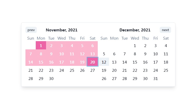
Customizing
You can fully customize the Calendar component using the extendTheme provided by chakra-ui, you can see an example below.
In your theme you can overrides the default theme (you can see all available components keys for theme customization here)
import { extendTheme } from '@chakra-ui/react'
import { CalendarDefaultTheme } from '@uselessdev/datepicker'

export const theme = extendTheme(CalendarDefaultTheme, {
  components: {
    Calendar: {
      parts: ['calendar'],

      baseStyle: {
        calendar: {
          borderWidth: '6px',
          borderColor: 'pink.400',
          rounded: 'none',
          shadow: 'none',
          boxShadow: '32px 16px 0 6px #3B4DCC'
        },
      },
    },

    CalendarControl: {
      parts: ['button'],

      baseStyle: {
        button: {
          h: 6,
          px: 2,
          rounded: 'none',
          fontSize: 'sm',
          color: 'white',
          bgColor: 'pink.400',

          _hover: {
            bgColor: 'pink.200',
          },

          _focus: {
            outline: 'none',
          },
        },
      },
    }
  },
})
Now you can use this theme in ChakraProvider:
import { ChakraProvider } from '@chakra-ui/react'
import { theme } from './theme'

function App() {
  return (
    <ChakraProvider theme={theme}>
      {/* children... */}
    </ChakraProvider>
  )
}
Theses changes will produce the following results in Calendar:

Available components theme keys
| Key name | Description | Parts |
|---|---|---|
| Calendar | Calendar is a multipart component this is reponsible for the calendar it self. | calendar, months |
| Month | Month is responsible to style one month block. | month, name, week, weekday, days |
| Day | Day apply styles to individual day. This is the only single part component. | — |
| CalendarControl | CalendarControl apply styles to prev and next months. | controls, button |
License
This code is under the Apache-2.0 License