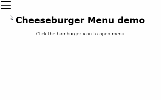
Cheeseburger Menu
This component provides the sliding menu only, not the hamburger button. For your button I'd suggest react-hamburger-menu.
Usage
Cheeseburger Menu has two required props, isOpen and closeCallback, plus a number of optional props described below. Your content should go inside as child components.
closeCallback will be called when the user taps out of the menu, or when they slide it closed.
Example:
import CheeseburgerMenu from 'cheeseburger-menu'

...

<CheeseburgerMenu isOpen={this.state.menuIsOpen} closeCallback={this.closeMenu}>
  <div className="my-menu-content">
    <ul>
      <li><Link to="/thing1" onClick={this.closeMenu}>Menu item 1</Link></li>
      <li><Link to="/thing2" onClick={this.closeMenu}>Menu item 2</Link></li>
    </ul>
  </div>
</CheeseburgerMenu>
Optional props
| name | type | default | description |
|---|---|---|---|
right |
bool | false |
If true, menu will slide in from the right (default is left) |
transitionTime |
number | 0.3 |
Slide in/out duration in seconds |
topOffset |
number or string | 0 |
Distance between the top of the viewport and the top of the menu (if you want the menu to appear beneath your header). Can be a number (of pixels) or any valid CSS length, e.g. '2em'. |
bottomOffset |
number or string | 0 |
Same as topOffset but for the bottom |
width |
number | 300 |
Menu width in pixels |
backgroundColor |
string | 'white' |
Background color for the menu |
noShadow |
bool | false |
If true, there will be no shadow at the edge of the menu |
skewY |
number | 0 |
Vertical skew in degrees |
className, overlayClassName, outerClassName, innerClassName, shadowClassName |
string | undefined |
Props for adding classes to the various elements |
Additional custom styling can be done with CSS.