react-data-table-component
A simple table library with built in sorting, pagination, selection, expandable rows and customizable styling.
React Data Table Component
Creating yet another React table library came out of necessity while developing a web application for a growing startup. I discovered that while there are some great table libraries out there, some required heavy customization, were missing out of the box features such as built in sorting and pagination, or required understanding the atomic structure of html tables.
If you want to achieve balance with the force and want a simple but flexible table library give React Data Table Component a chance. If you require an Excel clone or heavy "enterprise" capabilities, then this is not the React table library you are looking for ?
Key Features
- Declarative Configuration
- Built-in and configurable:
- Sorting
- Selectable Rows
- Expandable Rows
- Pagination
- Themeable/Customizable
- Accessibility
- Responsive (via x-scroll/flex)
Requirements
React Data Table Component requires the following be installed in your project:
- React 16.8.0+
- styled-components 3.2.3+ || 4.0.0+ || 5.0.0+
Installation
React Data Table utilizes the wonderful styled-components library. If you've already installed styled-components there is no need to install it again.
npm install react-data-table-component styled-components
or
yarn add react-data-table-component styled-components
Logging Issues and Contributions
Please use the github issue templates feature for logging issues or feature proposals. Including a codesandbox and providing clear details on the feature/issue will elicit a much quicker response ?
API and Usage
Columns
Nothing new here - we are using an array of object literals and properties to describe the columns:
| Property | Type | Required | Example |
|---|---|---|---|
| name | string, component or number | no | the display name of our Column e.g. 'Name' |
| selector | string or (row, index) => {} | no | a data set property in dot notation. e.g. property1.nested1.nested2 property1.items[0].nested2 or as a function e.g. row => row.timestamp. A selector is required anytime you want to display data but can be ommitted if your column does not require showing data (e.g. an actions column) |
| sortable | bool | no | if the column is sortable. Note: selector is required for the column to sort |
| sortFunction | function | no | custom sorting function e.g. (rowA, rowB) => rowA.myIndex - rowB.myIndex (see Array.prototype.sort()) |
| format | (row, index) => {} | no | apply formatting to the selector e.g. row => moment(row.timestamp).format('lll') without changing the actual selector value. |
| cell | (row, index, column, id) => {} | no | for ultimate control use cell to render your own custom component!e.g row => <h2>{row.title}</h2>. if you are using properties such as: onRowClicked, onRowDoubleClicked, expandOnRowClicked or expandOnRowDoubleClicked then those click events will be ignored when clicking on your custom cell. To allow RowClicked events you can add data-tag="allowRowEvents" to your custom cell component elements. If your custom cell component is more complex and has nested elements you want to add data-tag="allowRowEvents" to the innermost element or on the elements you want to propagate the click event to. e.g row => <h2 data-tag="allowRowEvents">{row.title}</h2> Note: that using cell negates format. |
| grow | number | no | flex-grow of the column. This is useful if you want a column to take up more width than its relatives (without having to set widths explicitly). this will be affected by other columns where you have explicitly set widths |
| width | string | no | give the column a fixed width |
| minWidth | string | no | give the column a minWidth |
| maxWidth | string | no | give the column a maxWidth |
| right | bool | no | right aligns the content in the cell. useful for numbers |
| center | bool | no | center aligns the content in the cell |
| compact | bool | no | sets cell padding to 0 |
| ignoreRowClick | bool | no | prevents the onRowClicked and onRowDoubleClicked event from being passed on the specific TableCell column. This is really useful for a menu or button where you do not want the onRowClicked triggered, such as when using onRowClicked for navigation or routing |
| button | bool | no | this is like ignoreRowClick except it will apply additional styling for button placement. you do not need to set ignoreRowClick when using button |
| wrap | bool | no | whether the cell content should be allowed to wrap. |
| allowOverflow | bool | no | allows content in the cell to overflow. useful for menus/layovers that do not rely on "smart" positioning |
| hide | integer or string preset (sm, md, lg) |
no | specify a screen size (breakpoint) as an integer (in pixels) that hides the column when resizing the browser window. You can also use the preset values of: sm (small), md(medium), and lg(large) |
| omit | bool | no | omits the column from the table. useful if you need to hide access to data. |
| style | object | no | allows you to customize the css of the cell using css-in-js style objects |
| conditionalCellStyles | array | no | allows an array of conditional style objects to conditionally apply css styles to a cell |
| id | string or number | no | in most cases you should not need to set a column id as RDT will auto generate one for each column. However, when developing an SSR app you may encounder an id did not match warning. In this case, you can explicitly set the id to fix the warning |
column.hide media presets
When the breakpoint is reached the column will be hidden. These are the built-in media breakpoint presets when hiding columns
| Value | Breakpoint | Description |
|---|---|---|
| sm | 599px | small (phones) |
| md | 959px | medium(landscape tablets) |
| lg | 1280px | large(laptops/desktops) |
DataTable Properties
Basic
| Property | Type | Required | Default | Description |
|---|---|---|---|---|
| title | string or component | no | The Title displayed in the Table Header | |
| columns | array<Columns> |
yes | [] | The column configuration |
| data | array<Object> |
no | [] | It's highly recommended that your data have a unique identifier (keyField). The default keyField is id. If you need to override this value then see keyField |
| keyField | string | no | 'id' | Your data should have a unique identifier. By default, React Data Table looks for an id property on each item in your data. You must match keyField to that identifier key, especially if you want to manage row state at a later time or use the expander feature. If a unique id is not present, React Data Table will attempt to use the row index and by reference checks as fallbacks, however, certain features will not work correctly. |
| striped | bool | no | false | stripe color the odd rows |
| highlightOnHover | bool | no | false | if rows are to be highlighted on hover |
| pointerOnHover | bool | no | false | if rows show a point icon on hover |
| noDataComponent | string or component | no | A custom component to display when there are no records to display | |
| className | string | no | override the className on the Table wrapper | |
| style | object | no | override the style on the Table wrapper | |
| responsive | bool | no | true | makes the table horizontally scrollable on smaller screen widths |
| disabled | bool | no | false | disables the Table section |
| onRowClicked | func | no | callback to access the row, event on row click. Note that if you are using custom cells ( column[].cell), you will need to apply the data-tag="allowRowEvents" to the innermost element or on the elements you want to propagate the onRowClicked event to. |
|
| onRowDoubleClicked | func | no | callback to access the row, event on row double click. Note that if you are using custom cells ( column[].cell), you will need to apply the data-tag="allowRowEvents" to the innermost element or on the elements you want to propagate the onRowDoubleClicked event to. |
|
| overflowY | bool | no | false | if a table is responsive, items such as layovers/menus/dropdowns will be clipped on the last row(s) due to to overflow-x-y behavior - setting this value ensures there is invisible space below the table to prevent "clipping". However, if possible, the correct approach is to use menus/layovers/dropdowns that support smart positioning. If used, the table parent element must have a fixed height or height: 100%. |
| overflowYOffset | string | no | 250px | used with overflowY to "fine tune" the offset |
| dense | bool | no | false | compacts the row height. can be overridden via theming rows.denseHeight. Note that if any custom elements exceed the dense height then the row will only compact to the tallest element any of your cells |
| noTableHead | bool | no | false | hides the the sort columns and titles (TableHead) - this will obviously negate sorting |
| persistTableHead | bool | no | Show the table head (columns) even when progressPending is true. Note that the noTableHead will always hide the table head (columns) even when using persistTableHead |
|
| direction | string | no | auto | Accepts: ltr, rtl, or auto. When set to auto (default), RDT will attempt to detect direction by checking the HTML and DIV tags. For cases where you need to force rtl, or ltr just set this option manually (i.e. SSR) |
Row Selection
| Property | Type | Required | Default | Description |
|---|---|---|---|---|
| selectableRows | bool | no | false | Whether to show selectable checkboxes |
| selectableRowsVisibleOnly | bool | no | false | When using using pagination and selectableRows all rows in data are selected by default if you check the select all rows checkbox. For example, if you have 20 rows and with pagination 10 rows per page clicking on the select all checkbox results in 20 rows being selected (i.e. rows are selected that are not in the view). However, with selectableRowsVisibleOnly only the 10 rows that are visible (those that are on the current page) are allowed to be selected using select all. Things to note when using selectableRowsVisibleOnly: 1. When you sort then selected items will be cleared 2. When using sortServer for server side sorting you do not need to set selectableRowsVisibleOnly as the behavior is implicit |
| selectableRowsHighlight | bool | no | false | Highlight a row when it is selected |
| selectableRowsNoSelectAll | bool | no | false | Whether to show the select all rows checkbox |
| clearSelectedRows | bool | no | false | Toggling this property clears the selectedRows. If you use redux or react state you need to make sure that you pass a toggled value or the component will not update. See Clearing Selected Rows |
| onSelectedRowsChange | func | no | Callback that fires anytime the rows selected state changes. Returns ({ allSelected, selectedCount, selectedRows }). Note It's highly recommended that you memoize the callback that you pass to onSelectedRowsChange if it updates the state of your parent component. This prevents DataTable from unnecessary re-renders every time your parent component is re-rendered |
|
| selectableRowsComponent | func | no | Override the default checkbox component - must be passed as a function (e.g. Checkbox not <Checkbox />). You can also find UI Library Integration examples here |
|
| selectableRowsComponentProps | object | no | Additional props you want to pass to selectableRowsComponent. See Overriding with Ui Component Library to learn how you can override indeterminate state |
|
| selectableRowSelected | func | no | Select a row based on a property in your data. e.g. row => row.isSelected. selectableRowSelected must return a boolean to determine if the row should be programatically selected. Note that changing the state of selectableRowSelected will NOT re-render RDT, instead you should change your data if you want to update the items that are selected. |
|
| selectableRowDisabled | func | no | Disable row select based on a property in your data. e.g. row => row.isDisabled. selectableRowDisabled must return a boolean to determine if the row should be programatically disabled. |
Row Expander
| Property | Type | Required | Default | Description |
|---|---|---|---|---|
| expandableRows | bool | no | false | Whether to make a row expandable, if true it requires an expandableRowsComponent. It is highly recommended your data set have a unique identifier defined as the keyField for row expansion to work properly. |
| expandableIcon | object | no | default expander icons | you may pass in your own custom icons using the expandableIcon: { collapsed: <svg>...</svg>, expanded: <svg>...</svg> |
| expandableRowExpanded | func | no | Expand a row based on a property in your data. e.g. row => row.expandMe. expandableRowExpanded must return a boolean to determine if the row should be programatically expanded. |
|
| expandableRowDisabled | func | no | Disable a row expand based on a property in your data. e.g. row => row.expandDisabled. expandableRowDisabled must return a boolean to determine if the row should be programatically disabled. |
|
| expandableRowsComponent | string or component | no | A custom component to display in the expanded row. It will have the data prop composed so that you may access the row data |
|
| expandOnRowClicked | bool | no | The default behavior is to expand the row when the expander button is clicked. expandOnRowClicked allows expanding the row when an area within the row is clicked. Requires expandableRows be set to true. Note: that if you are using custom cells ( column[].cell), you will need to apply the data-tag="allowRowEvents" to the innermost element or on the elements you want to propagate the expandOnRowClicked event to. |
|
| expandOnRowDoubleClicked | bool | no | The default behavior is to expand the row when the expander button is clicked. expandOnRowDoubleClicked allows expanding the row when an area within the row is double clicked. Requires expandableRows be set to true. Note: that if you are using custom cells ( column[].cell), you will need to apply the data-tag="allowRowEvents" to the innermost element or on the elements you want to propagate the expandOnRowDoubleClicked event to. t |
|
| expandableRowsHideExpander | bool | no | false | Do not render the expander button. This is useful when using expandOnRowClicked or expandOnRowDoubleClicked |
| onRowExpandToggled | func | false | When a row is Expanded or Collapsed onRowExpandToggled will fire and return (toggleState, row) |
|
| expandableInheritConditionalStyles | bool | no | false | Whether to apply conditionalRowStyles to the expander row |
Sorting
| Property | Type | Required | Default | Description |
|---|---|---|---|---|
| defaultSortField | string | no | setting this ensures the table data is presorted before it renders and the field(selector) is focused | |
| defaultSortAsc | bool | no | true | set this to false if you want the table data to be sorted in DESC order. Note: This will apply work when the table is initially loaded |
| sortIcon | component | no | override the default sort icon - the icon must be a font or svg icon and it should be a "downward" icon since animation will be handled by React Data Table | |
| onSort | func | no | callback to access the sort state when a column is clicked. returns (column, sortDirection, event) | |
| sortFunction | func | no | pass in your own custom sort function e.g. (rows, field, direction) => {...yourSortLogicHere}. Your function must return an new array reference, otherwise RDT will not "know" to re-render. For example, Array.sort sorts the array in place but because of JavaScript object equality it will be the same reference and will not re-render. A common pattern is to return yourArray.slice(0) which creates a new array. |
|
| sortServer | bool | no | false | disables internal sorting for use with server-side sorting or when you want to manually control the sort behavior. place your sorting logic and/or api calls in an onSort handler. Note: sortFunction is a better choice if you simply want to override the internal sorting behavior |
Pagination
| Property | Type | Required | Default | Description |
|---|---|---|---|---|
| pagination | bool | no | false | enable pagination with defaults. by default the total record set will be sliced depending on the page, rows per page. if you wish to use server side pagination then use the paginationServer property |
| paginationServer | bool | no | false | changes the default pagination to work with server side pagination |
| paginationServerOptions | object | no | { persistSelectedOnPageChange: false, persistSelectedOnSort: false } |
when using selectableRows is used to make selected rows persist on page change and on sort when using server side pagination. Note: when using persistSelectedOnPageChange that select all checkbox will not be visible (i.e. you cannot select rows there you have to retrieved from the server) |
| paginationDefaultPage | number | no | 1 | the default page to use when the table initially loads |
| paginationResetDefaultPage | bool | no | false | the prop can be "toggled" to reset the pagination back to paginationDefaultPage. For this to work make sure you are using some sort of state and toggling the prop. e.g. setResetPaginationToggle(!resetPaginationToggle) or for a class component setState(resetPaginationToggle: !resetPaginationToggle) |
| paginationTotalRows | number | no | 0 | allows you to provide the total row count for your table as represented by your API when performing server side pagination. if this property is not provided then react-data-table will use data.length |
| paginationPerPage | number | no | 10 | the default rows per page to use when the table initially loads |
| paginationRowsPerPageOptions | number | no | [10, 15, 20, 25, 30] |
row page dropdown selection options |
| onChangePage | func | no | null | callback when paged that returns onChangePage(page, totalRows) |
| onChangeRowsPerPage | func | no | null | callback when rows per page is changed returns onChangeRowsPerPage(currentRowsPerPage, currentPage) |
| paginationComponent | component | no | Pagination | a component that overrides the default pagination component. It must satisfy the following API: { rowsPerPage: PropTypes.number.isRequired, rowCount: PropTypes.number.isRequired, onChangePage: PropTypes.func.isRequired, onChangeRowsPerPage: PropTypes.func.isRequired, currentPage: PropTypes.number.isRequired }; |
| paginationComponentOptions | object | no | { rowsPerPageText: 'Rows per page:', rangeSeparatorText: 'of', noRowsPerPage: false, selectAllRowsItem: false, selectAllRowsItemText: 'All' } |
override options for the built in pagination component. Note that this prop only works with the built-in Pagination component |
| paginationIconFirstPage | no | JSX | a component that overrides the first page icon for the pagination. Note that this prop only works with the build in Pagination component* |
|
| paginationIconLastPage | no | JSX | a component that overrides the last page icon for the pagination. Note that this prop only works with the build in Pagination component* |
|
| paginationIconNext | no | JSX | a component that overrides the next page icon for the pagination. Note that this prop only works with the build in Pagination component* |
|
| paginationIconPrevious | no | JSX | a component that overrides the previous page icon for the pagination. Note that this prop only works with the build in Pagination component* |
Header
| Property | Type | Required | Default | Description |
|---|---|---|---|---|
| actions | component or array of components | no | add actions to the TableHeader | |
| noHeader | bool | no | false | Removes the table header. title, contextTitle and contextActions will be ignored |
| fixedHeader | bool | no | false | Makes the table header fixed allowing you to scroll the table body |
| fixedHeaderScrollHeight | string | no | 100vh | In order for fixedHeader to work this property allows you to set a static height to the TableBody. height must be a fixed value |
| subHeader | bool | no | false | Show a sub header between the table and table header |
| subHeaderAlign | string | no | right | Align the sub header content (left, right, center) |
| subHeaderWrap | bool | no | true | Whether the sub header content should wrap |
| subHeaderComponent | component or array of components | no | [] | A component you want to render |
Header Context Menu when using Selectable Rows
| Property | Type | Required | Default | Description |
|---|---|---|---|---|
| contextMessage | object | no | { singular: 'item', plural: 'items', message: 'selected' } |
override the context menu selected message when using selectableRows |
| contextActions | component or array of components | no | add context actions to the context menu when using selectableRows |
|
| contextComponent | bool | no | false | Overide the default context menu when using selectableRows with your own custom componet. RDT will compose the selectedCount prop to your custom component. This will negate contextMessage and contextActions |
| noContextMenu | bool | no | false | Do not display the context menu when using selectableRows |
Progress Indicator
| Property | Type | Required | Default | Description |
|---|---|---|---|---|
| progressPending | bool | no | Disables the table and displays a plain text Loading Indicator | |
| progressComponent | component | no | Allows you to use your own custom progress component. Note that in some cases (e.g. animated/spinning circular indicators) you will need to add a wrapping div with padding. |
Theming and Customization
| Property | Type | Required | Default | Description |
|---|---|---|---|---|
| theme | string | no | default | Possible values are default or dark |
| customStyles | object | no | styles.js for a detailed catalog of RDT styles that you can override or extend using css-in-js objects |
Dark Mode Theme
You can easily toggle to dark mode by setting theme="dark"
Defining Your Own Theme Using createTheme
You can create your very own theme using the createTheme helper.
Note that createTheme inherits from the default theme. Also, this theme will now be available to all DataTables across your project so you may want to define your custom themes in a seperate file.
Refer to themes.js for properties you can use to create your own color theme.
import DataTable, { createTheme } from 'react-data-table-component';

createTheme('solarized', {
  text: {
    primary: '#268bd2',
    secondary: '#2aa198',
  },
  background: {
    default: '#002b36',
  },
  context: {
    background: '#cb4b16',
    text: '#FFFFFF',
  },
  divider: {
    default: '#073642',
  },
  action: {
    button: 'rgba(0,0,0,.54)',
    hover: 'rgba(0,0,0,.08)',
    disabled: 'rgba(0,0,0,.12)',
  },
});

const MyComponent = () => (
  <DataTable
    title="Arnold Movies"
    columns={columns}
    theme="solarized"
  />
);
Overidding Styling using css-in-js
For more advanced use cases you can override or replace the default styling using the customStyles prop and passing in css-in-js. Internally, this just deep merges your customStyles with the default styling. Disclaimer: you're on your own here since you will have the power to not only cusotmize but break RDT. This is the sky's the limit escape hatch feature.
Let's apply a simple customStyles to override the default row height and change the cell padding:
import DataTable from 'react-data-table-component';

const customStyles = {
  rows: {
    style: {
      minHeight: '72px', // override the row height
    }
  },
  headCells: {
    style: {
      paddingLeft: '8px', // override the cell padding for head cells
      paddingRight: '8px',
    },
  },
  cells: {
    style: {
      paddingLeft: '8px', // override the cell padding for data cells
      paddingRight: '8px',
    },
  },
};

const MyComponent = () => (
  <DataTable
    title="Arnold Movies"
    columns={columns}
    customStyles={customStyles}
  />
);
View styles.js for a detailed catalog of RDT styles that you can override or extend using css-in-js objects.
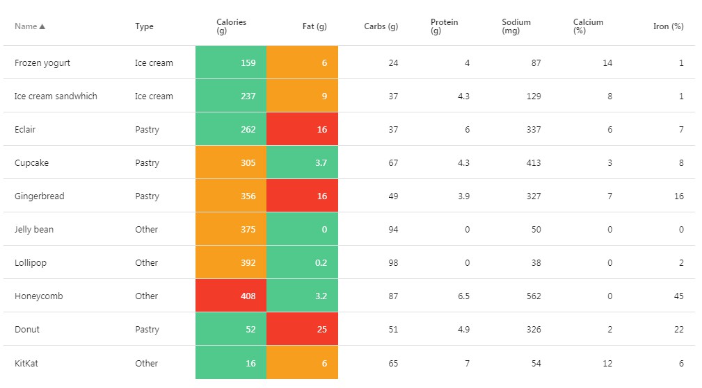
Conditional Row Styling
| Property | Type | Required | Default | Description |
|---|---|---|---|---|
| conditionalRowStyles | array | no | [] | Allows an array of conditional style objects |
Example
The following will style the background color of a row to green and set a hover effect when the expression row => row.calories < 300 evaluates to true
| Property | Type | Required | Example
...
const conditionalRowStyles = [
  {
    when: row => row.calories < 300,
    style: {
      backgroundColor: 'green',
      color: 'white',
      '&:hover': {
        cursor: 'pointer',
      },
    },
  },
  // You can also pass a callback to style for additional customization
  {
    when: row => row.calories < 300,
    style: row => ({
      backgroundColor: row.isSpecia ? 'pink' : 'inerit',
    }),
  },
];

const MyTable = () => (
  <DataTable
    title="Desserts"
    columns={columns}
    data={data}
    conditionalRowStyles={conditionalRowStyles}
  />
);
Conditional Style Object
| Property | Type | Required | Description |
|---|---|---|---|
| when | function | yes | when accepts a callback that gives you access to your row data. The when callback must return a boolean to determine if the style will be applied. e.g. row => row.status === 'completed' will apply the style when the row.status field is completed |
| style | object or (row) => object | yes | Accepts a css-in-js style object. Alternativly, you can also specify callback that has access to the row props. e.g. (row) => ({ backgroundColor: row.isSpecial ? 'pink' : inherit }) |
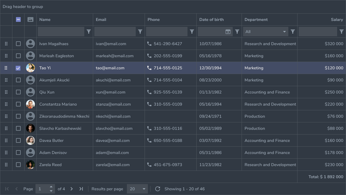
Basic Table
The following declarative structure creates a sortable table of Arnold movie titles:
import DataTable from 'react-data-table-component';

const data = [{ id: 1, title: 'Conan the Barbarian', year: '1982' } ...];
const columns = [
  {
    name: 'Title',
    selector: 'title',
    sortable: true,
  },
  {
    name: 'Year',
    selector: 'year',
    sortable: true,
    right: true,
  },
];

class MyComponent extends Component {
  render() {
    return (
      <DataTable
        title="Arnold Movies"
        columns={columns}
        data={data}
      />
    )
  }
};
Selectable Rows
Let's make our rows selectable so we can access the selected results
...

const handleChange = (state) => {
  // You can use setState or dispatch with something like Redux so we can use the retrieved data
  console.log('Selected Rows: ', state.selectedRows);
};

class MyComponent extends Component {
  render() {
      return (
        <DataTable
          title="Arnold Movies"
          columns={columns}
          data={data}
          selectableRows // add for checkbox selection
          Clicked
          Selected={handleChange}
        />
    )
  }
};
Clearing Selected Rows
We need some hook to trigger all the selectedRows to clear. If you were building your own table component, you would manage the selected rows state in some parent component, however, in our case, since we to keep row management within React Data Table, a clearSelectedRows prop is provided so you can pass a toggled state.
It will be up to you to make sure you do not pass the same state twice. For example, if you set clearSelectedRows={true} twice, on the second update/trigger, none the rows will not be cleared.
...
// set the initial state
state = { toggledClearRows: false }
...

const handleChange = (state) => {
  // You can use setState or dispatch with something like Redux so we can use the retrieved data
  console.log('Selected Rows: ', state.selectedRows);
};

// Toggle the state so React Table Table changes to `clearSelectedRows` are triggered
const handleClearRows = () => {
  this.setState({ toggledClearRows: !this.state.toggledClearRows})
}

class MyComponent extends Component {
  render() {
    return (
      <DataTable
        title="Arnold Movies"
        columns={columns}
        data={data}
        selectableRows // add for checkbox selection
        onSelectedRowsChange={handleChange}
        clearSelectedRows={this.state.toggledClearRows}
      />
    )
  }
};
Overriding with Ui Component Library
Don't like those ugly html checkboxes? Let's override them with some Material Ui sexiness. While we are at it we will also override the sortIcon:
...
import Checkbox from '@material-ui/core/Checkbox';
import ArrowDownward from '@material-ui/icons/ArrowDownward';

const sortIcon = <ArrowDownward />;
...

const MyComponent = () => (
  <DataTable
    title="Arnold Movies"
    columns={columns}
    data={data}
    selectableRows
    selectableRowsComponent={Checkbox} // Pass the function only
    selectableRowsComponentProps={{ inkDisabled: true }} // optionally, pass Material Ui supported props down to our custom checkbox
    sortIcon={sortIcon} // use a material icon for our sort icon. rdt will rotate the icon 180 degrees for you
    onSelectedRowsChange={handleChange}
  />
);
Using Custom Checkboxes and Indeterminate State
Sometimes UI Library checkbox components have their own way of handling indeterminate state. We don't want React Data Table hard coded to a specific ui lib or custom component, so instead a "hook" is provided to allow you to pass a function that will be resolved by React Data Table's internal Checkbox for use with indeterminate functionality.
Example Usage:
import Checkbox from '@material-ui/core/Checkbox';

...

/*
  In this example, the Material Ui ui lib determines its own indeterminate state via the `indeterminate` property.
  Let's override it using selectableRowsComponentProps`
*/
const selectProps = { indeterminate: isIndeterminate => isIndeterminate };

const MyComponent = () => (
  <DataTable
    title="Arnold Movies"
    columns={columns}
    data={data}
    selectableRows
    selectableRowsComponent={Checkbox} // Pass the function only
    selectableRowsComponentProps={selectProps}
  />
);
Note This is currently only supported for indeterminate state, but may be expanded in the future if there is a demand
Custom Cells
Let's give our Movie list a summary, but in the same cell as Name:
....

const data = [{ id: 1, title: 'Conan the Barbarian', summary: 'Orphaned boy Conan is enslaved after his village is destroyed...',  year: '1982' } ...];
const columns = [
  {
    name: 'Title',
    sortable: true,
    cell: row => <div data-tag="allowRowEvents"><div style={{ fontWeight: bold }}>{row.title}</div>{row.summary}</div>,
  },
  {
    name: 'Year',
    selector: 'year',
    sortable: true,
    right: true,
  },
];

...

class MyComponent extends Component {
  render() {
    return (
      <DataTable
        title="Arnold Movies"
        columns={columns}
        data={data}
        selectableRows
        selectableRowsComponent={Checkbox}
        selectableRowsComponentProps={{ inkDisabled: true }}
        sortIcon={<FontIcon>arrow_downward</FontIcon>}
        onSelectedRowsChange={handleChange}
      />
    )
  }
};
Expandable Rows
Let's make our rows expandable so we can view more details:
...

const data = [{ id: 1, title: 'Conan the Barbarian', summary: 'Orphaned boy Conan is enslaved after his village is destroyed...',  year: '1982', image: 'http://conan.image.png' } ...];
const columns = [
  {
    name: 'Title',
    sortable: true,
    cell: row => <div><div style={{ fontWeight: 700 }}>{row.title}</div>{row.summary}</div>,
  },
  {
    name: 'Year',
    selector: 'year',
    sortable: true,
    right: true,
  },
];

...

// The row data is composed into your custom expandable component via the data prop
const ExpandableComponent = ({ data }) => <img src={data.image} />;

class MyComponent extends Component {
  render() {
    return (
      <DataTable
        title="Arnold Movies"
        columns={columns}
        data={data}
        selectableRows
        selectableRowsComponent={Checkbox}
        selectableRowsComponentProps={{ inkDisabled: true }}
        sortIcon={<FontIcon>arrow_downward</FontIcon>}
        onSelectedRowsChange={handleChange}
        expandableRows
        expandableRowsComponent={<ExpandableComponent />}
      />
    )
  }
};
But in some cases we don't have more details to show:
...

const data = [{ id: 1, title: 'Conan the Barbarian', summary: 'Orphaned boy Conan is enslaved after his village is destroyed...',  year: '1982', expanderDisabled: true, image: 'http://conan.image.png' } ...];
const columns = [
  {
    name: 'Title',
    sortable: true,
    cell: row => <div><div style={{ fontWeight: 700 }}>{row.title}</div>{row.summary}</div>,
  },
  {
    name: 'Year',
    selector: 'year',
    sortable: true,
    right: true,
  },
];

...

// The row data is composed into your custom expandable component via the data prop
const ExpandableComponent = ({ data }) => <img src={data.image} />;

class MyComponent extends Component {
  render() {
    return (
      <DataTable
        title="Arnold Movies"
        columns={columns}
        data={data}
        selectableRows
        selectableRowsComponent={Checkbox}
        selectableRowsComponentProps={{ inkDisabled: true }}
        sortIcon={<FontIcon>arrow_downward</FontIcon>}
        onSelectedRowsChange={handleChange}
        expandableRows
        expandableRowDisabled={row => row.disabled}
        expandableRowsComponent={<ExpandableComponent />}
      />
    )
  }
};
UI Library Integration
React Data Table Component makes it easy to incorporate ui components from other libraries for overriding things like the sort icon, select checkbox.
Optimizing for Performance and Caveats
Pre-optimizaton can be the root of all evil, however, there are some best practices you can adhere to that will ensure React Data Table (RDT) is giving you the performance that you expect.
Passing non-primitive props (objects, arrays and functions)
While RDT has internal optimizations to try and prevent re-renders on deeper internal components, it's up to you to make sure that you understand how React manages rendering when props/state change as well as how JavaScript determines equality for non-primitives. As a general rule, or if you are experiencing performance issues you should ensure that any non-primitive props passed into RDT are not re-created on every render cycle. This is ever important when you have larger data sets or you are passing complex components and columns to DataTable.
Optimizing Class Components
You can typically achieve this by moving props such as objects, arrays, functions or other React components that you pass to RDT outside of the render method. For cases where you need to memoize memoize-one is a great library.
Examples of Optimizations
The following component will cause RDT to fully re-render every time onSelectedRowsChange is triggered. Why? Because when setState is called it triggers myComponent to re-render which by design triggers a re-render on all child components i.e. DataTable. But luckily for you React optimally handles this decision on when and how to re-render DataTable and a full re-render should not occur as long as DataTable props are the same.
However, in the example below columns changes on every re-render because it's being re-created. This is due to referential equality checking, simply: columns[] !== columns[]. In other words, while both instances of columns contain the same elements, they are "different" arrays.
Bad
...
import React, { Component } from 'react';
import DataTable from 'react-data-table';

class MyComponent extends Component {
  updateState = state => {
    this.setState({ selectedRows: state.selectedRows }); // triggers MyComponent to re-render with new state
  }

  render () { // by design runs on every setState trigger
    // upon re-render columns array is recreated and thus causes DataTable to re-render
    const columns = [....];

    return (
      <DataTable
        data={data}
        columns={columns}
        onSelectedRowsChange={this.updateState}
        selectableRows
      />
    )
  }
}
A "solution" could be to declare any field that is a non primitive field outside of the render function so that it does not get recreated on every re-render cycle:
Good
...
import React, { Component } from 'react';
import DataTable from 'react-data-table';

const columns = [....]; // is only created once

class MyComponent extends Component {
  updateState = state => {
    this.setState({ selectedRows: state.selectedRows });
  }

  render () {

    return (
      <DataTable
        data={data}
        columns={columns}
        onSelectedRowsChange={this.updateState}
        selectableRows
      />
    )
  }
}
But that only works if you don't need to pass component props/methods to the column object. For example what if you want to attach an event handler to a button in the row using column.cell?
const columns = [;
  {
    cell: () => <Button raised primary onClick={this.handleAction}>Action</Button>,
    ignoreRowClick: true,
    allowOverflow: true,
    button: true,
  },
  ...
];
So how do we attach event handlers to our columns without having to place it in the render method and dealing with unnecessary re-renders?
- Create a
columnsfunction and pass the arguments needed - Memoize the
columnsfunction
This way, when React checks if columns has changed columns will instead be the cached result (remember referential equality), thus no unnecessary re-render.
Got it? Let's try this again with the optimal solution using the wonderful memoization library memoize-one:
import React, { Component } from 'react';
import memoize from 'memoize-one';
import DataTable from 'react-data-table';

const columns = memoize(handleAction => [
  ...
  {
    cell: () => <Button raised primary onClick={handleAction}>Action</Button>,
    ignoreRowClick: true,
    allowOverflow: true,
    button: true,
  },
  ...
]);

class MyComponent extends Component {
  updateState = state => {
    this.setState({ selectedRows: state.selectedRows });
  }

  render () {
    return (
      <DataTable
        data={data}
        columns={columns(this.updateState)}
        onSelectedRowsChange={this.updateState}
        selectableRows
      />
    );
  }
}
Notice that this.updateState does not require memoization. That's because this.updateState is defined as a class method and therefore only created once. This however, is a different matter with functional components.
Optimizing Functional Components
If you're building functional components in React 16.8+ you get access to React Hooks such as useMemo and useCallback. In this example, simply wrap columns in a useMemo callback and your updateState into useCallback:
import React, { useState, useMemo } from 'react';
import DataTable from 'react-data-table';

const MyComponentHook = () => {
  const [thing, setThing] = useState();
  const handleAction = value => setThing(value);
  // unlike class methods updateState will be re-created on each render pass, therefore, make sure that callbacks passed to onSelectedRowsChange are memoized using useCallback
  const updateState = useCallback(state => console.log(state));
  const columns = useMemo(() => [
    ...
    {
      cell: () => <Button raised primary onClick={handleAction}>Action</Button>,
      ignoreRowClick: true,
      allowOverflow: true,
      button: true,
    },
    ...
  ]);

  return (
    <DataTable
      data={data}
      columns={columns}
      onSelectedRowsChange={updateState}
      selectableRows
    />
  );
}
CSS Overrides
If you would like to customize the layout components of React Data Table using styled-components (e.g. styled(DataTable)), or your favorite CSS, SCSS, LESS, etc.. pre-processor you may use the following classNames:
- rdt_Table
- rdt_TableRow
- rdt_TableCol
- rdt_TableCol_Sortable
- rdt_TableCell
- rdt_TableHeader
- rdt_TableFooter
- rdt_TableHead
- rdt_TableHeadRow
- rdt_TableBody
- rdt_ExpanderRow
Development
Setup
Install the latest Node JS LTS and Yarn and simply run yarn or yarn install command in the root and stories directory.
It is advised to run the script whenever NPM packages are installed.
Local development
During development:
# watch and build new source changes
yarn start
# or serve *.stories.js files and manually test on the Storybook app
yarn storybook
Including NPM packages
This project uses two package.json structure.**
Library dependencies -- <root_dir>/package.**json
yarn add [package-name] --dev # for dev tools
yarn add [package-name] # for app
Storybook dependencies -- <root_dir>/stories/package.json
cd stories/
yarn add [package-name]
Lint
yarn lint # runs linter to detect any style issues (css & js)
yarn lint:css # lint only css
yarn lint:js # lint only js
yarn lint:js --fix # tries to fix js lint issues
Test
yarn test:tdd # runs functional/unit tests using Jest with watcher
yarn test # runs functional/unit tests using Jest
yarn test --coverage # with coverage
Build
yarn build # builds sources at src/