 Highlightable Input
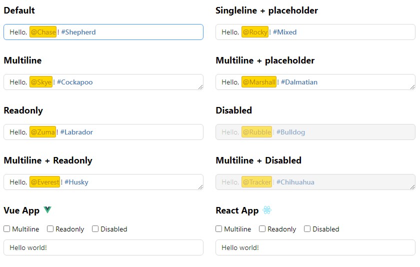
A simple yet fully stylable text field that highlights the text as you type.
Motivation
There are two main approaches to implement a highlightable text field:
- Use a
<textarea>to receive user input and synchronize the text entered by the user to an element with the exact same size, font size, etc. to provide style. - Use
contenteditable.
For the first approach, there are already great packages like inokawa/rich-textarea, but this approach has a major limitation: the styled text is not fully stylable. For example, you can’t use font-size or padding on the styled text.
For contenteditable elements, most implementations are full-featured rich text editors. I want something lighter. So this package utilizes contenteditable but only for highlighting texts.
Vanilla JS
Basic usage
import { setup } from 'highlightable-input'
import 'highlightable-input/style.css' // or add to `<link>` in HTML

const el = document.querySelector('highlightable-input')

const input = setup(el, {
  highlight: [
    /* highlight rules */
  ],
  onInput: ({ value }) => {
    console.log(value)
  }
})

// Please make sure to call `destroy` when leaving current view (eg. before route change in an SPA)
input.dispose()
<highlightable-input
  >Hello, <mark class="mention">@Ryder</mark></highlightable-input
>
API types
type Replacer = Parameters<typeof String.prototype.replace>[1]

interface HighlightRule {
  pattern: RegExp | string
  class?: string
  tagName?: string // default: mark
  style?: string
  replacer?: Replacer // eg. (match) => `<mark>${match}</mark>`
}

interface SetupOptions {
  highlight: HighlightRule | Array<HighlightRule> | ((value: string) => string) // use a function to fully customize the highlighting
  patch?: (el: HTMLElement, html: string) => void // used to customize the patching process, set `innerHTML` by default
  onInput?: ({ value }: { value: string; position: number }) => void
}

interface SelectOptions {
  force?: boolean
  collapse?: 'start' | 'end' | false
}

type SelectOffsets = [number, number] | number | true

declare function setup(
  el: HTMLElement,
  { onInput, highlight, patch }: SetupOptions
): {
  getValue(): string | null // get the value of the input
  setValue(value: string): void // set the text value of the input
  setSelection(offsets: SelectOffsets, options?: SelectOptions): void // set the selection offsets of the text content
  getSelection(): [number, number] // get the current selection offsets of the text content
  valueToRawHTML(value: string): string // convert text value to HTML according to the highlight rules
  dispose: () => void // to release global event listeners and inactivate the element
  refresh(): void // re-initialize the element
}
Note
The
highlightfunction or thereplaceroption shouldn’t change the length of the text (only wrap text with HTML tags).
Attributes
The setup function will respect certain attributes on the element. As we are not using the built-in <input> or <textarea> elements, we deliberately chose aria-* to carry default styles and behave as the declarative API so that we can keep the A11Y of this component to a high standard. The attributes should be self-explanatory.
aria-multilinearia-placeholderaria-readonlyaria-disabled
For example:
<highlightable-input
  aria-multiline="true"
  aria-placeholder="Type something..."
></highlightable-input>
Note
You should call
refreshafter these attribute change to update the behavior of the element.
Customizing patch
By default, the patch function will set the innerHTML after each keystroke. If you want to customize the patching process, you can pass a custom patch function to the setup function so that you can leverage the performance boost brought by DOM diffing libraries like diffhtml.
Styling
We have integrated themes from 11 different design systems in the highlightable-input package. You can import theme styles like this:
import 'highlightable-input/themes/light.css'
<highlightable-input data-theme="light"></highlightable-input>
Available themes:
light(Light Design)antd(Ant Design)arco(Arco Design)atlassian(Atlassian Design)bootstrap(Bootstrap)carbon(Carbon Design System)chakra(Chakra UI)fluent(Fluent UI)lightning(Lightning Design System)semi(Semi Design)spectrum(Spectrum Design System)
You can add more themes or refine current themes here.
You can also add your own theme in your own project:
highlightable-input[data-theme='custom'] {
  /* default styles */
}

highlightable-input[data-theme='custom'][aria-multiline='true'] {
  /* multiline styles */
}

highlightable-input[data-theme='custom'][aria-placeholder]::before {
  /* hidden placeholder styles */
}

highlightable-input[data-theme='custom'][aria-placeholder]:empty::before {
  /* visible placeholder styles */
}

highlightable-input[data-theme='custom']:hover {
  /* hover styles */
}

highlightable-input[data-theme='custom'][aria-readonly='true'] {
  /* readonly styles */
}

highlightable-input[data-theme='custom']:focus {
  /* focus styles */
}

highlightable-input[data-theme='light'][aria-disabled='true'] {
  /* disabled styles */
}
Vue component
Usage
<script setup>
import { ref } from 'vue'
import HighlightableInput from 'highlightable-input/vue'

const text = ref('Hello, @Chickaletta!')
const rules = [
  /* highlight rules */
]
</script>

<template>
  <highlightable-input v-model="text" :highlight="rules" />
</template>
Props
interface HighlightableInputProps {
  modelValue?: string
  highlight: HighlightRule | Array<HighlightRule> | ((value: string) => string)
  patch?: (el: HTMLElement, html: string) => void
  theme?: string
  multiline?: boolean
  placeholder?: string
  readonly?: boolean
  disabled?: boolean
}
Events
{
  'update:modelValue': (text: string) => void
}
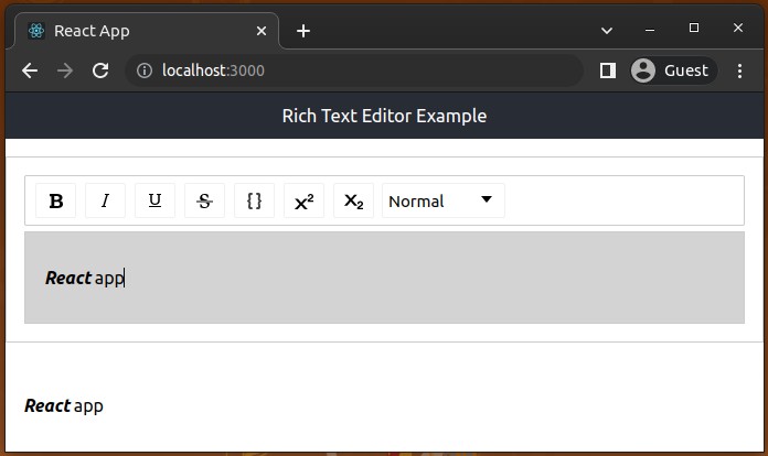
React component
Usage
import { useState } from 'react'
import HighlightableInput from 'highlightable-input/react'

export function App () {
  const [text, setText] = useState('Hello, @Chickaletta!')
  const rules = [
    /* highlight rules */
  ]

  return (
    <HighlightableInput
      value={text}
      onChange={setText}
      highlight={rules}
    />
  )
}
Props
interface HighlightableInputProps {
  value?: string
  highlight: HighlightRule | Array<HighlightRule> | ((value: string) => string)
  patch?: (el: HTMLElement, html: string) => void
  theme?: string
  multiline?: boolean
  placeholder?: string
  readonly?: boolean
  disabled?: boolean
  onChange?: (text: string) => void
}
Limitations
- Undo/redo are currently unavailable.