React Typescript Toggle
This is a react based toggle button component developed using Typescript.
Features
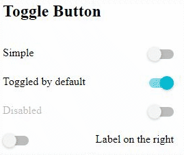
- [x] Pass the Label Value
- [ ] Pass Custom Style's
- [x] Pass Default value
- [x] Toggle Animation Effects
- [x] Label position - Left/Right
- [ ] Pass disabled mode Styles
Usage
Basic:
    interface Props extends React.Props<Toggle> {
        label: string;
        style: any;
    };

    const styles = {
      togglebutton: {
        marginBottom: 16
      }
    };

    <Toggle label="Simple" style={styles.togglebutton} />
The above example demonstrates the following:
How to pass custom label
How to pass custom style
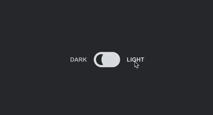
Shows the default checked, un-checked toggle icons
Further Customization
    const styles = {
      togglebutton: {
        marginBottom: 16
      }
    };

    <Toggle label="Custom icon" style={styles.togglebutton} uncheckedIcon={} checkedIcon={} />
The above example demonstrates the following:
How to pass custom label
How to pass custom style
How to pass custom icon's
Can use any svg-image as icons for checked, un-checked toggle icons
To install dependencies
npm install
To build the pages
npm start