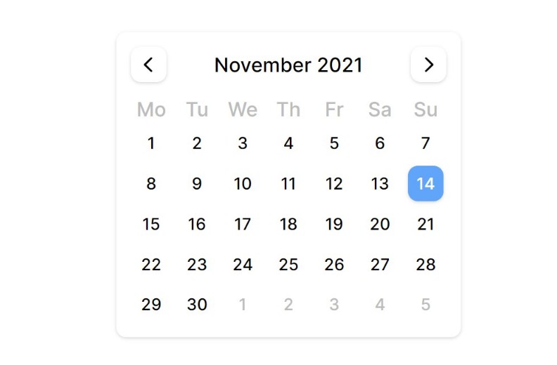
sassy-datepicker
Beautiful, minimal and accessible date-picker for react.

Installation
yarn add sassy-datepicker
# or
npm install sassy-datepicker
Usage
import DatePicker from 'sassy-datepicker';

function Example() {
  const onChange = (date) => {
    console.log(date.toString());
  };

  return (
    <DatePicker onChange={onChange} />
  );
}
Customization
Styles have been defined using CSS custom properties under the sdp CSS class, hence those properties will have to be changed for customization.
Note – You will have to use the !important directive to override the default styles
- Background Color for Selected Date (default #60a5fa)
.sdp {
  --theme-color: #8b5cf6 !important; /* violet color */
}
- Text Color for Selected Date (default #ffffff)
.sdp {
  --selected-date-color: #eeeeee !important; /* light-gray color */
}
- Font Family (default ‘Inter’)
.sdp {
  --font: 'Kollektif', sans-serif !important;
}