react-onboard
Onboard users with messages that highlight components. Fully customizable
react-onboard lets you easily present a set of messages that are associated with components in your app to the user. Messages don't show up until all related components are rendered at the same time and only one shows up at a time. Messages go away after a user has acknowledged them (i.e., clicked a highlight or hovered over it for more than a second). It interoperates with any way you show notifications and with any wrapper component to highlight components.
Install
npm install --save react-onboard
or
yarn add react-onboard
Usage
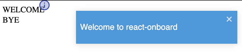
Below is a simple example using react-toastify for notifications and material-ui for component highlights.
import React from 'react'
import { ToastContainer, toast } from 'react-toastify'
import 'react-toastify/dist/ReactToastify.css'
import { Badge, BadgeProps } from '@material-ui/core'
import InfoTwoToneIcon from '@material-ui/icons/InfoTwoTone'
import { OnboardProvider, OnboardElement } from 'react-onboard'

export default function App() {
  const messages = [
    {
      id: 'welcomeMessage',
      children: <div>Welcome to react-onboard</div>,
      elementIds: ['welcome']
    },
    {
      id: 'byeMessage',
      children: <div>Bye-bye</div>,
      elementIds: ['bye']
    }
  ]

  return (
    <>
      <ToastContainer />
      <OnboardProvider
        messages={messages}
        showCallback={({ messageId, children, onAck }) => {
          toast.info(children, {
            autoClose: false,
            toastId: messageId,
            onClose: onAck
          })
        }}
        ackCallback={({ messageId }) => toast.dismiss(messageId)}
        HighlightComponent={
          (({ children, ...rest }) => (
            <Badge
              anchorOrigin={{
                vertical: 'top',
                horizontal: 'right'
              }}
              badgeContent={<InfoTwoToneIcon color='primary' />}
              {...rest}
            >
              {children}
            </Badge>
          )) as React.FC<BadgeProps>
        }
      >
        <OnboardElement id='welcome'>
          <div>WELCOME</div>
        </OnboardElement>
        <br />
        <OnboardElement id='bye'>
          <div>BYE</div>
        </OnboardElement>
      </OnboardProvider>
    </>
  )
}
API
OnboardProvider
| Prop | Type | Default | Description |
|---|---|---|---|
| messages | Array<{id: string, elementIds?: Array<string>, children: React.ReactNode}> | - | Onboard messages optionally highlighting related elements |
| showCallback | ({messageId: string, children: React.ReactNode, onAck: () => void}) => void | - | Function to call when a message is made active (This is where you actually show the message how you want) |
| ackCallback | ({messageId: string}) => void | - | Function to call when a message is acknowledged (This is where you hide the message you previously showed) |
| HighlightComponent | React.FC | - | A functional component that is wrapped around and draws visual attention to elements that are related to the message |
OnboardElement
| Prop | Type | Default | Description |
|---|---|---|---|
| id | string | - | A unique identifier for the element to be used in the elementIds field of related messages in OnboardProvider |
| ackOnClick | boolean | true | Whether to allow a related message to be acknowledged by the user clicking the element |
| ackOnMouseOver | number | 1000 | Number of milliseconds to acknowledge a related message after user has hovered on element for (0 to disable) |