React Treeview
Customizable Treeviewer built in react for visualizing hierarchical data.
Installing
npm install --save react-treeviewer
The fontawesome css file is not included so include it in your webpage:
<link href="https://maxcdn.bootstrapcdn.com/font-awesome/4.6.3/css/font-awesome.min.css" rel="stylesheet" />
Another tree viewer?
There are already multiple solutions out the for viewing hierarchical data but I found all existing libraries to be lacking in some manner. I wanted to be able to customize more than I could with the existing solutions.
Features
- Customize expand and collapse icons
- Add custom icons to each node
- Expand nodes by clicking text if selectable is not true.
- Draggable nodes.
- Double Click a node to expand or collapse all the children
- Test suite with 100% coverage
Coming soon
- Lazy loading node's children
- Live Examples
Basic Usage
import TreeView from  'react-treeviewer';
render: () {
    <TreeView
        data={data}
    />


}
TreeView Properties
animation
boolean
Turn animations on/off when expanding or collapsing a node.
--
selectable
boolean
Can nodes be selected? ( Selected nodes get the className: ad-selected-node )
--
onSelect(event, nodeData)
function
Callback executed when a node is selected
--
draggable
boolean
Can nodes be dragged?
--
onDrag(event, nodeData), onDragStart(event, nodeData), onDragEnd(event, nodeData)
functions
Callback functions associated with dragging a node.
--
onExpand(event, nodeData)
function
Callback function executed when a node is expanded.
--
onCollapse(event, nodeData)
function
Callback function executed when a node is collapsed.
onExpandAll(event, nodeData)
function
Callback function executed when all nodes are expanded or collapsed.
--
checkable
boolean
Adds checkboxes to each node.
--
onCheck(event, nodeData)
function
Callback executed when a node is checked
--
collapsedIcon
string
Fontawesome icon string to represent the collapsed node anchor
--
expandededIcon
string
Fontawesome icon string to represent the expanded node anchor
--
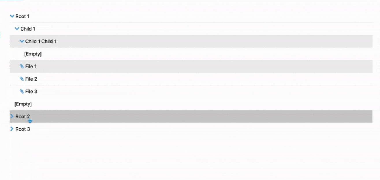
Data format
[{
    id:1,
    text:"Root",
    icon:"folder",
    expanded:false,
    children:[{
        id:3,
        selected: true,
        checked: false,
        text:"Child 1",
        iconObj: {
            name: 'rocket',
            size: '2x',
            spin: true,
            style: { color: 'red' }
        },
        children:[{id:5, text:"Grandchild 1"}]
        }
    ]
}]
Optional data properties
Add properties to each data node for more fine grained control.
icon
string
Fontawesome icon name.
--
iconObj
object
All properties in this object will be passed down to the icon. (This overrides the icon string property if present.)
expanded
boolean
Is the node expanded?
--
selected
boolean
Is the node selected?
--
checked
boolean
Is the node checked?