D3js force-directed graph on cloud file-sharing
We demo a graph of cloud file-sharing events in an organization over 1 day.
In our setting, we have two kinds of entities: users + files, and one kind of relationship: file sharing.
This can be generalized to more entities and relationships.
The original raw data was curated from real cloud activity log.
The data is anonymized. No real/actual user or file names are exposed.
Interactive Demo (can’t embed, so not on github)
Demo source code:
Graphical elements
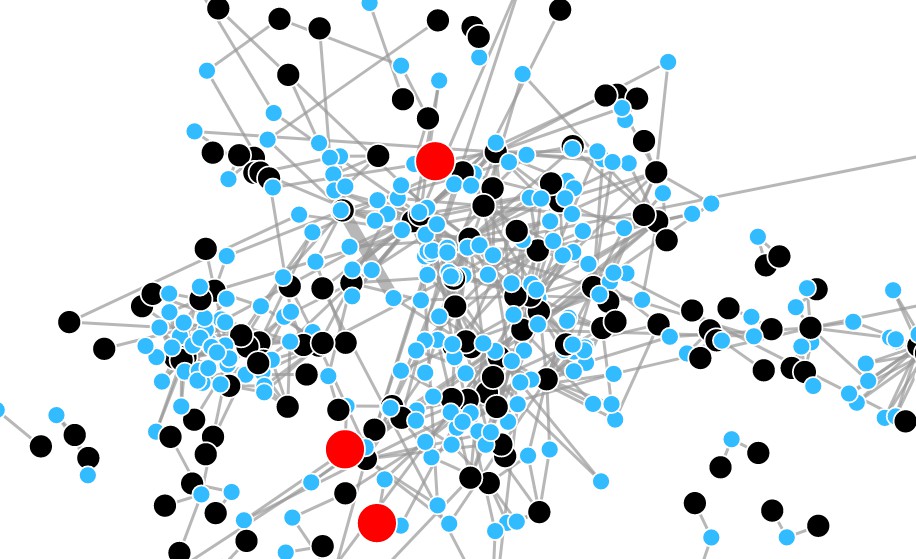
- Blue circles represent files
- Black circles represent users in an organization
- Red circles represent users outside the organization (email-id in another domain)
- Edges are always between a user and a (shared) file
- Thicker edges represent multiple sharing events
- Each user/file has a unique id and appears exactly once in the chart
- The entities (file, user) are what the forces act on
- The relations between the entities are the forces acting on entities
Interacting with the graph
- Hover over circles to see the (anonymized) user-ids or file-ids
- Click and drag any circle; the graph self-organizes again
- Try to untangle some knots
- Watch how the graph reacts when you release your mouse button
- Click & drag an isolated small sub-graph over a long distance
- Release & watch it settle in a new niche
What exactly is a self-directed graph?
The forces that make this graph self-organize are very much like the negative and positive charges in polar molecules, like water (H2O, 108 degrees angle between H-0-H):
- Opposite charges (a user & a file) attract each other
- Similar charges (two files, or two users) repel each other
The attraction & repulsion cause the chart to self organize into a minimum (potential) energy state.
Whenever disturbed, the graph settles into a new state of equilibrium.
Force related constants which affect the speed of settling into equilibrium, the friction or “stiffness” of the chart, and others, are configured in the code.
In a sense: the data computes itself into a picture that makes relationships very clear to the observer.
Think of it this way, without any sharing, all users are unrelated to each other. If two users share files among themselves, they are going to be globally attracted to these files and end up close to each other. But because users repel each other, the files end-up between the users that share them, plus the files will repel each other so they don’t all appear at one point.
In this particular demo, I made the repelling force for files be somewhat weaker than the repelling force between users because the number of files is larger than the number of users.
A picture is worth a 1000 words
A self-organizing picture, with which you can interact, becomes even more expressive.
The graph may tell many stories:
- Some users share much more than others
- Some small cliques of users as islands in the big picture
- Some users share files only one person
- Sub-graphs may represent sub-departments (or users who like to share with like minded colleagues)
- The red circles may hint of a potential ex-filtration of data
Credits
Mike Bostock, observablehq.com and all contributors to the D3js framework. All I did here is adapt one of their examples to a different dataset, separate the raw data from the code, and customize some parameters for better effect.