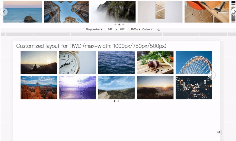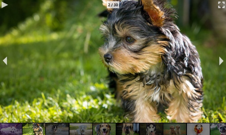
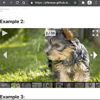
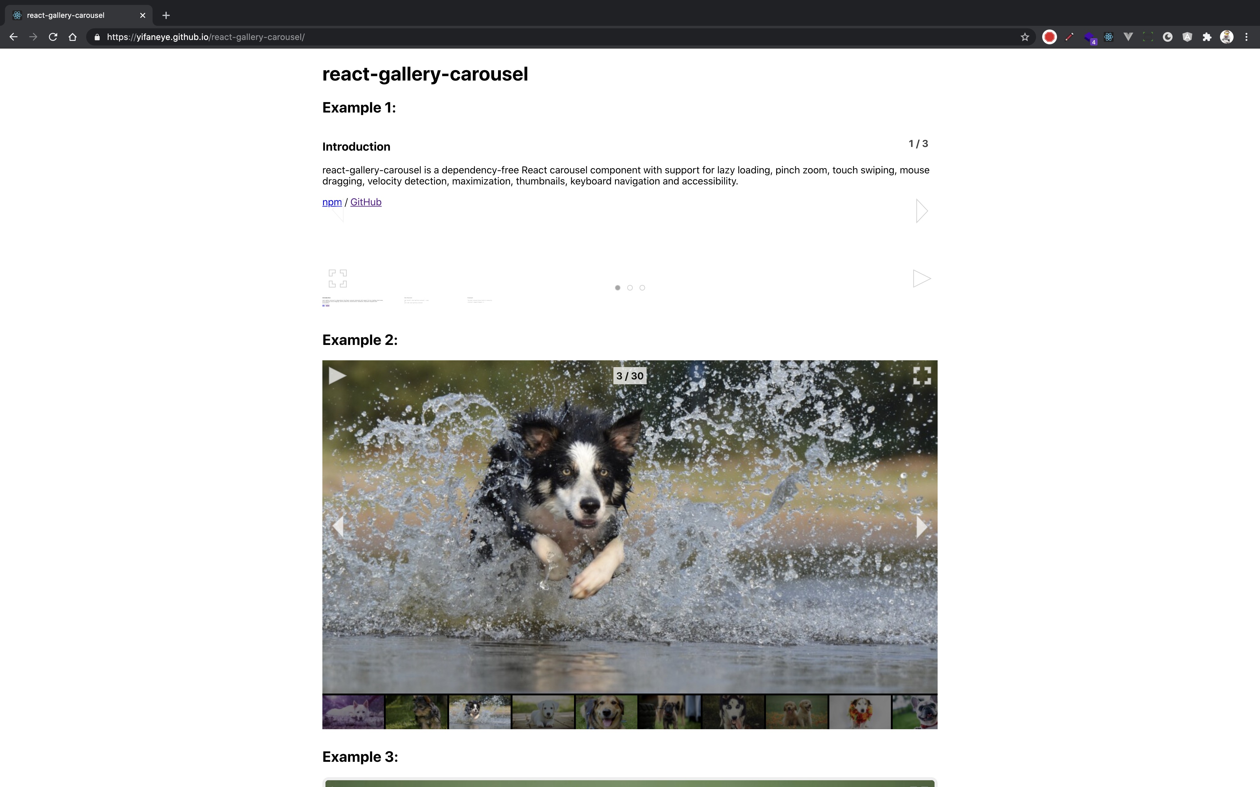
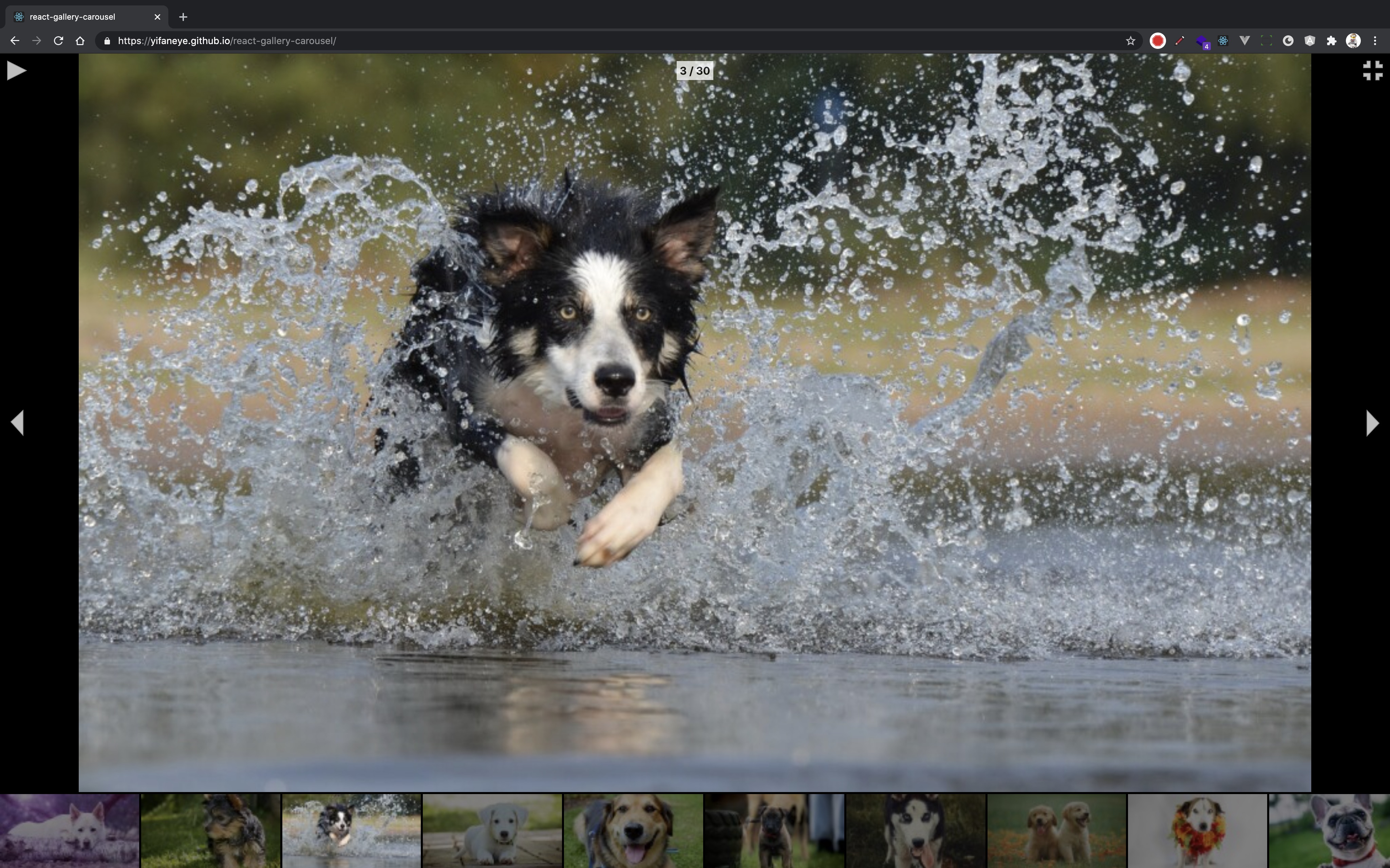
react-gallery-carousel
Dependency-free React carousel component with support for lazy loading, pinch zoom, touch swiping, mouse dragging, velocity detection, maximization, thumbnails, keyboard navigation and accessibility.
Install
npm install --save react-gallery-carousel
OR
yarn add react-gallery-carousel
Usage
import React from 'react';
import Carousel from 'react-gallery-carousel';
import 'react-gallery-carousel/dist/index.css';

const App = () => {
  const images = [900, 800, 700, 600, 500].map((size) => ({
    src: `https://placedog.net/${size}/${size}`
  }));

  return (
    <Carousel images={images} />
  );
};

export default App;
Props
To customize the carousel, use the following props:
| Name | Type | Default | Description |
|---|---|---|---|
| images | Array | undefined | Array of image(s) to be placed in the carousel. Each image object (e.g. example object) in the array has a required attribute 'src'. |
| children | node or Array of nodes | undefined | HTML element(s) to be placed into the carousel, but it (they) will be placed only if the 'images' prop is falsy. |
| index | Number | undefined | Current (0-indexed) index of the slides of the carousel as a whole number starting from 0. |
| isRTL | Boolean | false | If true, the slides of the carousel starts from the right (and also auto plays from the right to the left). |
| isLoop | Boolean | true | If true, the carousel form a loop (i.e. going left from the left-most slide lands at the right-most slide, and vice versa) from the ribbon of slides. |
| isMaximized | Boolean | false | If true, the carousel is maximized initially. |
| shouldLazyLoad | Boolean | true | If true, images that are not yet in the viewport of the carousel will be lazy loaded, except the 2 adjacent images from either side of the carousel which will be preloaded. |
| canAutoPlay | Boolean | true | If true, the carousel has auto play capability. |
| isAutoPlaying | Boolean | false | If true, the carousel auto plays initially. |
| autoPlayInterval | Number | 5000 | Interval of the auto play (in milliseconds). |
| hasTransition | Boolean | true | If false, the carousel does not have transition in moving between slides. |
| swipeThreshold | Number | 0.1 | Threshold swipe distance (in percentage of the width of the viewport of the carousel) to move to the previous or the next slide. |
| swipeRollbackSpeed | Number | 0.1 | Speed of the transition (in pixels per millisecond) in moving back to the current slide after a swipe smaller than swipeThreshold. |
| transitionSpeed | Number | 1 | Speed of the transition (in pixels per millisecond) in moving to the previous or the next slide on non-swipe updates on the carousel. |
| transitionDurationLimit | Number | 750 | Limit of transition duration (in milliseconds). The limit is used to flatten transition duration, where the maximum transition duration infinitely approaches this value. |
| transitionDurationMin | Number | 250 | Minimum transition duration (in milliseconds). Transition duration can be set to be a constant with transitionDurationMin === transitionDurationMax. |
| transitionDurationMax | Number | undefined | Maximum transition duration (in milliseconds). It will have precedence over transitionDurationMin, if transitionDurationMin > transitionDurationMax. |
| widgetsHasShadow | Boolean | false | If true, the following widgets (with *) have shadows. (Note: if true, the transition will tend to drop frames when there are a large number of slides.) |
| hasLeftButton * | Boolean or String | 'centerLeft' | If false, the carousel does not show left button. Its position can be specified by one of small widget positions. |
| hasRightButton * | Boolean or String | 'centerRight' | If false, the carousel does not show right button. Its position can be specified by one of small widget positions. |
| hasMediaButton * | Boolean or String | 'topLeft' | If false, the carousel does not show media button (i.e. play/pause button). Its position can be specified by one of small widget positions. If the value of 'canAutoPlay' is falsy, media button will not be shown on the carousel. |
| hasSizeButton * | Boolean or String | 'topRight' | If false, the carousel does not show size button (i.e. maximize/minimize button). Its position can be specified by one of small widget positions. |
| hasIndexBoard * | Boolean or String | 'topCenter' | If false, the carousel does not show index board (i.e. currentIndex / totalNumberOfSlides). Its position can be specified by one of small widget positions. |
| hasDotButtons * | Boolean or String | false | If false, the carousel does not show dot buttons (i.e. array of dots indicating the current slide in relation to other slides). Its position can be specified by one of large widget positions. |
| hasCaptions * | Boolean or String | false | If false, the carousel does not show caption for each image. Its position can be specified by one of large widget positions. |
| hasThumbnails | Boolean | true | If false, the carousel does not show thumbnails at the bottom. |
| hasLeftButtonAtMax * | Boolean or String | undefined | If false, the maximized carousel does not show left button. Its position can be specified by one of small widget positions. It overrides 'hasLeftButtons' prop for the maximized carousel. If not specified, the value of 'hasLeftButtons' will be used. |
| hasRightButtonAtMax * | Boolean or String | undefined | If false, the maximized carousel does not show right button. Its position can be specified by one of small widget positions. It overrides 'hasRightButtons' prop for the maximized carousel. If not specified, the value of 'hasLeftButtons' will be used. |
| hasMediaButtonAtMax * | Boolean or String | undefined | If false, the maximized carousel does not show media button (i.e. play/pause button). Its position can be specified by one of small widget positions. It overrides 'hasMediaButton' prop for the maximized carousel. If not specified, the value of 'hasMediaButton' will be used. If the value of 'canAutoPlay' is falsy, media button will not be shown on the maximized carousel. |
| hasSizeButtonAtMax * | Boolean or String | undefined | If false, the maximized carousel does not show size button (i.e. maximize/minimize button). Its position can be specified by one of small widget positions. It overrides 'hasSizeButton' prop for the maximized carousel. If not specified, the value of 'hasSizeButton' will be used. |
| hasIndexBoardAtMax * | Boolean or String | undefined | If false, the maximized carousel does not show index board (i.e. currentIndex / totalNumberOfSlides). Its position can be specified by one of small widget positions. It overrides 'hasIndexBoard' prop for the maximized carousel. If not specified, the value of 'hasIndexBoard' will be used. |
| hasDotButtonsAtMax * | Boolean or String | undefined | If false, the maximized carousel does not show dot buttons (i.e. array of dots indicating the current slide in relation to other slides). Its position can be specified by one of large widget positions. It overrides 'hasDotButtons' prop for the maximized carousel. If not specified, the value of 'hasDotButtons' will be used. |
| hasCaptionsAtMax * | Boolean or String | undefined | If false, the maximized carousel does not show caption for each image. Its position can be specified by one of large widget positions. It overrides 'hasCaptions' prop for the maximized carousel. If not specified, the value of 'hasCaptions' will be used. |
| hasThumbnailsAtMax | Boolean | undefined | If false, the maximized carousel does not show thumbnails at the bottom. It overrides 'hasThumbnails' for the maximized carousel. If not specified, the value of 'hasThumbnails' will be used. |
| leftIcon | node | undefined | Left icon (HTML element) to be placed into the left ArrowButton. |
| rightIcon | node | undefined | Right icon (HTML element) to be placed into the right ArrowButton. |
| playIcon | node | undefined | Play icon (HTML element) to be placed into the MediaButton. |
| pauseIcon | node | undefined | Pause icon (HTML element) to be placed into the MediaButton. |
| minIcon | node | undefined | Minimize icon (HTML element) to be placed into the SizeButton. |
| maxIcon | node | undefined | Maximize icon (HTML element) to be placed into the SizeButton. |
| activeIcon | node | undefined | Active dot icon (HTML element) to be placed into the active DotButton indicating the current slide. |
| passiveIcon | node | undefined | Passive dot icon (HTML element) to be placed into the passive DotButton indicating all non-current slide(s). |
| shouldSwipeOnMouse | Boolean | true | If true, the carousel can be swiped by the cursor using a mouse or a track pad. |
| shouldMaximizeOnClick | Boolean | false | If true, the carousel can be maximized by clicking. |
| shouldMinimizeOnClick | Boolean | false | If true, the carousel can be minimized by clicking. |
| shouldMinimizeOnSwipeDown | Boolean | true | If true, the carousel can be minimized by touch swiping down. |
| onIndexChange | Function | () => {} | Callback function invoked when the current index of the slides of the carousel is being updated. (Note: it is called regardless of whether index value's before and after are the same.) |
| objectFit | String | 'cover' | CSS 'object-fit' style to be placed on each image, on the non-maximized carousel. |
| objectFitAtMax | String | 'contain' | CSS 'object-fit' style to be placed on each image, on the maximized carousel. |
| zIndexAtMax | Number | undefined | CSS 'z-index' attribute to be placed on the maximized carousel. |
| className | String | undefined | Class name(s) to be placed on the non-maximized carousel. |
| style | Object | undefined | Inline style(s) to be placed on the non-maximized carousel. |
Local Development
- In a terminal tab, run rollup to watch the
src/directory and to automatically compile the local version ofreact-gallery-carouselinto thedist/directory.
yarn start
- In another terminal tab, run create-react-app dev server to serve the example in the
example/directory, which is dependent on the local version ofreact-gallery-carousel.
cd example
yarn start
(Note: it is not helpful to run either of these commands in the background, because you will miss out on errors and warnings.)
Definitions
- Developer users: developers who use this component.
- Users: end users of the products which use this component.
Image Object Example
{
  src: `https://placedog.net/700/420?id=1`, // required
  srcset: `https://placedog.net/400/240?id=1 400w, https://placedog.net/700/420?id=1 700w, https://placedog.net/1000/600?id=1 1000w`,
  sizes: '(max-width: 1000px) 400px, (max-width: 2000px) 700px, 1000px',
  alt: `Dogs are domesticated mammals, not natural wild animals. They were originally bred from wolves. They have been bred by humans for a long time, and were the first animals ever to be domesticated.`,
  thumbnail: `https://placedog.net/100/60?id=1`
}
Small Widget Positions
[
  'topLeft', 'topCenter', 'topRight',
  'centerLeft', 'centerCenter', 'centerRight',
  'bottomLeft', 'bottomCenter','bottomRight'
]
Large Widget Positions
['top', 'bottom']