React-Switch
A draggable toggle-switch component for React.


- Draggable with the mouse or with a touch screen.
- Accessible to visually impaired users and those who can't use a mouse.
- Customizable - Easy to customize size, color and more.
- Small package size - 2 kB gzipped.
- It Just Works - Sensible default styling. Uses inline styles, so no need to import a separate css file.
Installation
npm install react-switch
Usage
import React, { Component } from "react";
import Switch from "react-switch";
class SwitchExample extends Component {
constructor() {
super();
this.state = { checked: false };
this.handleChange = this.handleChange.bind(this);
}
handleChange(checked) {
this.setState({ checked });
}
render() {
return (
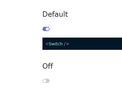
<label htmlFor="normal-switch">
<span>Switch with default style</span>
<Switch
onChange={this.handleChange}
checked={this.state.checked}
id="normal-switch"
/>
</label>
);
}
}
What's the deal with the label tag?
The Switch component in the above example is nested inside a label tag. The label tag has an htmlFor-value that is identical to the id-value that is passed to the Switch ("normal-switch").
These features are there to make the toggle-switch accessible to people with reduced sight who use screen readers. It will make screen readers read out the label text when the toggle-switch is selected. If you instead just put some text next to the switch, the screen reader will just read out "checkbox - not checked" or something like that and the user will have no idea what it is for. (The switch is actually a checkbox under the hood.)
It's not strictly necessary to both nest the switch inside the label AND use the htmlFor prop to link the label and the switch. It should be enough to do just one. However, using both will "cover 100% of assistive devices" and free you from annoying eslint errors.
Alternatively, you can use the aria-labelledby or aria-label props to give the switch a label. You can see examples of this at the bottom of the demo page.
API
| Prop | Type | Default | Description |
|---|---|---|---|
| checked | bool | Required | If true, the switch is set to checked. If false, it is not checked. |
| onChange ([checked], [event], [id]) | func | Required | Invoked when the user clicks or drags the switch. It is passed three arguments: checked, which is a boolean that describes the presumed future state of the checked prop (1), the event object (2) and the id prop (3). |
| disabled | bool | false | When disabled, the switch will no longer be interactive and its colors will be greyed out. |
| offColor | string | '#888' | The switch will take on this color when it is not checked. Only accepts hex-colors. |
| onColor | string | '#080' | The switch will take on this color when it is checked. Only accepts hex-colors. |
| offHandleColor | string | '#fff' | The handle of the switch will take on this color when it is not checked. Only accepts hex-colors. |
| onHandleColor | string | '#fff' | The handle of the switch will take on this color when it is checked. Only accepts hex-colors. |
| handleDiameter | number | undefined | The diameter of the handle, measured in pixels. By default it will be 2 pixels smaller than the height of the switch. |
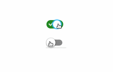
| uncheckedIcon | element or bool | Default value | An icon that will be shown on the switch when it is not checked. Pass in false if you don't want any icon. |
| checkedIcon | element or bool | Default value | An icon that will be shown on the switch when it is checked. Pass in false if you don't want any icon. |
| boxShadow | string | undefined | The default box-shadow of the handle. You can read up on the box-shadow syntax on MDN. |
| activeBoxShadow | string | '0 0 2px 3px #3bf' | The box-shadow of the handle when it is active or focused. Do not set this to null, since it is important for accessibility. |
| height | number | 28 | The height of the background of the switch, measured in pixels. |
| width | number | 56 | The width of the background of the switch, measured in pixels. |
| className | string | undefined | Set as the className of the outer shell of the switch. Useful for positioning the switch. |
| id | string | undefined | Set as an attribute to the embedded checkbox. This is useful for the associated label, which can point to the id in its htmlFor attribute. |
| aria-labelledby | string | undefined | Set as an attribute of the embedded checkbox. This should be the same as the id of a label. You should use this if you don't want your label to be a <label> element |
| aria-label | string | undefined | Set as an attribute of the embedded checkbox. Its value will only be seen by screen readers. |
The following props have to be either 3-digit or 6-digit hex-colors:
offColor, onColor, offHandleColor, and onHandleColor. This is because this library calculates intermediate color values based on the hex-color strings.
Examples of valid colors: '#abc', '#123456'
Examples of invalid colors: 'red', 'rgb(0,0,0)'
Development
You're welcome to contribute to react-switch.
To set up the project:
- Fork and clone the repository
$ npm install$ npm run dev
The demo page will then be served on http://localhost:8000/ in watch mode, meaning you don't have refresh the page to see your changes.