react-input-switch
React toggle switch component.
Installation
npm install react-input-switch --save
yarn add react-input-switch
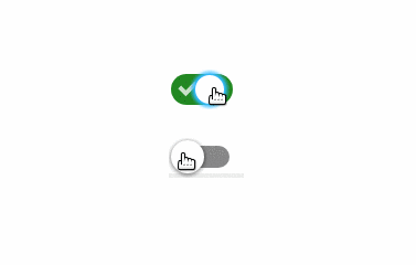
Custom styles
<Switch
  styles={{
    track: {
      backgroundColor: 'blue'
    },
    trackChecked: {
      backgroundColor: 'red'
    },
    button: {
      backgroundColor: 'yellow'
    },
    buttonChecked: {
      backgroundColor: 'blue'
    }
  }}
/>
Controlled example (with hook)
import React, { useState } from 'react';
import Switch from 'react-input-switch';

const App = () => {
  const [value, setValue] = useState(0);

  return <Switch value={value} onChange={setValue} />;
};
Custom on/off value
The default on/off value is 1/0 and default value is 1. This component will also render a hidden input (<input type="hidden"/>) with current value and the name prop.
import React, { useState } from 'react';
import Switch from 'react-input-switch';

const App = () => {
  const [value, setValue] = useState('yes');

  return <Switch on="yes" off="no" value={value} onChange={setValue} />;
};